How to :: color zones
Overview
This tutorial explains how to color zones that are simplified shapes of european countries. This can be very useful if you want to build a map of your shops, your facilities or even a more classic map.
Step1 : Define your data
To draw zones on the map, data must be associated with coordinates of these zones.
Therefore, you need 2 types of data :
- a geographical dataset containing the zones
- a dataset containing values to attach to each zone
To successfully visualize geographical datasets in your application, you need to :
- Import them into your small app: you create a zone datasource
Join geographical zones to data rows: you define the key for joining rows from both datasets
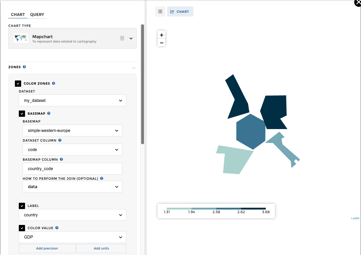
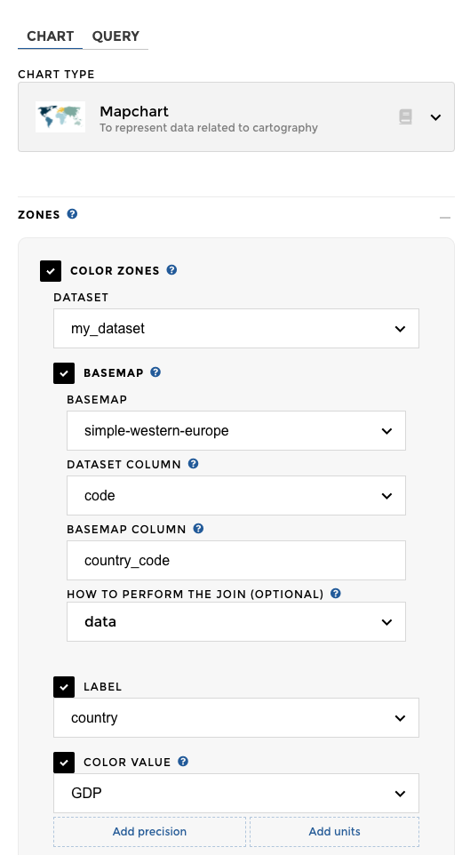
Step2 : Chart parameters
Warning
Correctly defining your dataset is very important to display your mapchart with no issues. Make sure you followed the above method!
Once you have a dataset with zones, you can associate it to the the mapchart:
Switch to the Chart tab to configure your map using the Zones option.
datasetindicates the name of the dataset containing your databasemapconfigures how to join zones and data (as seen in previous section)- choose the columns:
labelthat contains names for the zoneszone's colorthat contains values to be represented with color
And you are done !! 🎉 🎉
OMG sooooo easy 😱 😱 😱
Optional parameters
Drill
From your parent level: 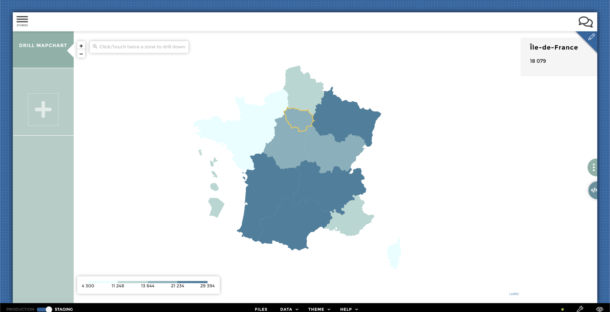
… To the children level: 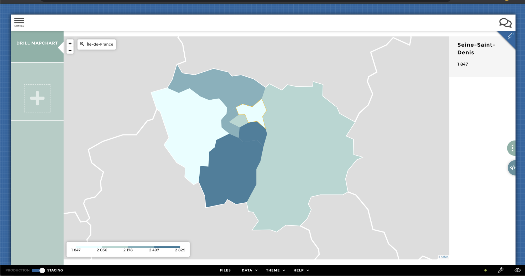
Adjusting the scale
By default, the values are split into four buckets, called quartiles.
Each bucket is associated with a color from the scale palette, as indicated in the legend at the bottom of the chart:
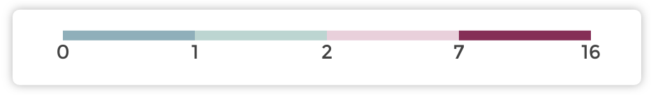
Hot/cold quartiles
Tip
Hot/cold contrasting colors are a good way to highlight extreme zones, and tell a story that focuses on them instead on the middle-ranged ones.
Reversing
Use Reverse scale option if the sentiment should be inverted (high
values are cold and low ones are hot).
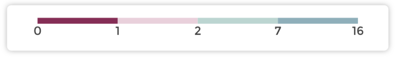
Reverse scaled quartiles
Number of buckets
If what you need is quintiles (five buckets of values) or another
number, update the number of scale's buckets with a number.
Tip
Quintiles are very useful to tell the story of the “typical” areas, ones that are in the middle bucket.
Reverse scaled quartiles
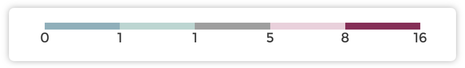
Custom color thresholds
If you want to specify custom threshold values for the color scale, use
the custom threshold values. You can specify up to 3 values which
will amount to 4 different colors.
Tip
This can be useful to focus on a subset of your data distribution.
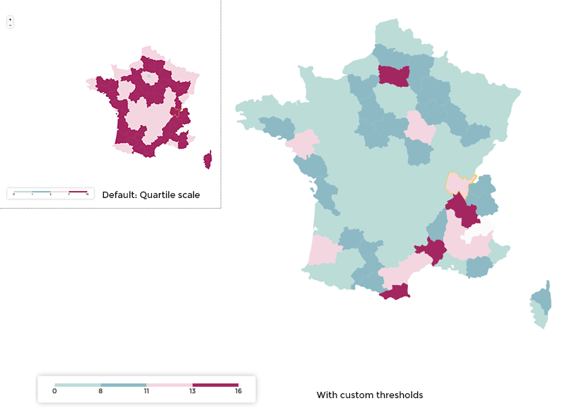
Custom color thresholds
Warning
Don’t forget to customize the color palette to fit your needs!
Use scaling on unfiltered dataset
By default, the scale is computed with the data after filtering.
If you prefer the scale to be consistent across filtering, activate the
Use scaling on unfiltered dataset option.
Handling zones with missing data
Maybe all zones don’t get associated with data.
The empty ones will by default display in light gray.
This behavior can be configured under the key
Zones with missing data option:
color: customize the color ot the empty zones. Can be a color name or any hexadecimal color like #000000.deactivate user's selection: prevent user to select empty zones (defaultfalse)
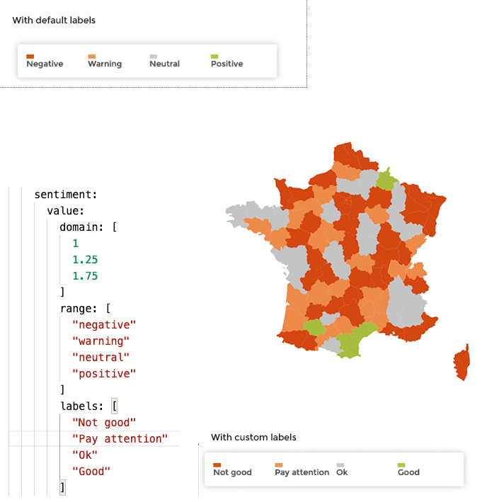
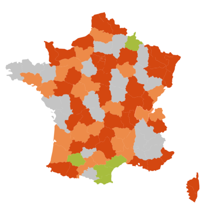
Using sentiment
Sometimes, it’s not the quantile in which each zone belong that you want to display, but rather a sentiment associated with each zone.
To achieve this, simply add a sentiment rule to the column used to color the zones.
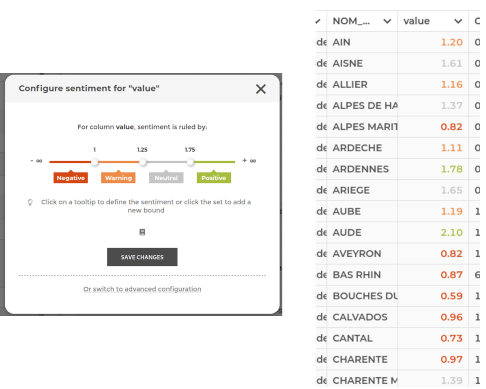
If you need to customize the labels for each sentiment, you need to
switch to code mode and add a labels property: