Heatmap Tutorials
Step by step tutorial
The user story
I’m a Marketing Director in an international company. ✈️
My company’s growth evolution is of 16.0% for this time period (month-to-date).
Awesome! 🤩 Does that mean every regions performed well? Is it as significant for every time periods?
Which regions contributed the most to this increase? Which ones need more attention to make sure the sales will go back up? Which time period performed the best? (Month-to-date, year-to-date, Q1, Q2 etc.)
Since I need a quick overview of my company’s growth versus the Market one -on several regions and on several time periods at the same time- let’s do a heatmap!
Warning
Before you start!
Make sure you added your datasource to your application. Once you’re done create a new story.
The dataset
Here is an example of the dataset expected to create a nice heatmap:
| EVOLUTION_TYPE | MARKET | BRAND EVOLUTION | MARKET EVOLUTION |
|---|---|---|---|
| EVOLUTION MTD | – ALL MARKETS – | 16.0 | 13.0 |
| EVOLUTION MTD | EUROPE | 4.0 | 6.0 |
| EVOLUTION MTD | NORTH AMERICA | 13.0 | 14.0 |
| EVOLUTION MTD | ASIA PACIFIC | 9.0 | -1.0 |
| EVOLUTION MTD | TRAVEL RETAIL | 1.0 | 23.0 |
| EVOLUTION YTD | – ALL MARKETS – | 16.0 | 7.0 |
| EVOLUTION YTD | EUROPE | 8.0 | -3.0 |
| EVOLUTION YTD | NORTH AMERICA | -3.0 | 15.0 |
| EVOLUTION YTD | ASIA PACIFIC | 20.0 | 12.0 |
| EVOLUTION YTD | TRAVEL RETAIL | 23.0 | 3.0 |
| Q1 2019 | – ALL MARKETS – | -3.0 | 15.0 |
| Q1 2019 | EUROPE | -3.0 | 8.0 |
| Q1 2019 | NORTH AMERICA | 16.0 | 11.0 |
| Q1 2019 | ASIA PACIFIC | 1.0 | 16.0 |
| Q1 2019 | TRAVEL RETAIL | 6.0 | 24.0 |
| Q2 2019 | – ALL MARKETS – | 7.0 | 20.0 |
| Q2 2019 | EUROPE | 10.0 | 21.0 |
| Q2 2019 | NORTH AMERICA | 7.0 | 7.0 |
| Q2 2019 | ASIA PACIFIC | 19.0 | 13.0 |
| Q2 2019 | TRAVEL RETAIL | 9.0 | 16.0 |
Very simple, isn’t it ? 😉 There is one line per time period and per region, and for each one of them there is the growth evolution and the market one.
Note
Don’t forget to add units to your brand and market evolution columns to contextualize the information and give meaning to your story!
Chart Parameters
Once my data has been setup, I just need to follow the steps and in 3 clicks I’m done! ✅
I need at least :
- a
x axiscolumn - that will be displayed as columns for your heatmap - a
y axiscolumn - that will be displayed as rows for your heatmap - a
valuecolumn - that will be displayed inside your heatmap
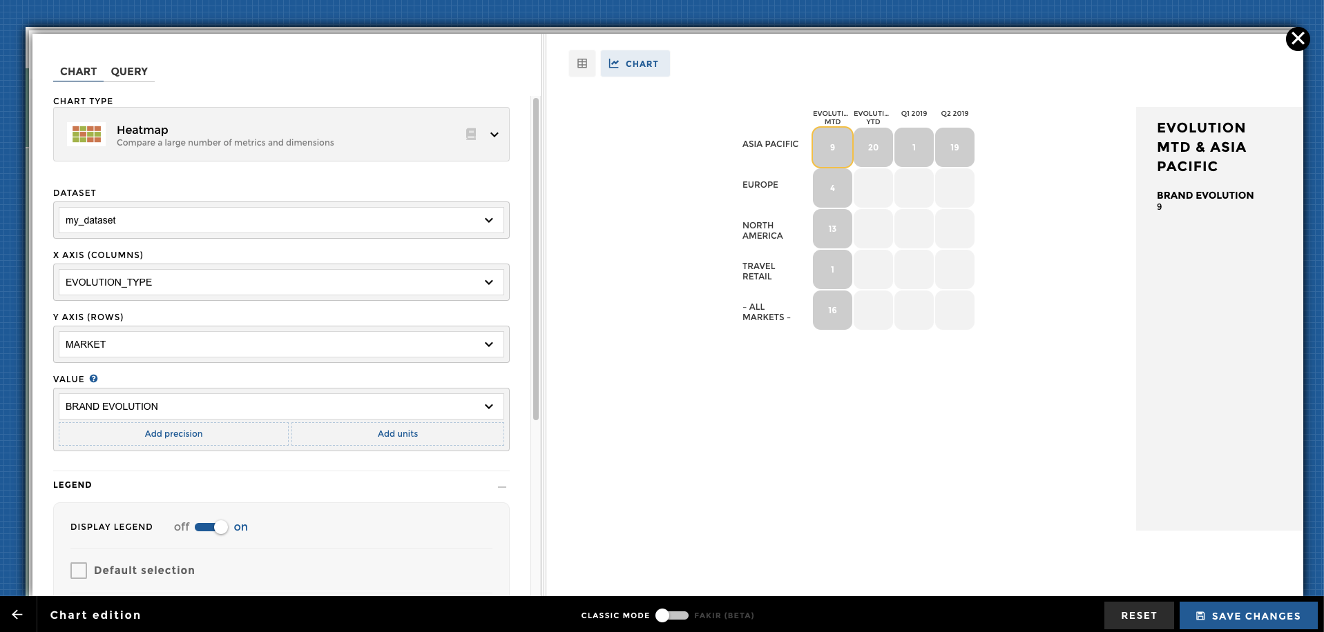
Add sentiment
The last step in order to get your heatmap colorful and shiny is to add sentiment. 😊
I want a green color when my brand evolution is above the market one and I want a red one when my brand evolution is under.
In order to do so, I add
sentiment
on my BRAND EVOLUTION column and I chose to make it depend on my
MARKET EVOLUTION column.
Here we go! 🎉
Other configuration examples
Dataset
Here is a sample of rows of the dataset (i.e. domain) used in the following examples:
| Movie | variable | value |
|---|---|---|
| The Jungle Book | Duration | 106 |
| The Secret Life of Pets | Duration | 87 |
| Jason Bourne | Duration | 123 |
| The Purge: Election Year | Duration | 109 |
| The Jungle Book | Budget | 175 |
| The Secret Life of Pets | Budget | 75 |
| Jason Bourne | Budget | 120 |
| The Purge: Election Year | Budget | 10 |
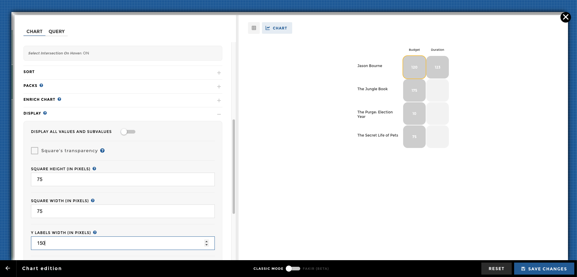
chart ex0
Please activate the legend option:
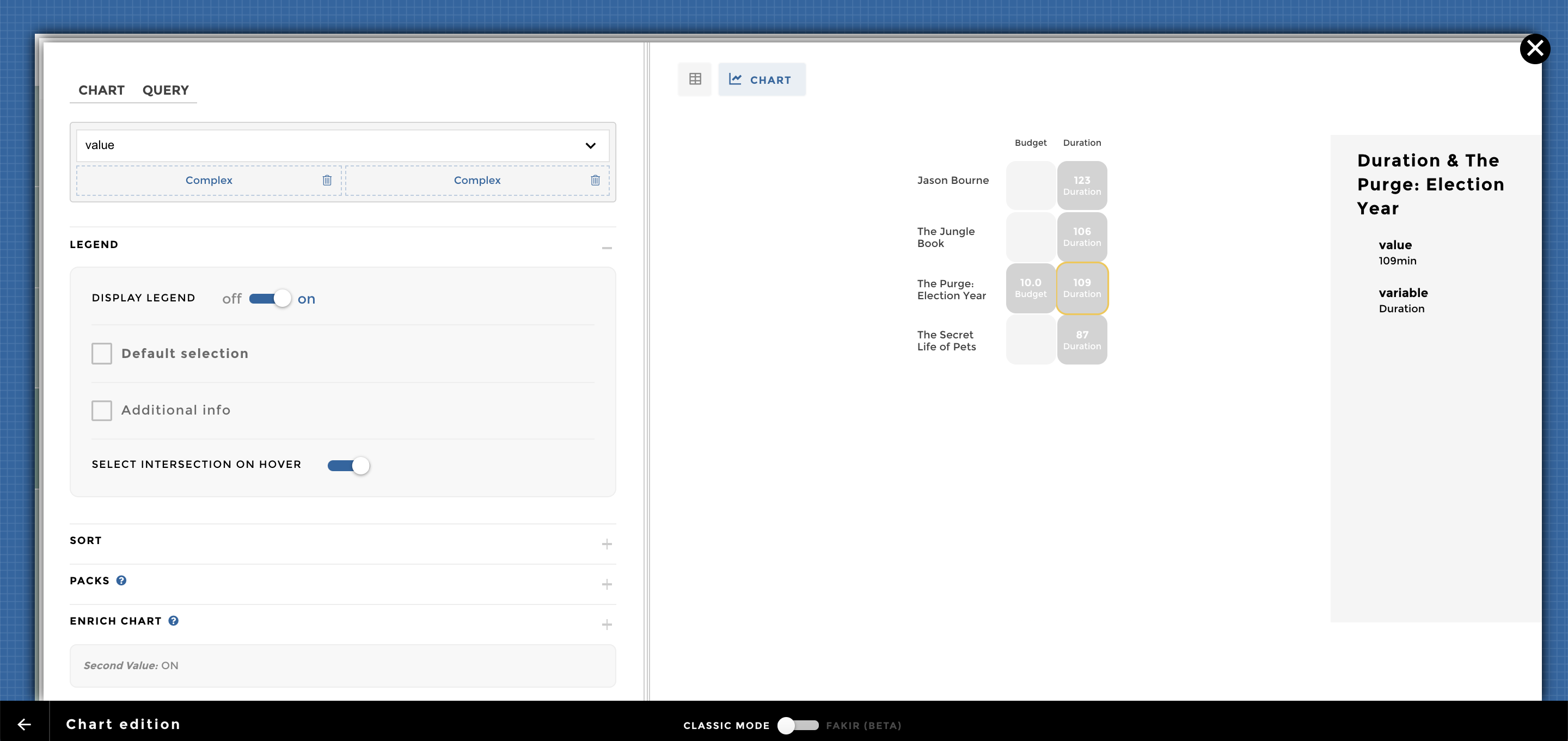
chart ex3
You can also add a second value into the Enrich chart option:
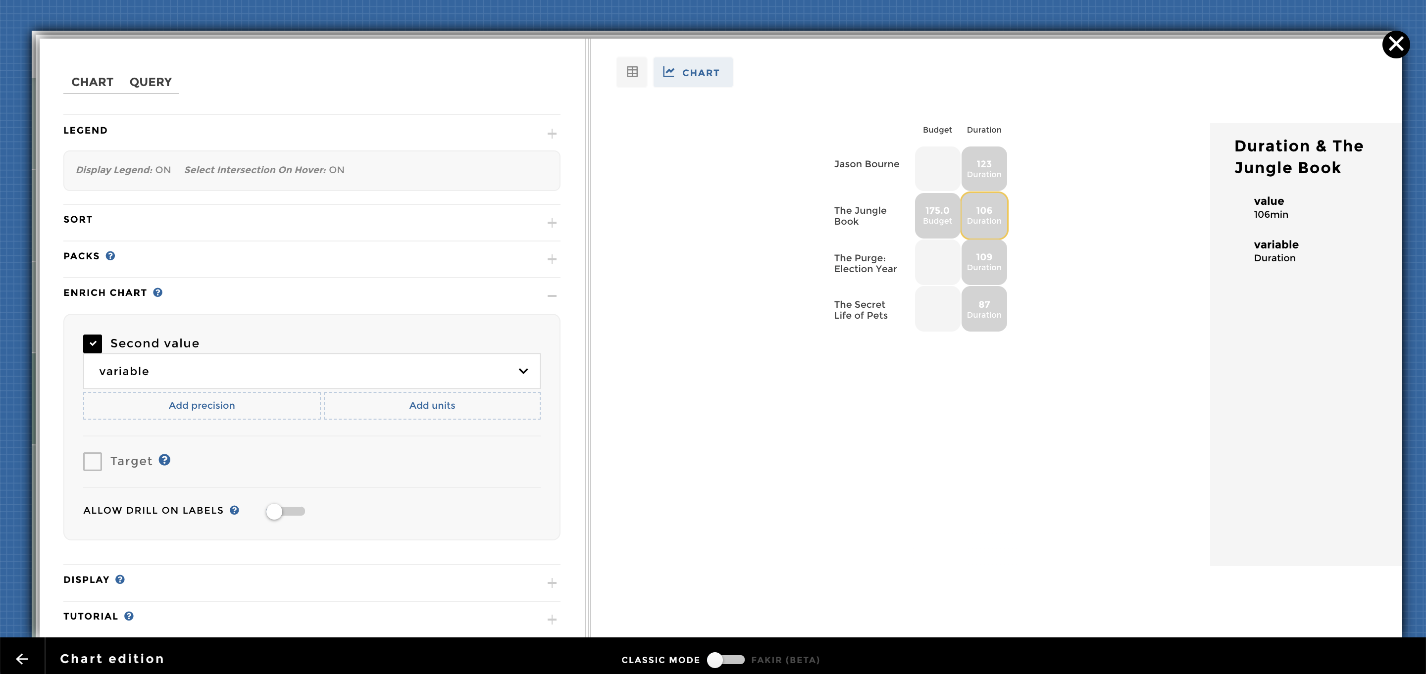
chart ex3 subvalue
Into the chart configuration, you can add a precision and units for the
main Value and Second Value= 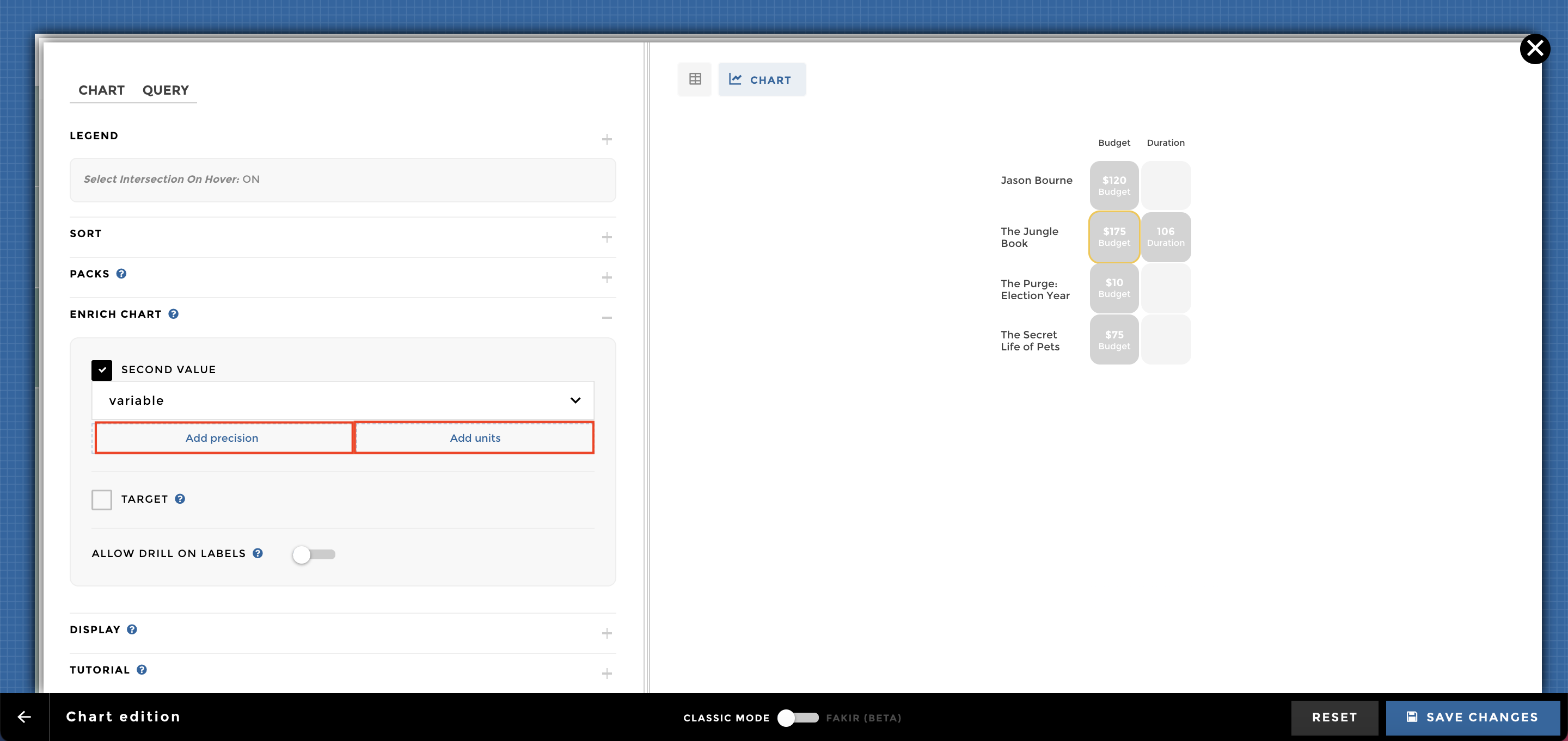
You can take a look at this documentation to set up advanced precision:
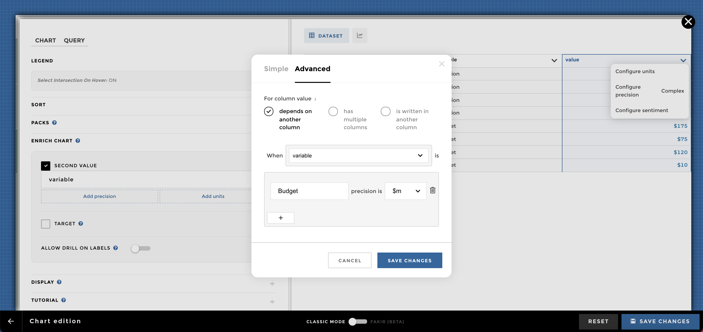
chart ex2 precision
You can take a look at this documentation to set up advanced units:
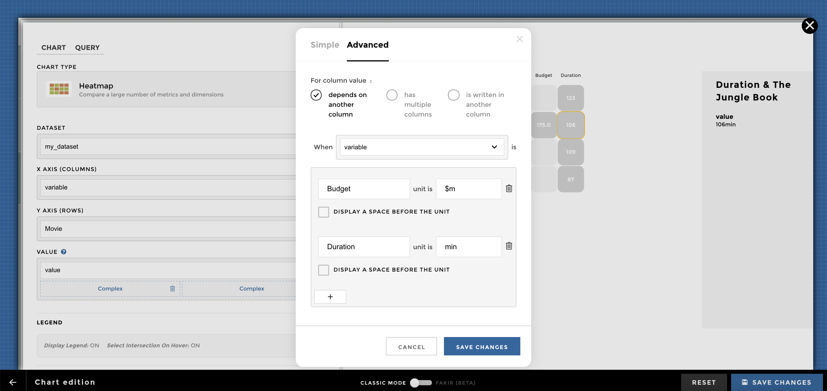
chart ex2 units
Dataset
Here is a sample of rows of the dataset (i.e. domain) used in the following examples:
| Movie | Country | variable | value |
|---|---|---|---|
| The Jungle Book | UK | Duration | 106 |
| The Secret Life of Pets | Japan | Duration | 87 |
| Jason Bourne | UK | Duration | 123 |
| The Purge: Election Year | France | Duration | 109 |
| The Jungle Book | UK | Budget | 175 |
| The Secret Life of Pets | Japan | Budget | 75 |
| Jason Bourne | UK | Budget | 120 |
| The Purge: Election Year | France | Budget | 10 |
You can add a filter to enrich the navigation of your chart:
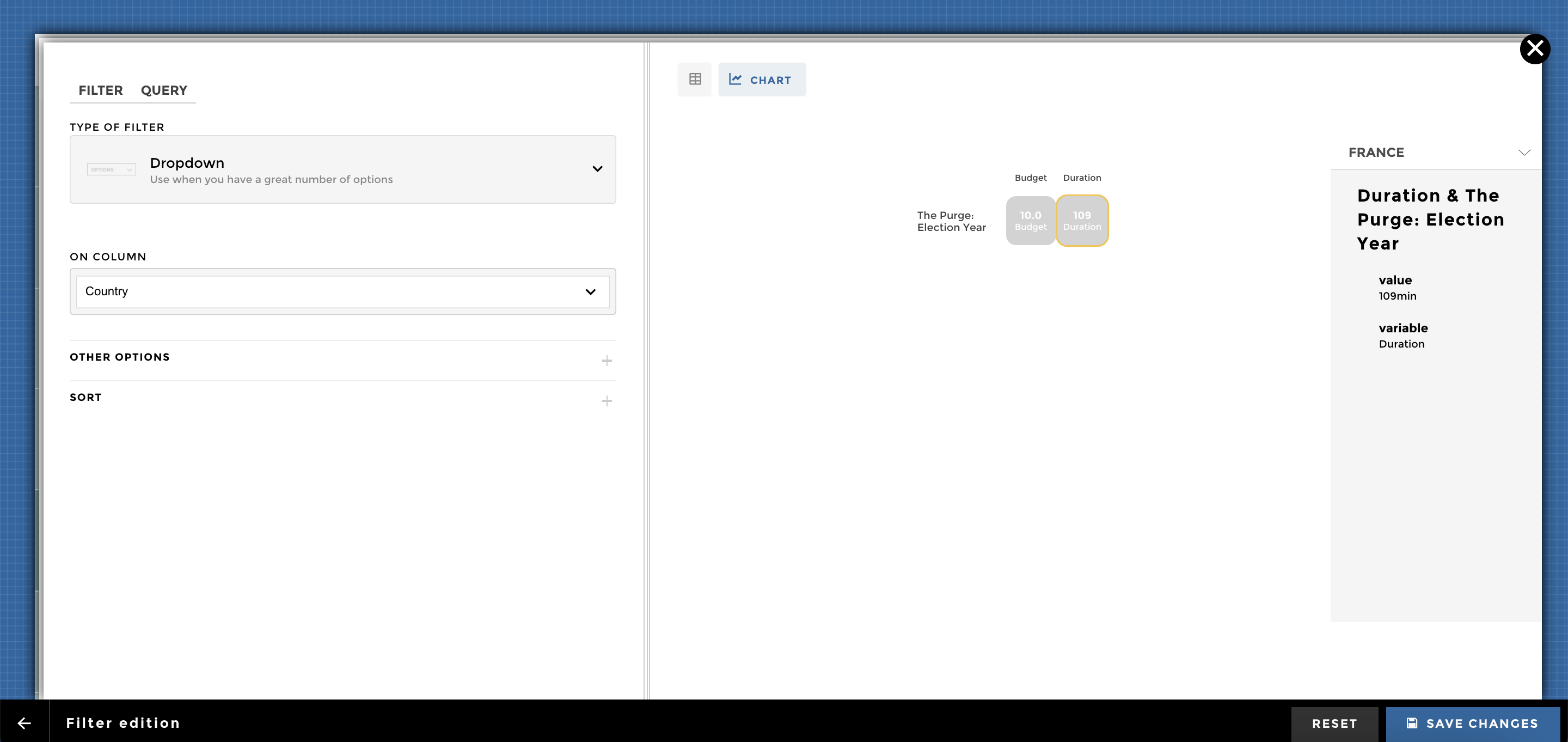
chart ex4
NB: You can add a Reset value to your filter configuration:
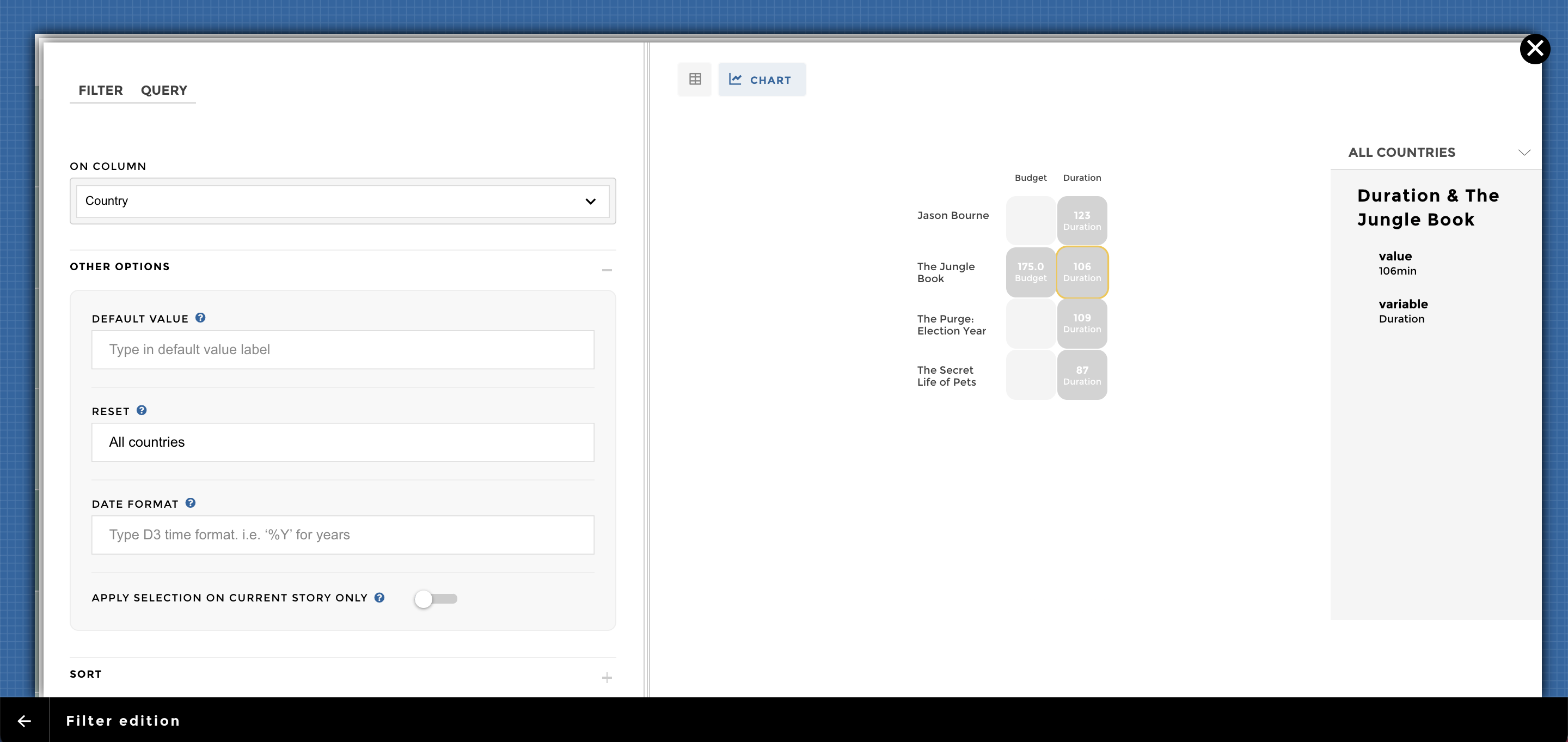
chart ex5
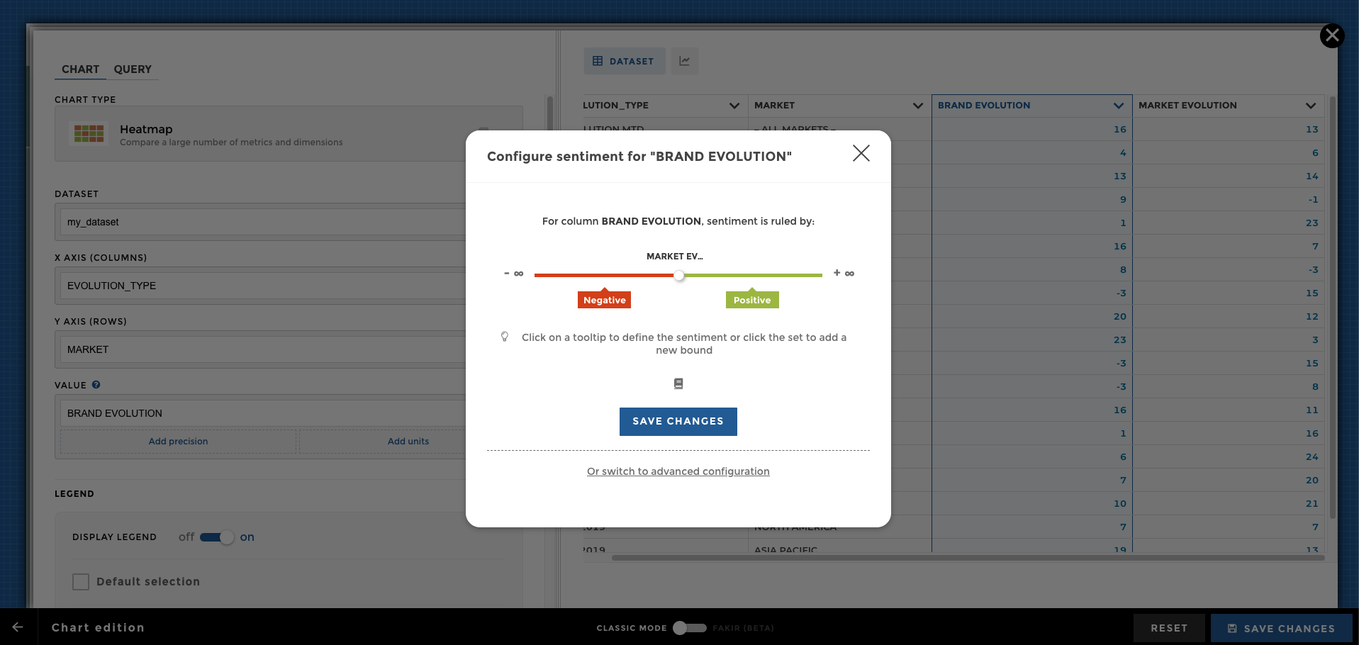
You can add a sentiment to enrich the navigation of your chart. Please select the preview of your dataset in the Chart category and click on Configure Sentiment:
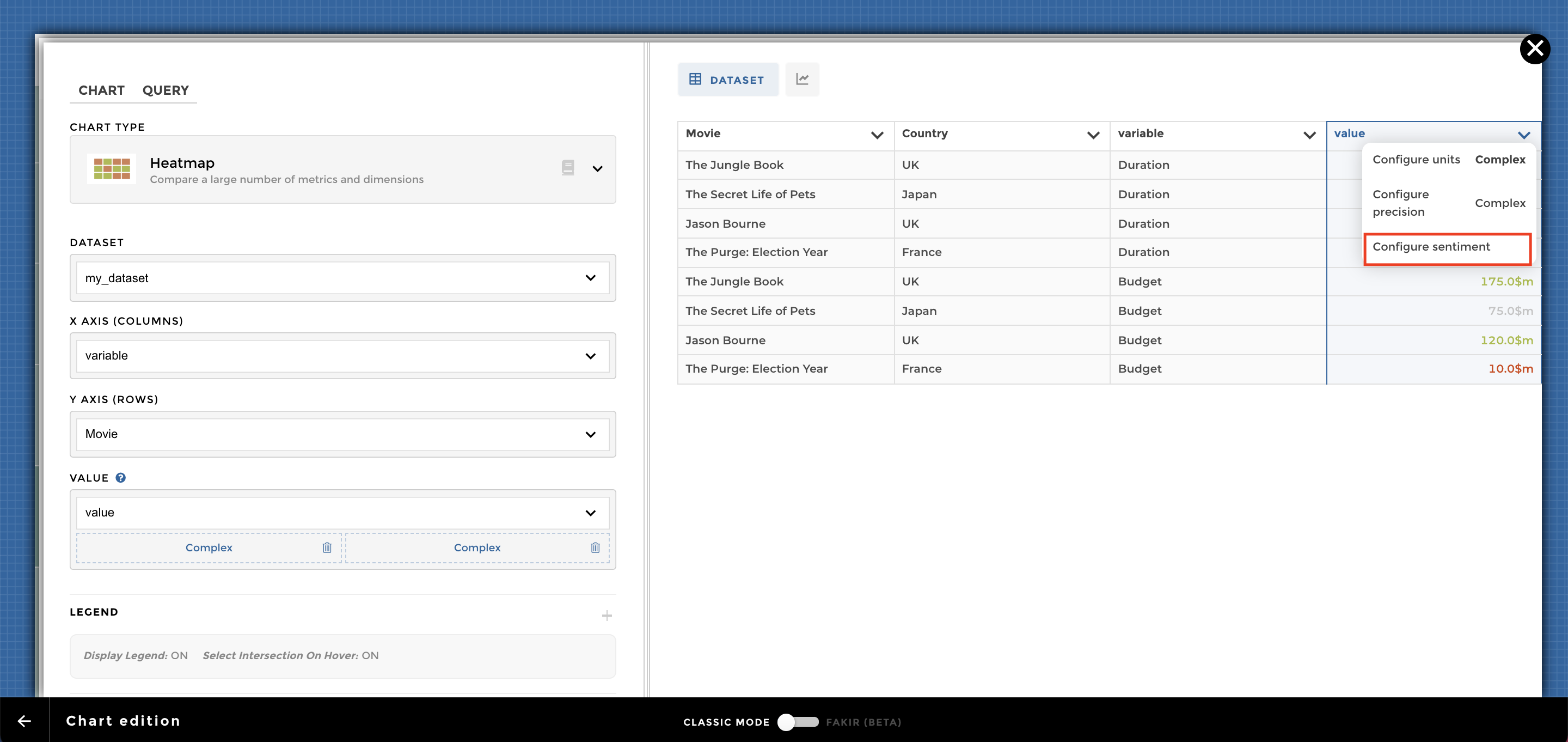
chart ex6
With an advanced sentiment it looks like:
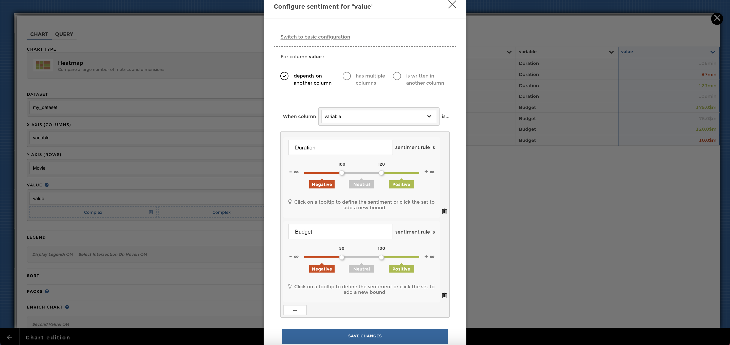
chart ex6 sentiment2
You just need to activate the *Square’s transparency** option (could be find in the Display section):
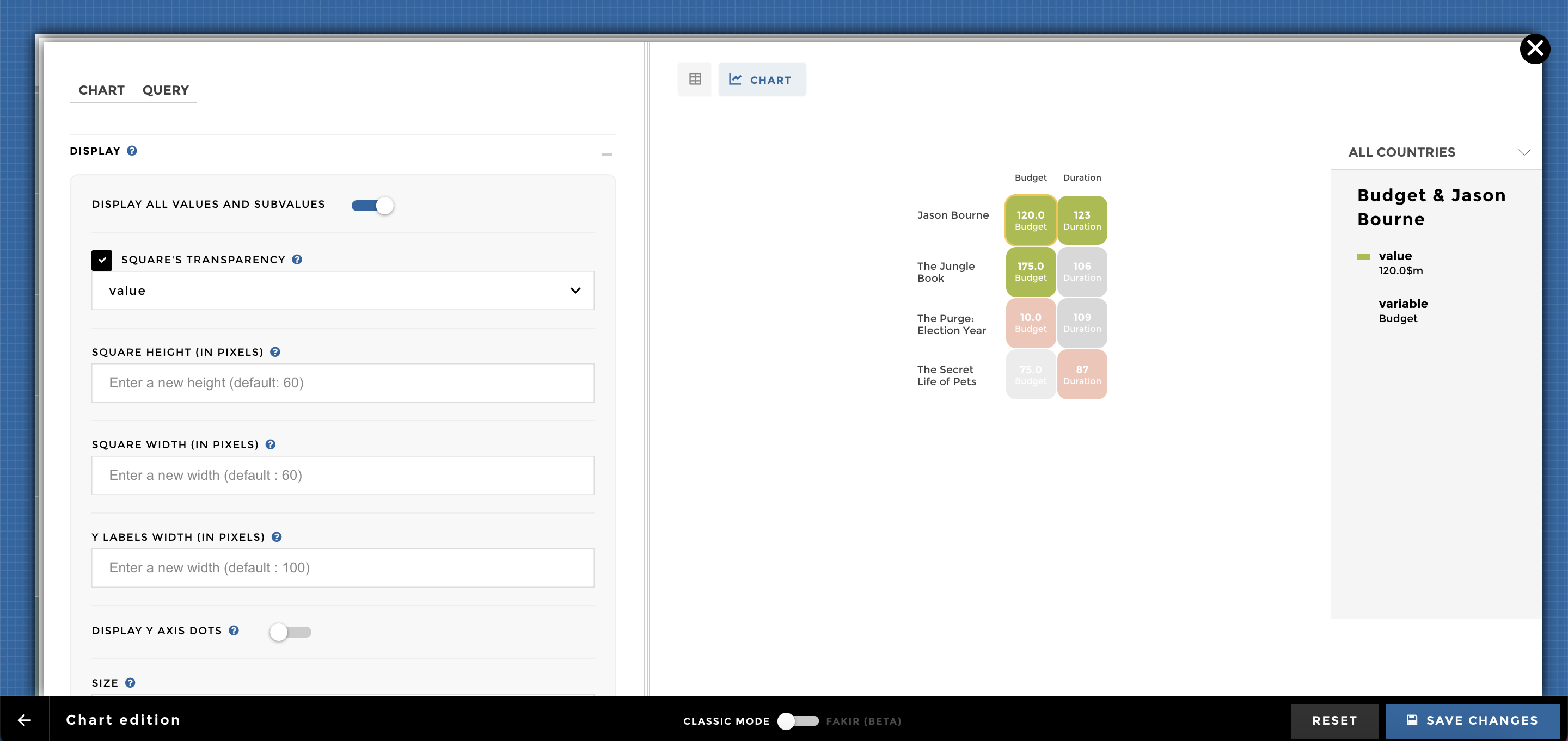
chart ex7
The sort option allow you to set up a specific order for your heatmap (could be done for the X or Y axis):
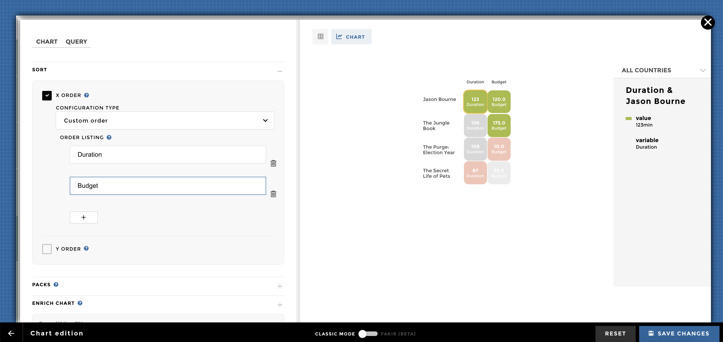
chart ex8
Adding Packs is a nice way to display your heatmap based on different groups/dimension:
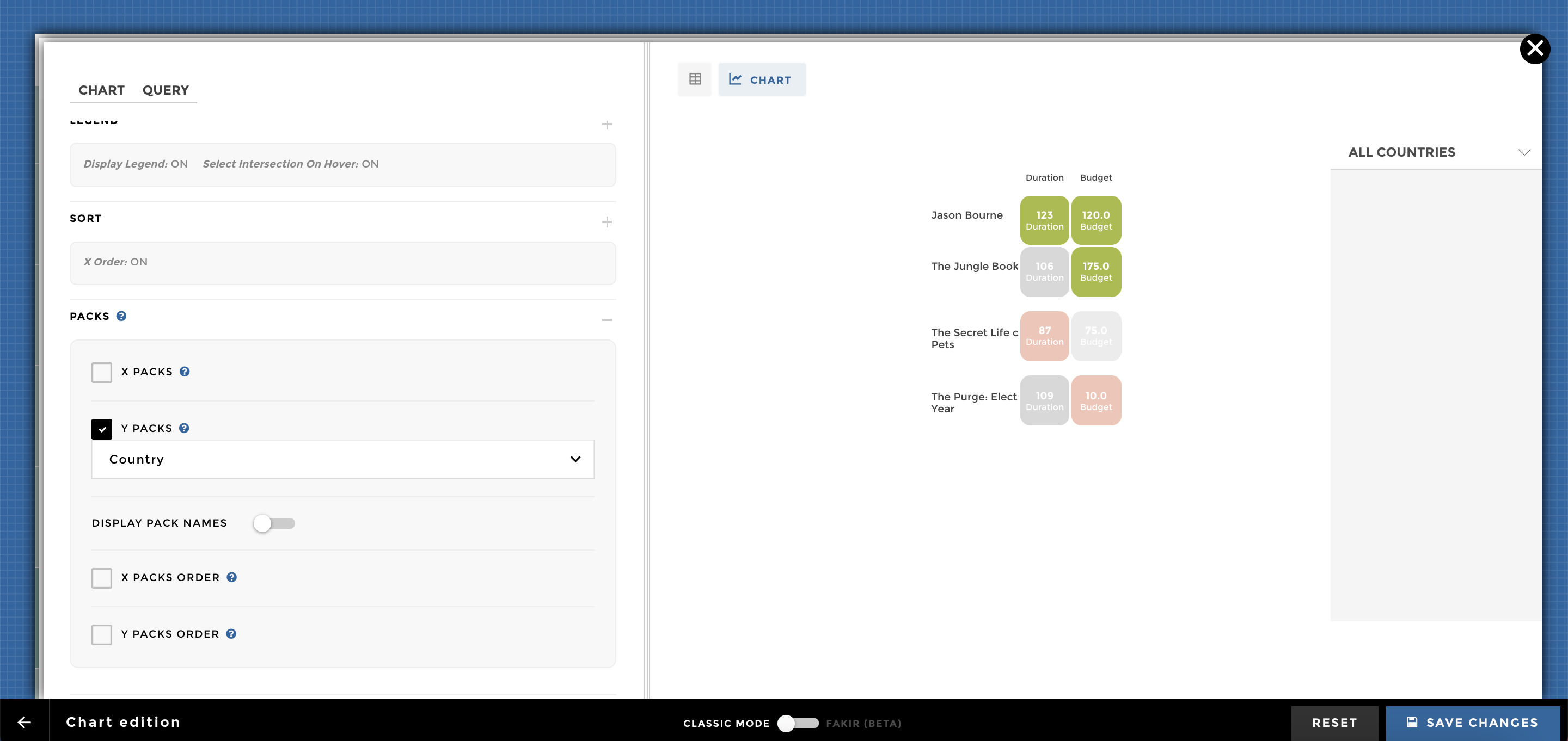
chart ex9
And here you go 🚀