Barlinechart Tutorials
Step by step tutorial
The dataset
We will work on two datasets to explore the barlinechart properties. In each dataset, all we need are two columns: label and value A label column (usually dates): this will define the name of each of the bars you want to display A value column: this will define the bar value
Below are a sample of rows from the dataset to get a sense its structure:
Barvalue dataset:
| year | serie | bar_value |
|---|---|---|
| 2004 | C | 4.05 |
| 2005 | C | 4.25 |
| 2006 | C | 4.25 |
| 2007 | C | 4.2 |
| 2008 | C | 3.85 |
| 2009 | C | 3.55 |
| 2010 | C | 4.35 |
| 2011 | C | 4.45 |
| 2012 | C | 4.4 |
| 2013 | C | 4.7 |
| 2014 | C | 4.9 |
Linevalue dataset:
| year | serie | line_value |
|---|---|---|
| 2004 | A | 8.1 |
| 2005 | A | 8.5 |
| 2006 | A | 8.5 |
| 2007 | A | 8.4 |
| 2008 | A | 7.7 |
| 2009 | A | 7.1 |
| 2010 | A | 8.7 |
| 2011 | A | 8.9 |
| 2012 | A | 8.8 |
| 2013 | A | 9.4 |
| 2014 | A | 9.8 |
Very simple ! There is one line value per year for series A and series B
Let us visualise this data !
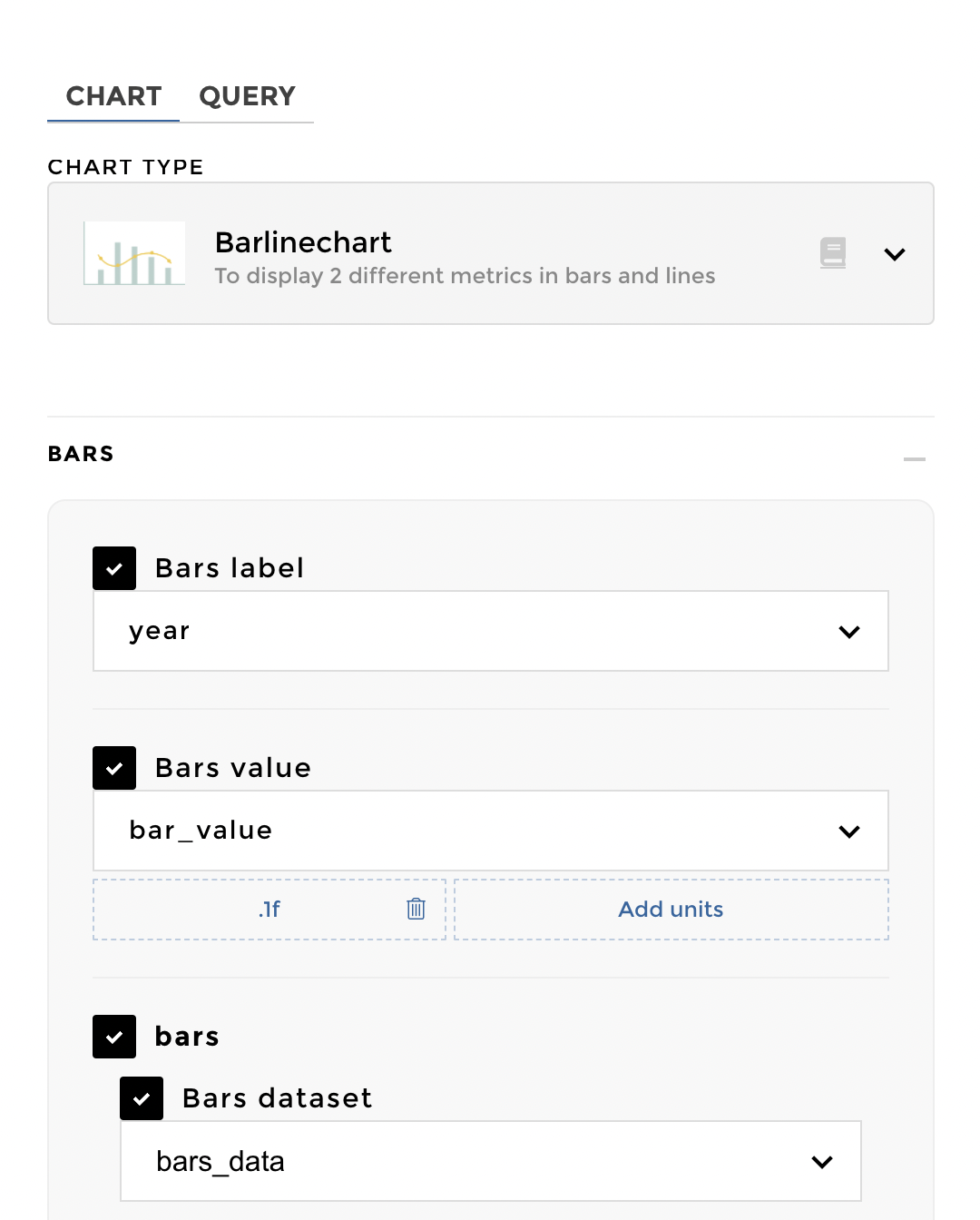
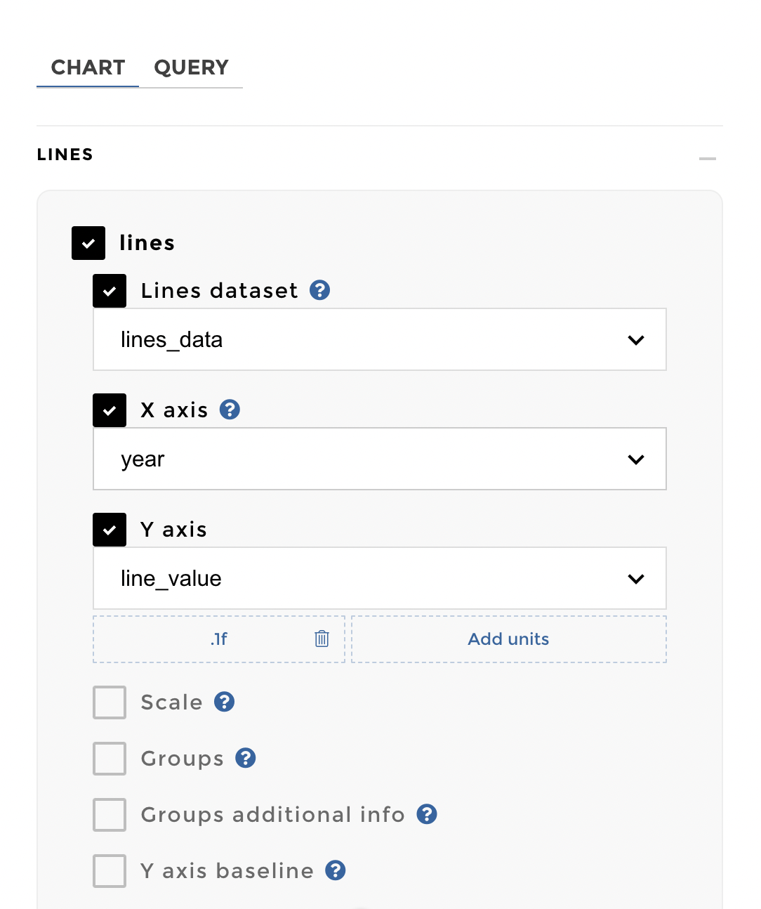
Chart Parameters
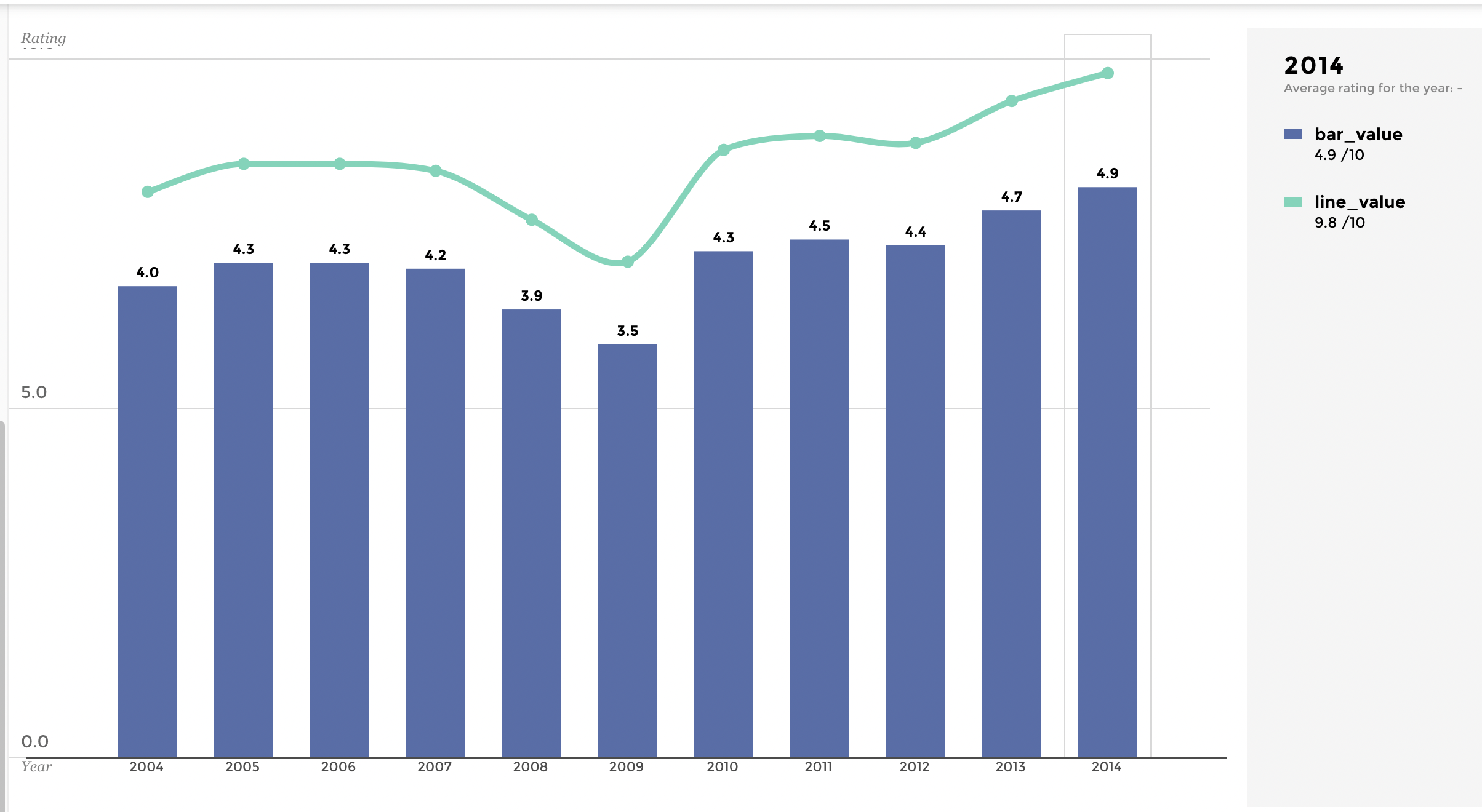
Once you have gathered the data you need, you can choose to configure a barlinechart. Select Barlinechart as your chart type and you will need to fill in information about the bars: dataset, label and value, and then, you will do the same for the line, and that’s it! ✨
tuto 0 image
tuto 1 image
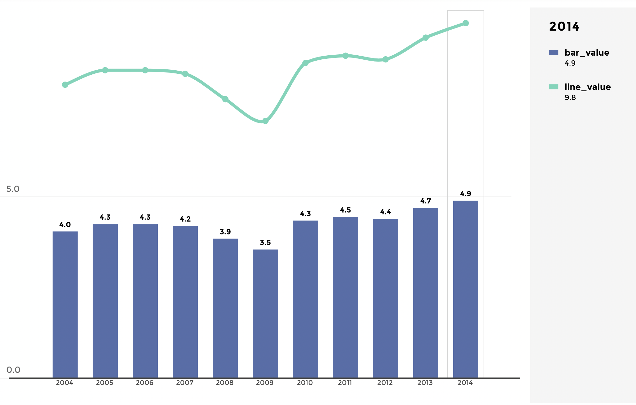
Here is how the visualisation looks like:
tuto 2 image
Adding specific axis scales, precision, units and a legend
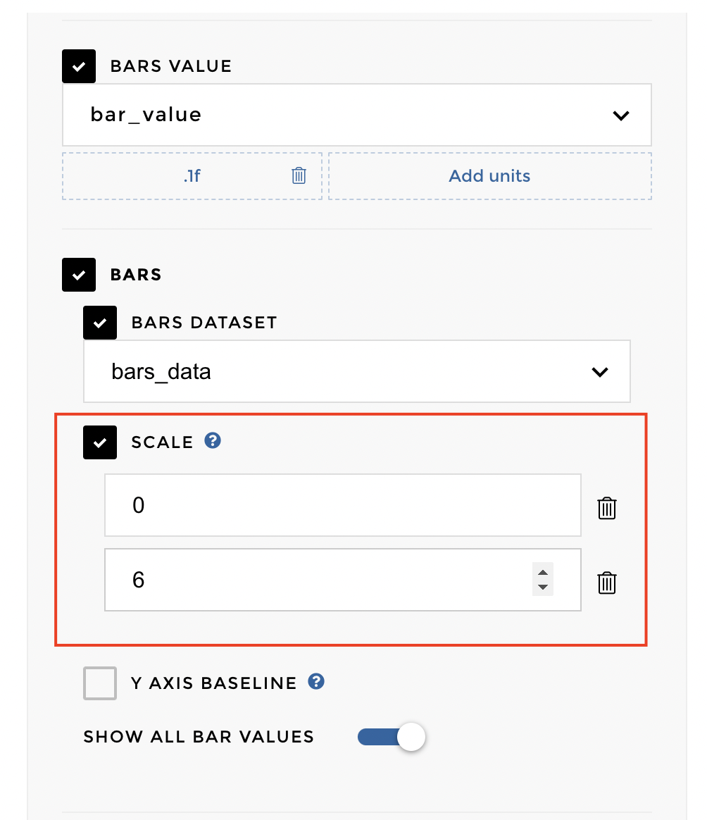
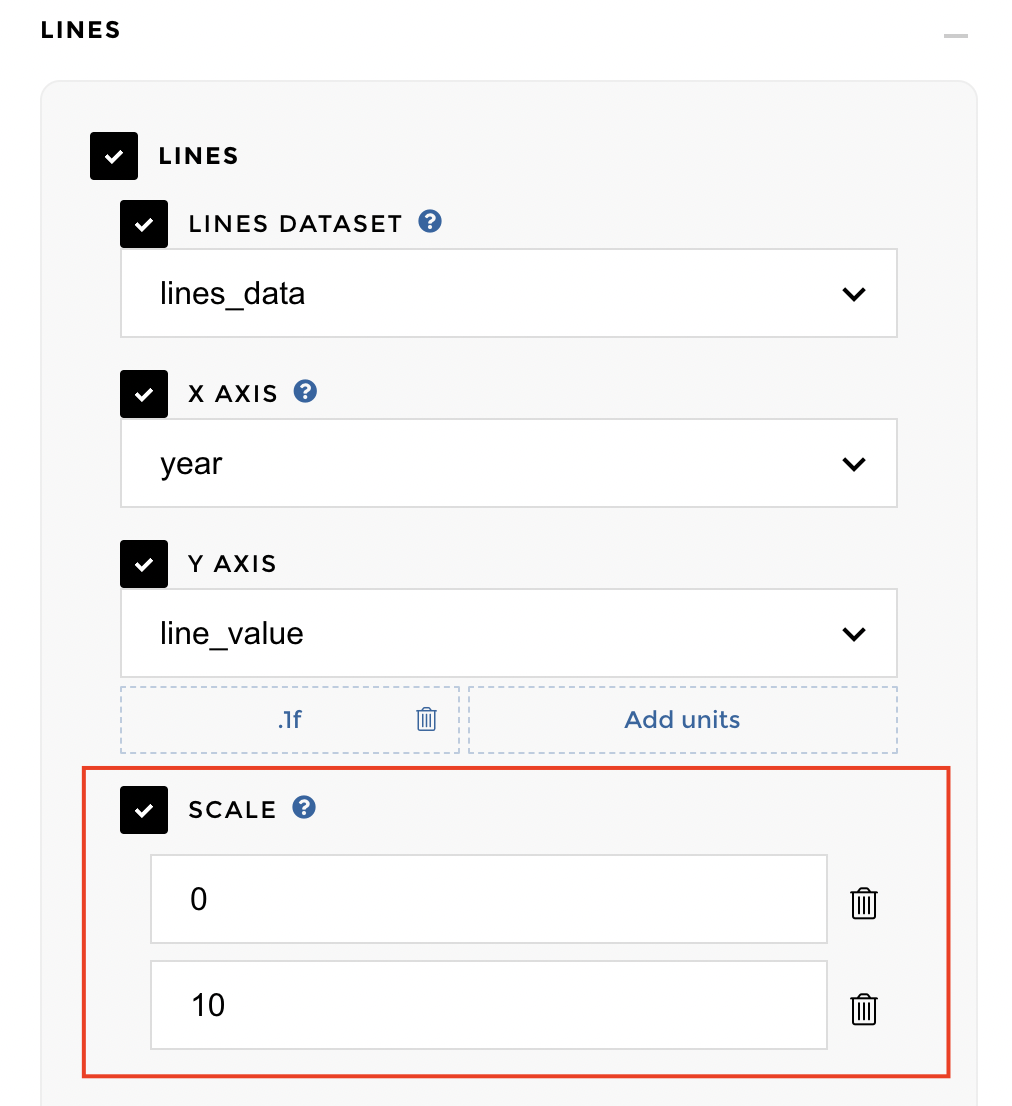
If you don’t want the same scale for your bars and your line, untick the option “Use the same scale for bars and lines” in the display parameters. You can also customize scale on the bars and lines as well. You will click on Scale option under lines or Bars option and fill in two bounds to scale your bars or lines.
tuto image 4
tuto image 3
Tip
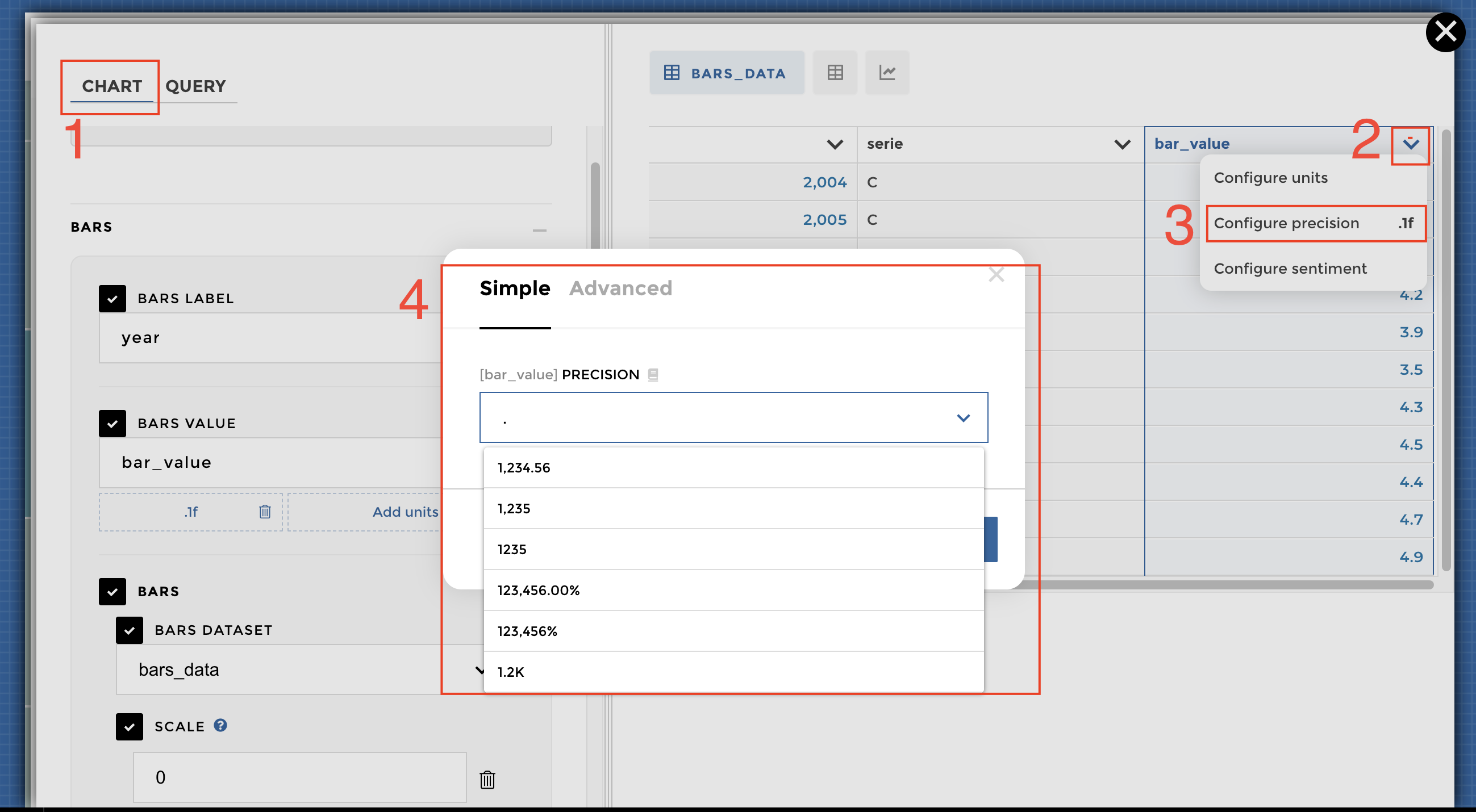
You may want to set the precision or units to your data. Select Chart > datasets > click on drop down next to column > Configure precision > Select the precision that works best for your data:
tuto image 5
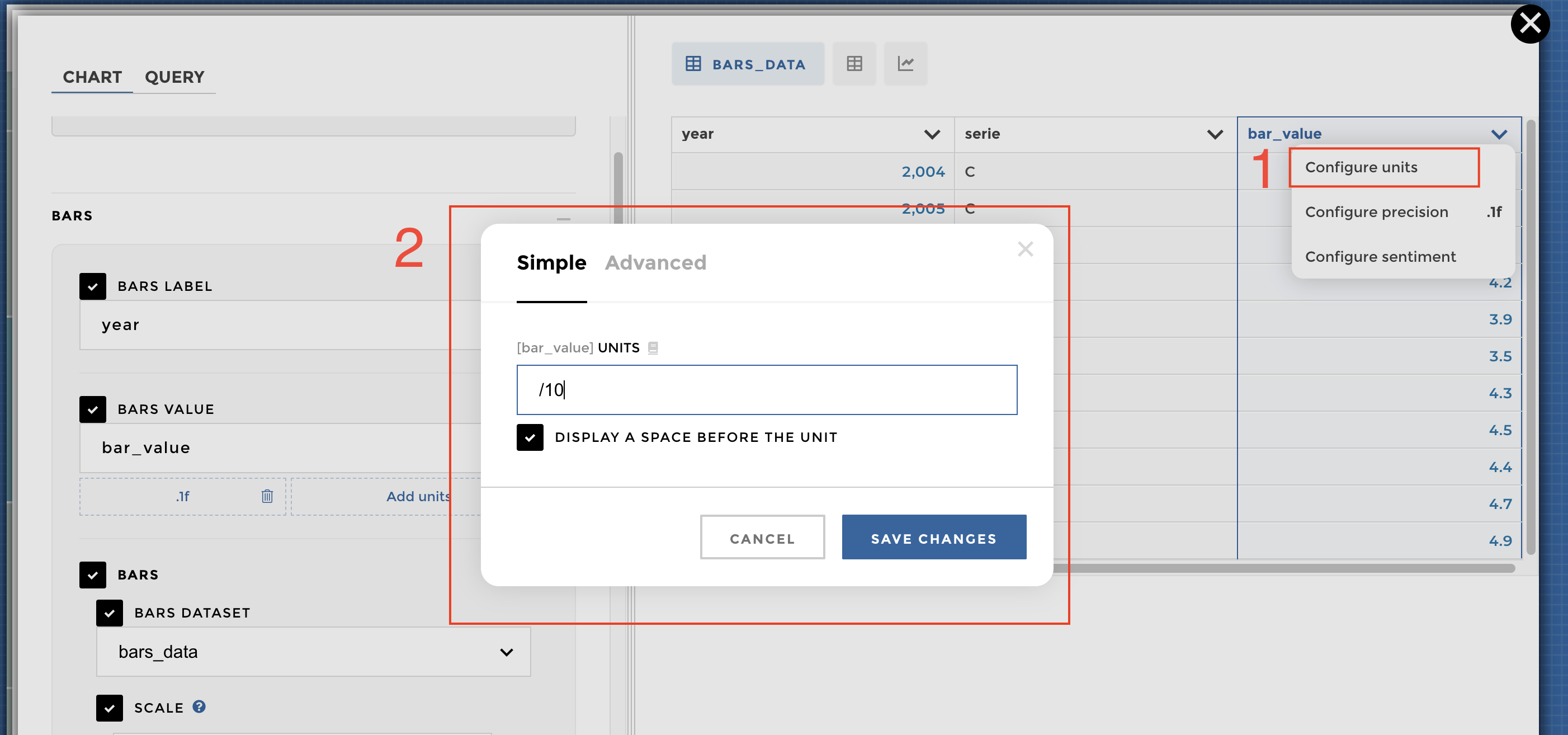
Similar process for adding [units](/concepteur/tutorials/power-apps-with-data/05-specifiers.html#how-to-use-specifiers-units-precision-and-sentiment- as well. Select Chart > datasets > click on drop down next to column > Configure units > Select the unit that works best for your data:
tuto image 6
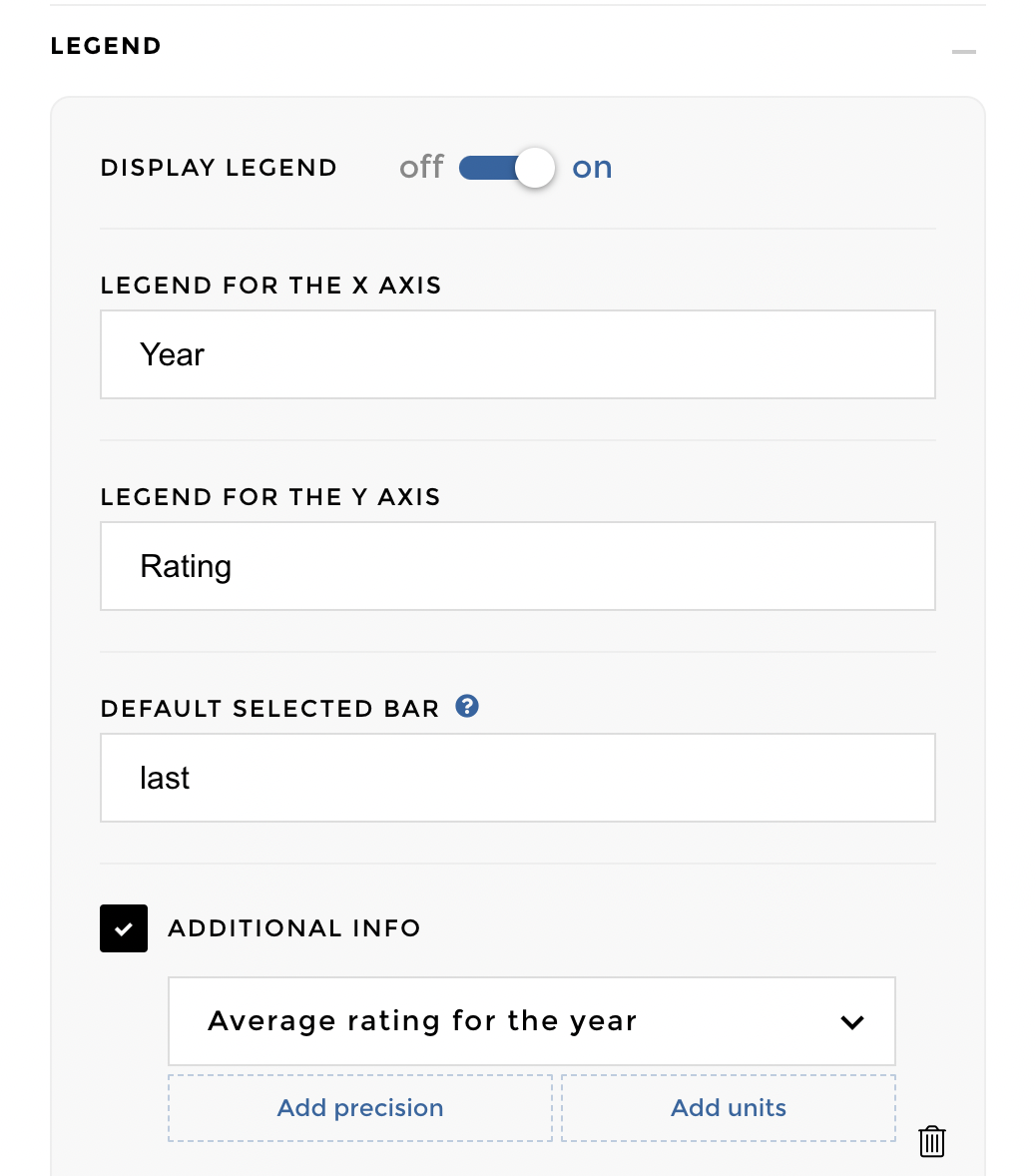
What more? Add some details on the legend for readability :)
tuto image 7
And here is what the visualisation looks like:
 Better right 🤩
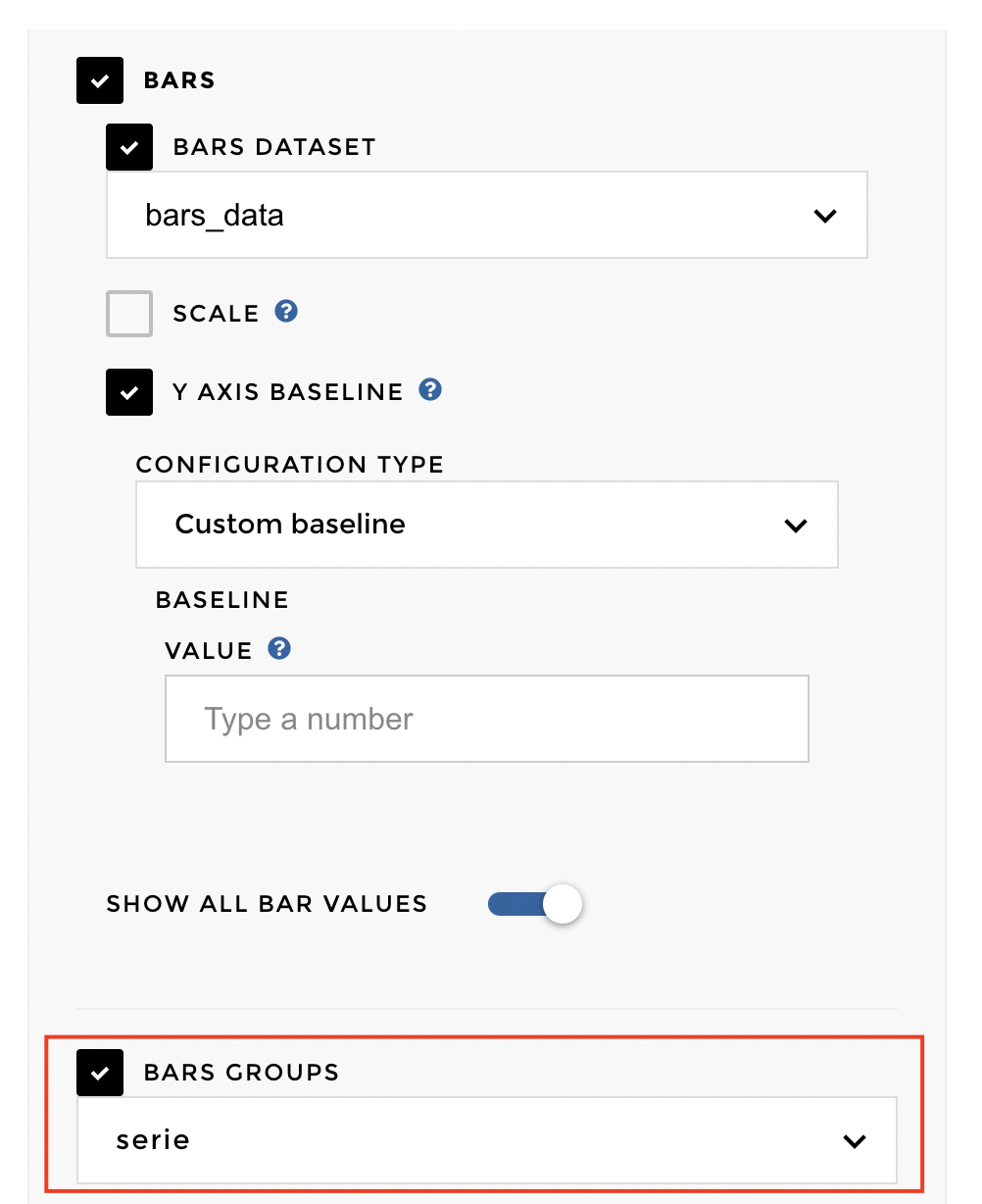
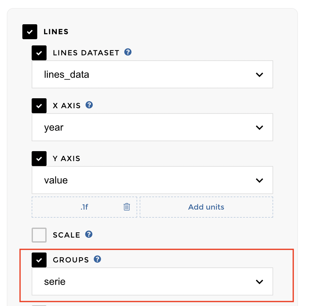
Adding groups
You can add groups to your values, if you want more than 1 value on each label. For that, you will need another column in your datasets with the group name.
Under Bars and Lines, there is an option to select bars group and line group. You can select the group column for display it on the chart
In this example, the bar&line group column is called “serie”:
tuto image 9
tuto image 10
Finally here is the visualisation:
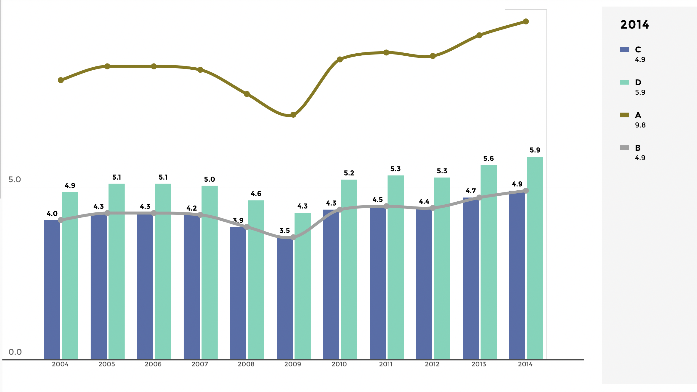
tuto image 11
Way better now !
Adding filters
Now what if we want to be able to juggle different countries data ? Let us add a lower-right button filter. Click on add filter option on the bottom right corner and select the type of filter. Here we are applying a buttons filter on column breakdown of dataset BARS_DATA
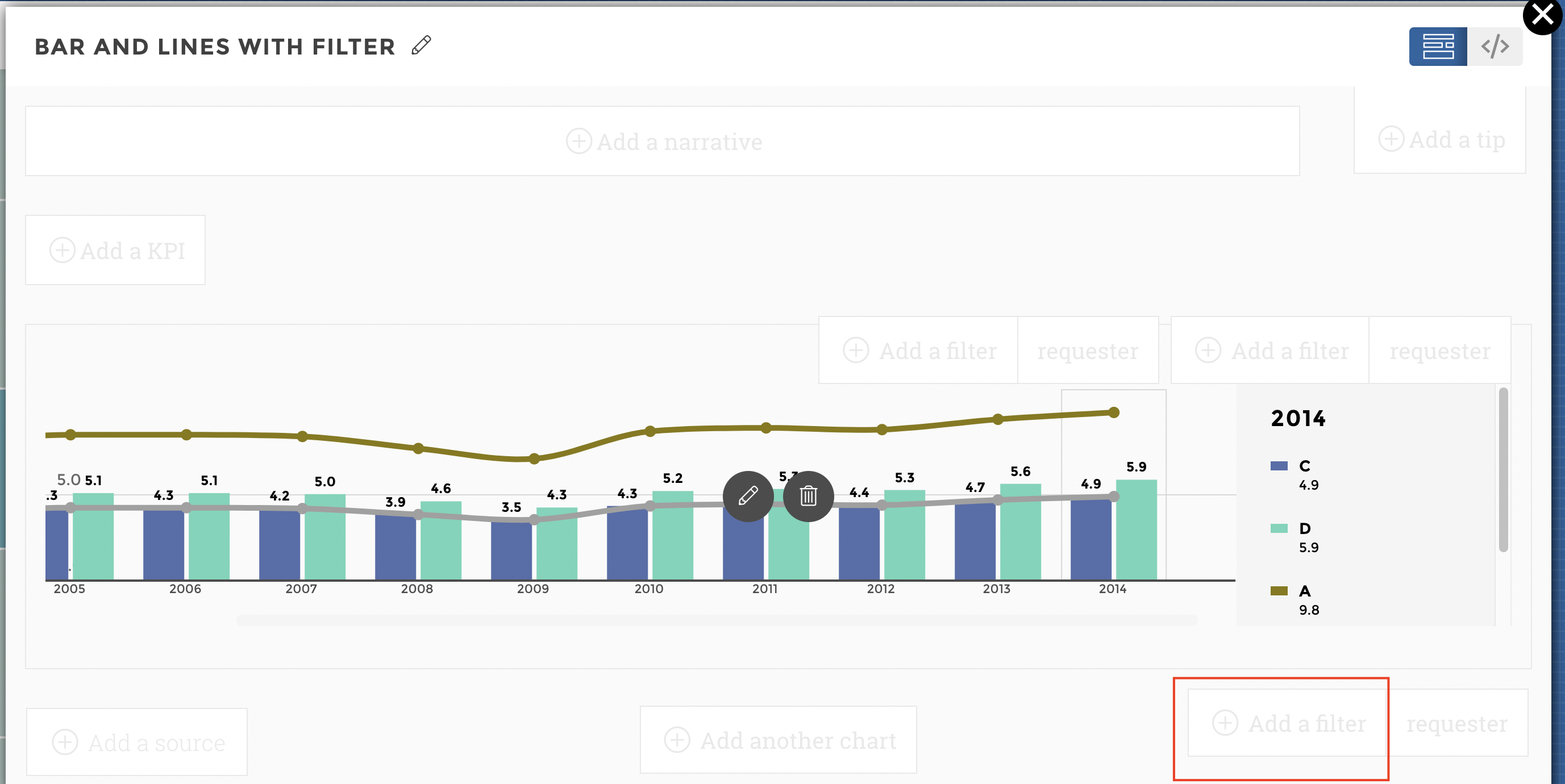
tuto image 12
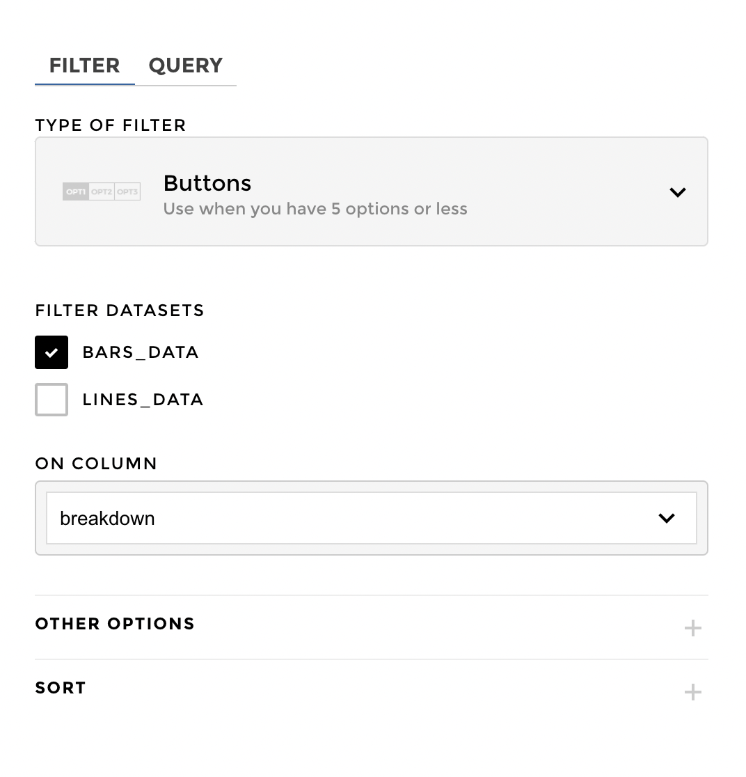
tuto image 13
Nice !
Finally here is the visualisation:
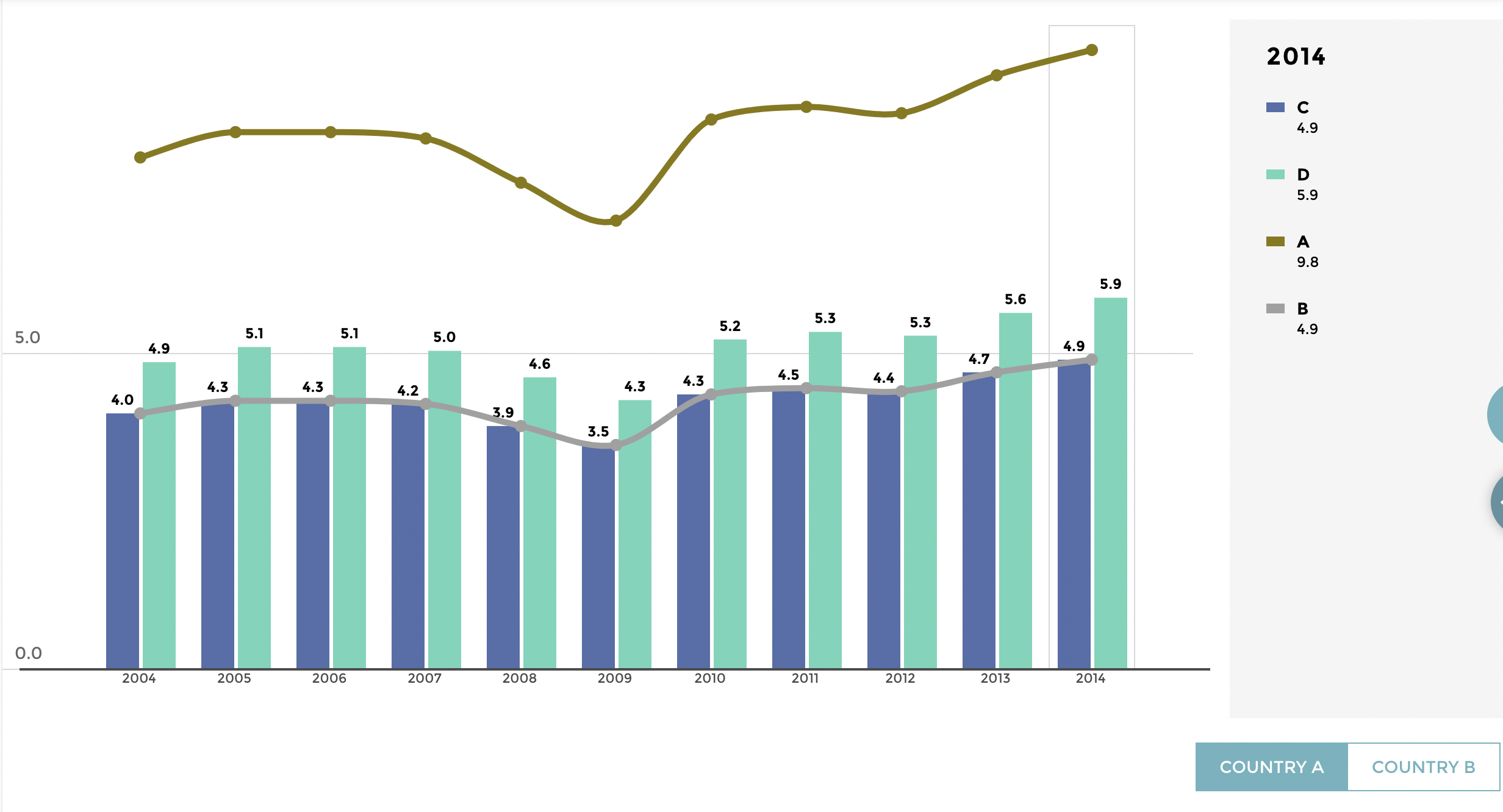
tuto image 14
The end !!! Congratulations, you are a barlinechart master now 👏