Bulletchart Tutorials
Step by step tutorial
The user story
I’m a Mall Center Director in a big commercial real estate company.
My mall’s growth evolution is great this year! Does that mean every shop within my mall performed well? Is it as significant for each of them vs their respective target? And vs their last year performance?
Which are the shops that have contributed the most to this increase? Which shops have best performed vs their objective? Which ones have the most significant evolution vs last year?
Since I want to compare my shop’s performance vs some reference values (target value, and last year value) let’s do a bulletchart!
Warning
Before you start! Make sure you added your datasource to your application. Once you’re done, create a new story.
The dataset
Here is an example of the dataset expected to create a nice bullet-chart:
| Retailer name | CA | Target | Last year |
|---|---|---|---|
| Shop #1 | 16.0 | 13.0 | 3.0 |
| Shop #2 | 4.0 | 6.0 | 12.0 |
| Shop #3 | 13.0 | 14.0 | 15.0 |
| Shop #4 | 9.0 | -1.0 | -3.0 |
| Shop #5 | 1.0 | 23.0 | 1.0 |
| Shop #6 | 16.0 | 7.0 | 4.0 |
| Shop #7 | 8.0 | -3.0 | -3.0 |
| Shop #8 | -3.0 | 15.0 | 20.0 |
| Shop #9 | 20.0 | 12.0 | 23.0 |
| Shop #10 | 23.0 | 3.0 | 13.0 |
Very simple, isn’t it ? 😉 There is one line per shop, and for each shop 3 different values : the actual one (CA), the budgeted one (Target), and the past value (Last year).
Note
Don’t forget to add units to your value, last year and target columns to contextualize the information and give meaning to your story!
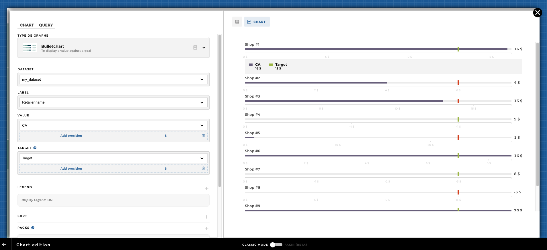
Chart Parameters
Once my data has been setup, I just need to follow the steps and in 3 clicks I’m done! ✅
I need at least :
- a
labelcolumn - these are the name of my shops - a
valuecolumn - that’s the bar on my bulletchart - a
targetcolumn - that’s the tick/small vertical bar on my bulletchart - and sometimes a
comparisoncolumn - this one is available in the optional parameters, and is the container bar on my bulletchart
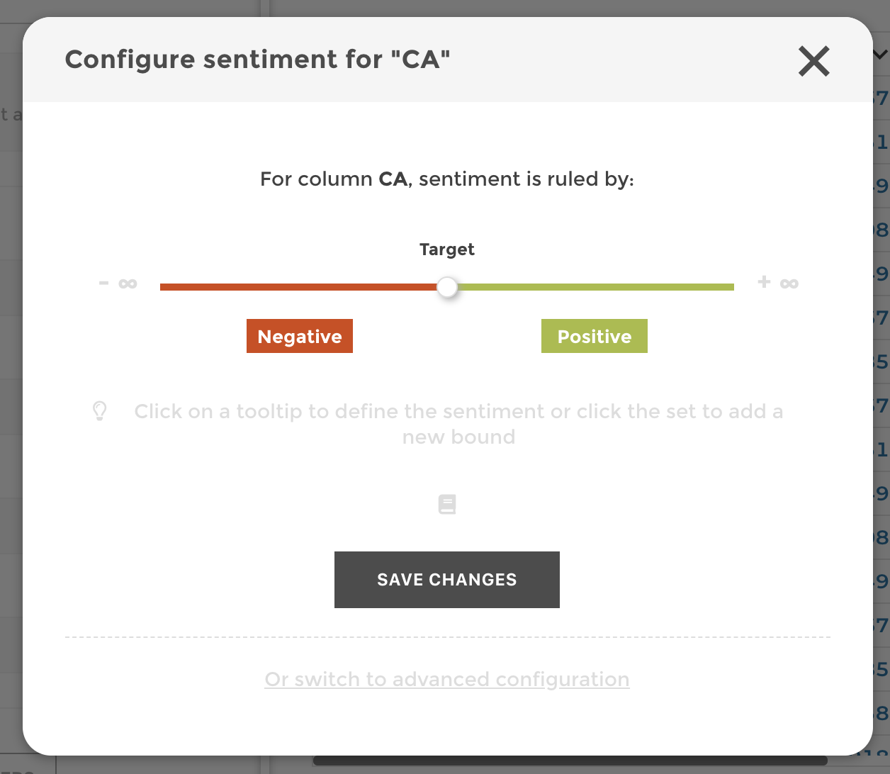
Add Sentiment
The last step in order to highlight my shop performances is to add sentiment. 😊
I want to get a green color when my shop has reached its target, and a red one when my shop performance evolution is under expectation.
In order to do so, I add a sentiment on my CA column, and chose to
make it depend on my Target column. That means that if the actual
turnover of my shop is above target, the tick target will be colored
in green. Or not.
Then I need to activate in my chart options the following option:
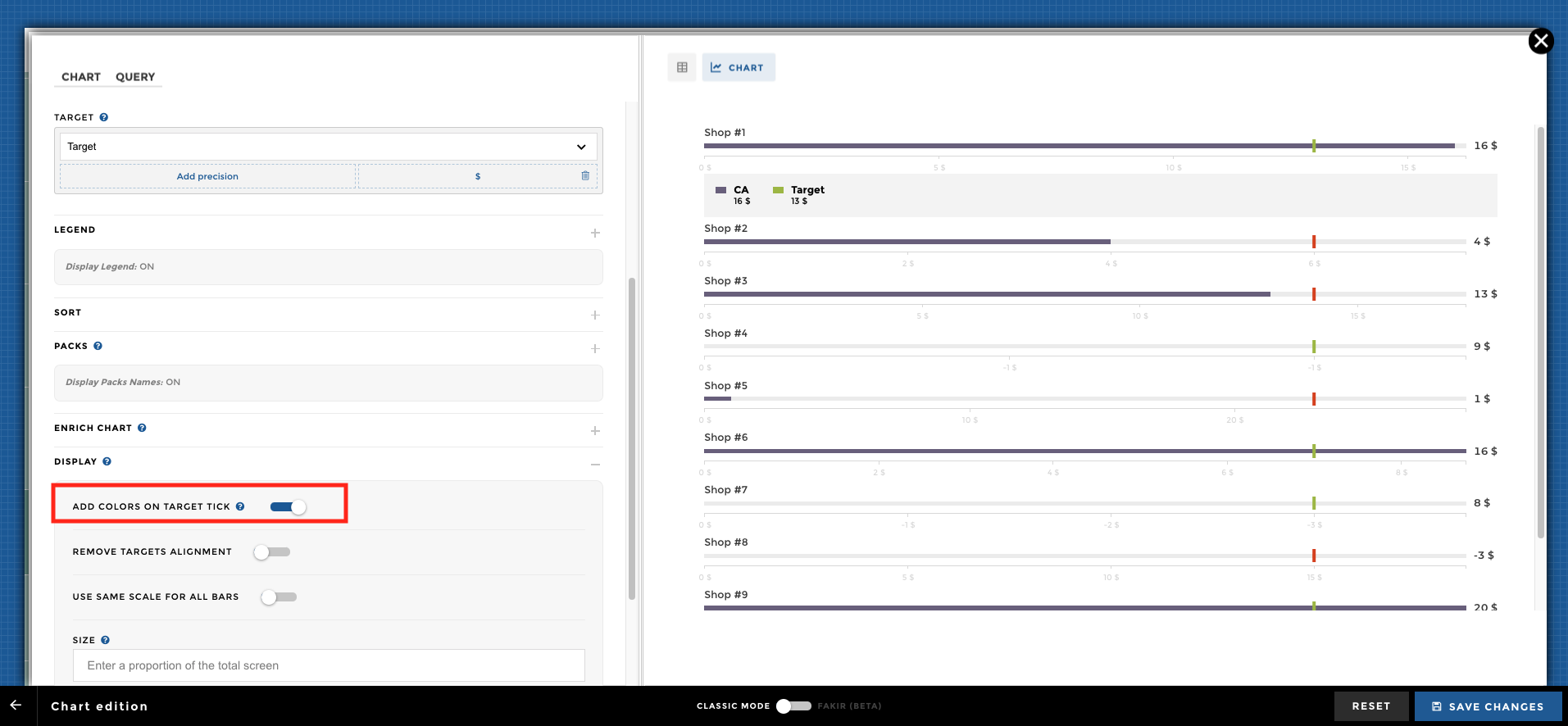
Here we go! 🎉
Other configuration examples
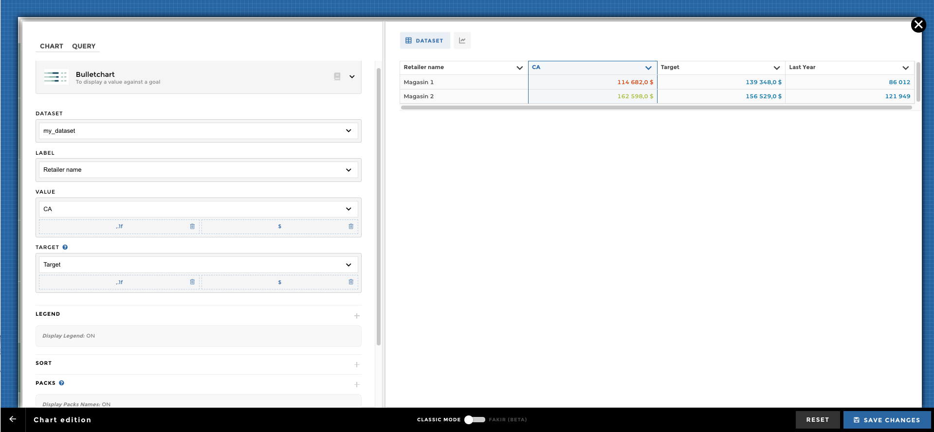
Data Structure:
| Retailer name | CA | Target | Last Year |
|---|---|---|---|
| Magasin 1 | 114,682 | 139,348 | 86,012 |
| Magasin 2 | 162,598 | 156,529 | 121,949 |
First, you need to fill the schema Label, Value, Target:
Then you can add your comparison: 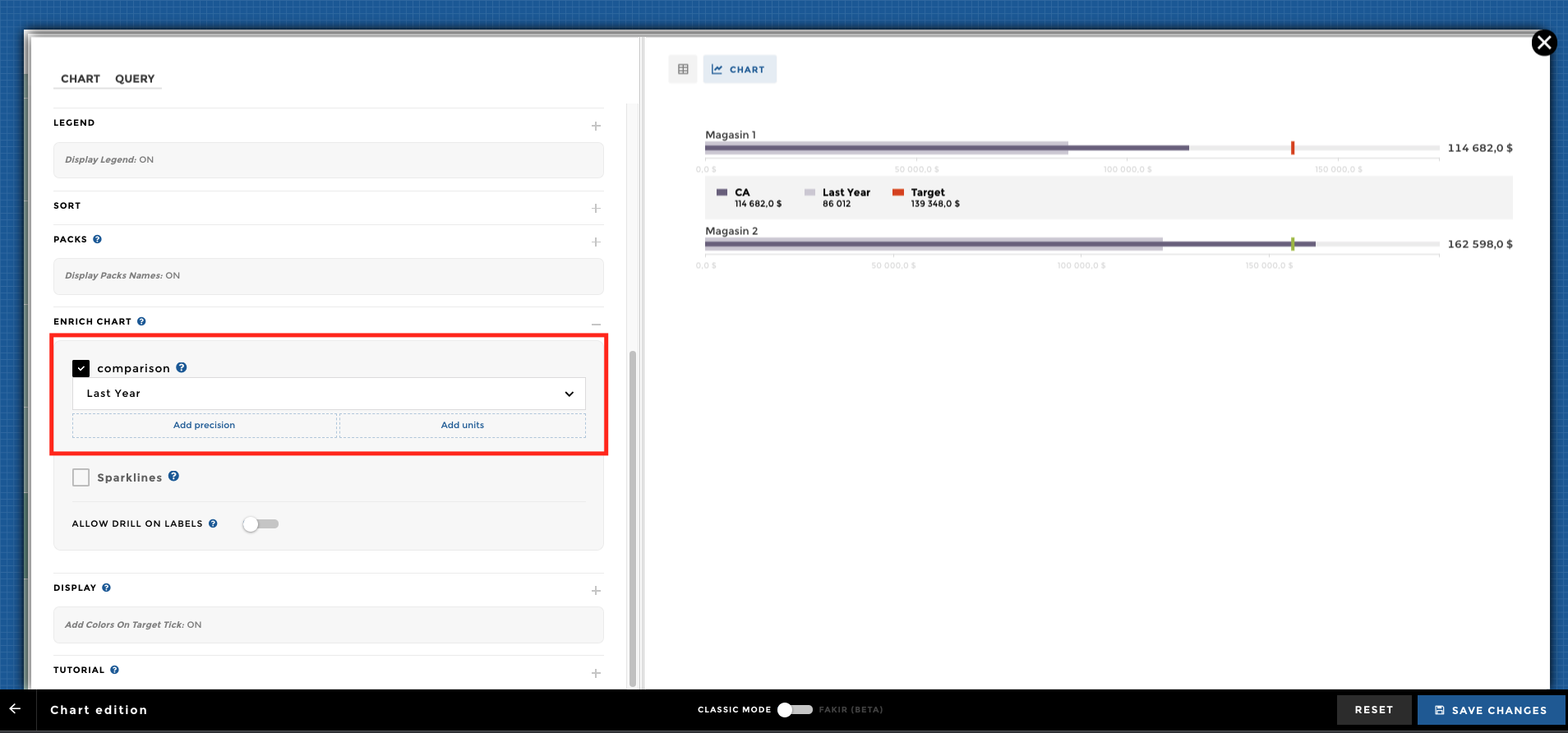
Tada 🎉 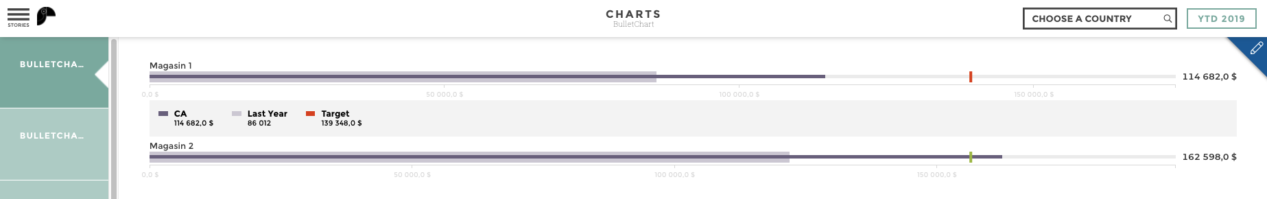
Display a bulletchart with a legend, units, sort and ranking:
| Retailer name | CA | Target | Last Year |
|---|---|---|---|
| Magasin 1 | 114,682 | 139,348 | 86,012 |
| Magasin 2 | 162,598 | 156,529 | 121,949 |
You can add a
sentiment
to your Value and Target: 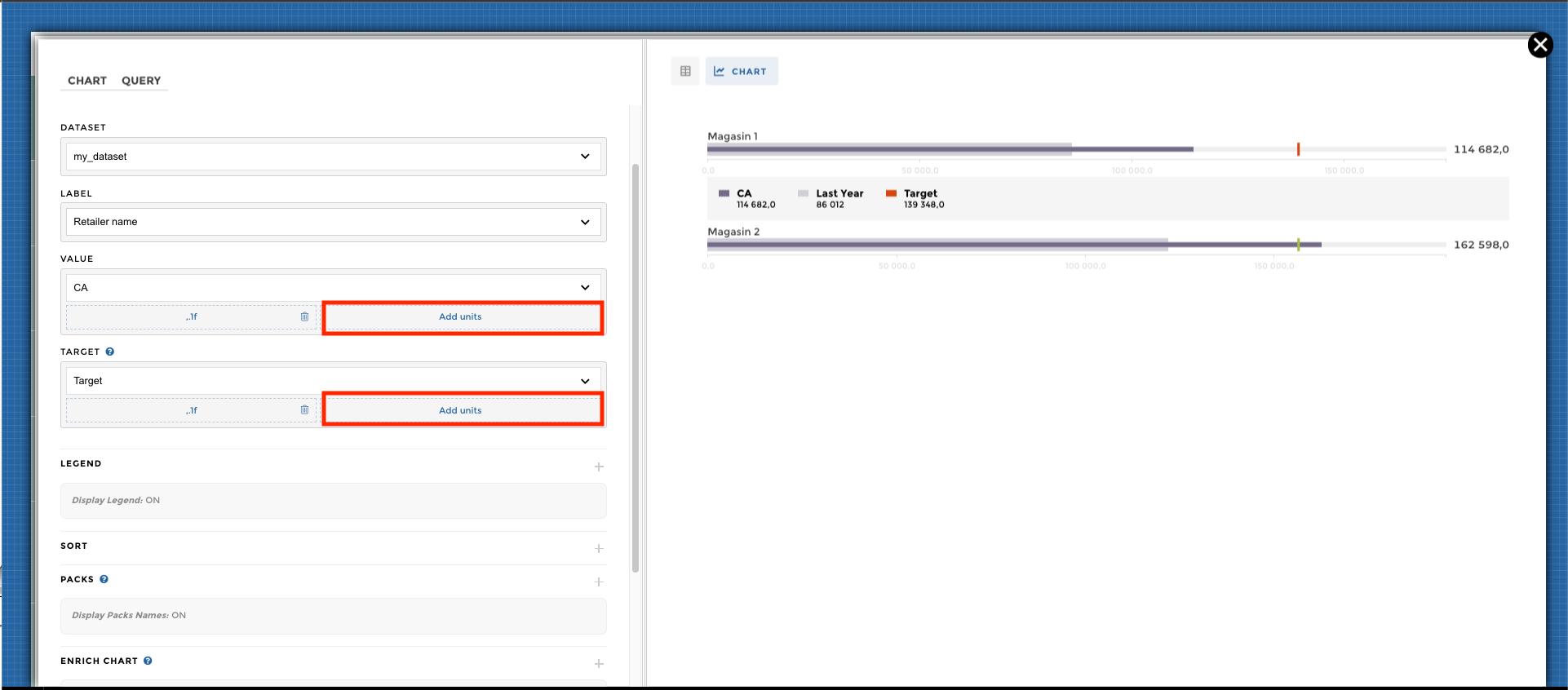
You need to activate the display legends options: 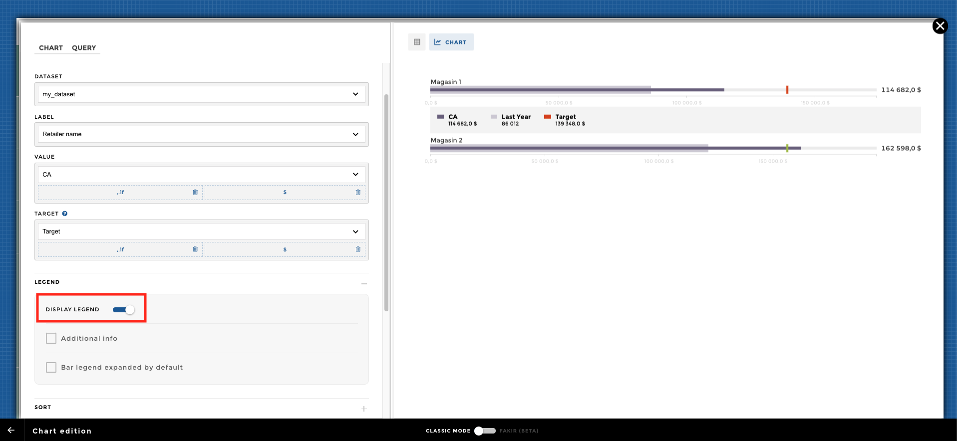
Finally, you can customize your labels order: 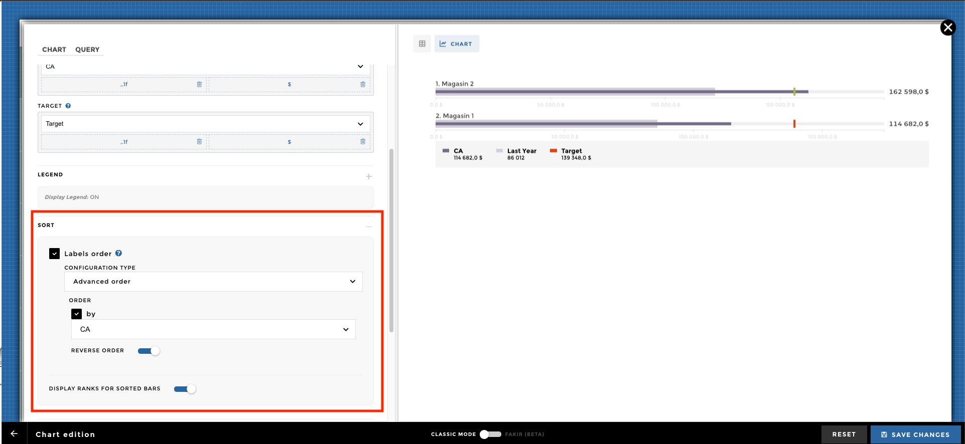
Display a bulletchart with a legend, units, sort and ranking:
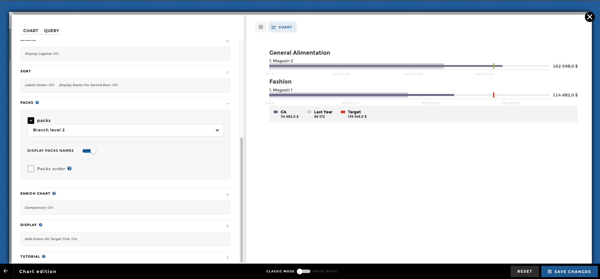
| Retailer name | CA | Target | Last Year | Branch level 2 |
|---|---|---|---|---|
| Magasin 1 | 114,682 | 139,348 | 86,012 | Fashion |
| Magasin 2 | 162,598 | 156,529 | 121,949 | General Alimentation |
You can add a pack to your bulletchart into the chart options:
If you want to work with a common scale you just need to activate
the following option: 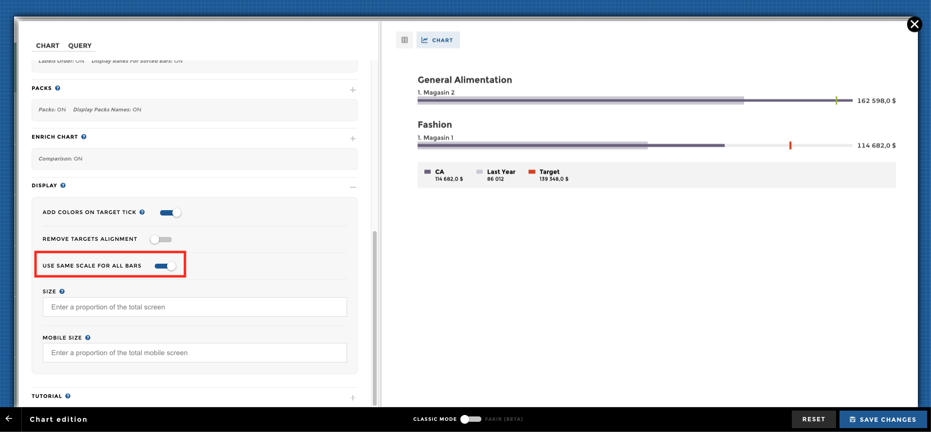
Isn’t that so easy 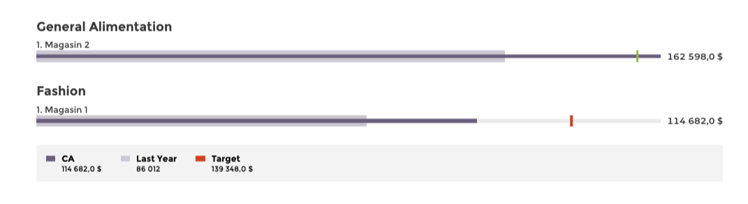
The end !!! Congratulations, you are a Bulletchart master now 👏