Versuschart Tutorials
Step by step tutorial
The user story
I’m a HR manager in an international company.
I want to compare the gender distribution by age groups.
As a company how are we performing in terms of gender equality ? Where do we notice the major gap between men and women repartition in the company ? In what age group do we need to hire more women to restore equality ?
As I’m comparing 2 categories (men and women) per groups, let’s do a versuschart
Warning
Before you start!
Make sure you added your datasource to your application. Once you’re done create a new story.
Pick some data
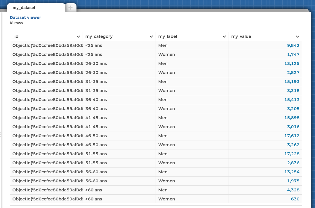
To create a nice versuschart, the chart needs to understand what is value at the end of the bars, their label, and the name of the 2 elements you are comparing.
So your data should reflect this structure in some way.
You need :
a
labelcolumn: contains the 2 elements to compare in the chartIn our case, the gender (men and women).
a
categorycolumn: contains the metrics used for the comparisonIn our case, the different age groups.
a
valuecolumn: what is the number I want to show ?
If your data is alredy in this format, move on to the next step. This is how your dataset should look like in the Dataset Editor.

Add units to your value column to contextualize the information and give meaning to your story.
Chart Parameters
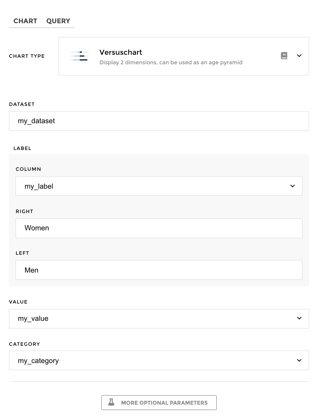
Once my data has been set up I can now choose to configure a versuschart.
I just need to follow the steps, and in 3 clicks I’m done! In the label category, you can choose the position (left or right) of the elements you want to compare.

And voilà !
