Stacked barchart Tutorials
Step by step tutorial
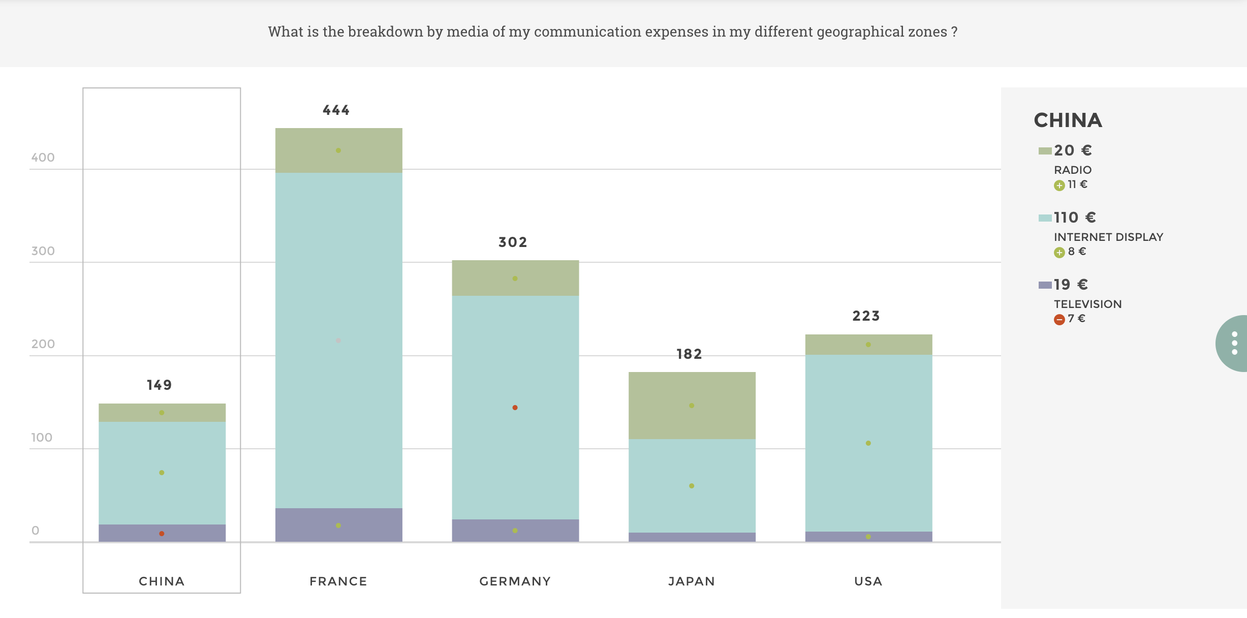
The user story
I’m a Marketing Director in an international company. ✈️
I would like to monitor my communication expenses. Do all my geographical zones spend the same amount of money in communication? Are the most used communication media the same in all countries?
Which regions have the highest communication expenses? In each region, what is the breakdown of the expenses by media? What share does each media represent in all communication expenses?
Since I need to visualize a breakdown by category for a whole entity, let’s do a stacked barchart !
Warning
Before you start!
Make sure you added your datasource to your application. Once you’re done create a new story.
The dataset
Here is an example of the dataset expected to create a stacked barchart:
| MEDIA | MARKET | VALUE | VALUE_TYPE |
|---|---|---|---|
| TELEVISION | USA | 36.0 | SHARE |
| TELEVISION | FRANCE | 24.0 | SHARE |
| TELEVISION | GERMANY | 11.0 | SHARE |
| RADIO | USA | 24.0 | SHARE |
| RADIO | FRANCE | 11.0 | SHARE |
| RADIO | GERMANY | 19.0 | SHARE |
| INTERNET DISPLAY | USA | 10.0 | SHARE |
| INTERNET DISPLAY | FRANCE | 24.0 | SHARE |
| INTERNET DISPLAY | GERMANY | 11.0 | SHARE |
| TELEVISION | USA | 36.0 | AMOUNT |
| TELEVISION | FRANCE | 24.0 | AMOUNT |
| TELEVISION | GERMANY | 11.0 | AMOUNT |
| RADIO | USA | 240.0 | AMOUNT |
| RADIO | FRANCE | 110.0 | AMOUNT |
| RADIO | GERMANY | 190.0 | AMOUNT |
| INTERNET DISPLAY | USA | 20.0 | AMOUNT |
| INTERNET DISPLAY | FRANCE | 48.0 | AMOUNT |
| INTERNET DISPLAY | GERMANY | 22.0 | AMOUNT |
Pretty simple 😉 You need to check you have at least one value per media type and geographical zone.
Note
In the above dataset example, the column value_type is here to enable the possibility of adding a filter to switch between the raw amounts of your communication expenses by media, and the share they represent compared to all the communication expenses. It’s a pretty common way of using the stacked barchart :)
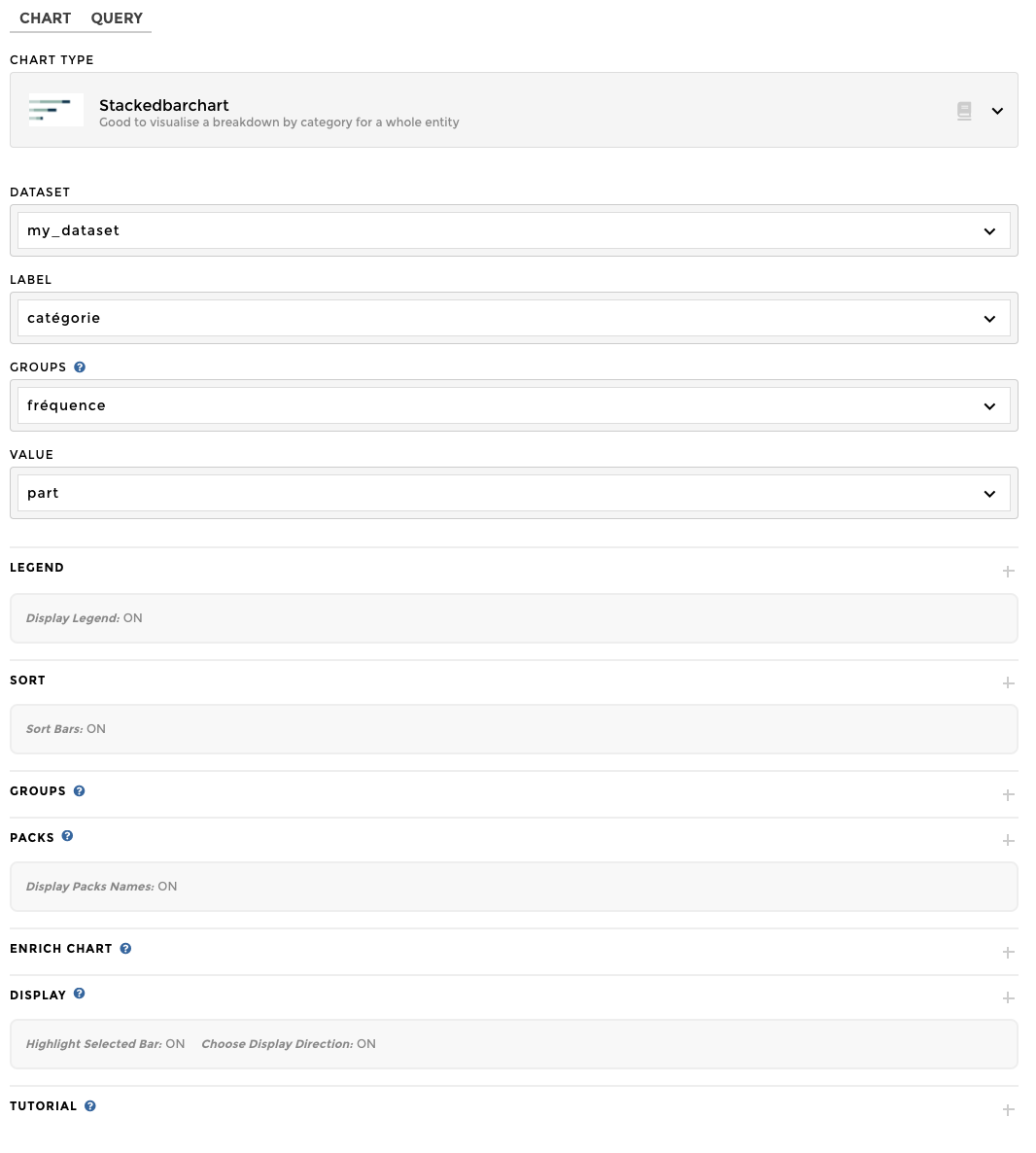
Chart Parameters
Once my data has been setup, I just need to follow the steps and in 3 clicks I’m done! ✅
I need at least:
- a
labelcolumn - that will display the list of the stacked bars, or your biggest entity: in our example, the geographical zones - a
groupscolumn - that will display the list of the compartments of the stacked bars, or the breakdown of your entity: in our example, the media types - a
valuecolumn - that will display the values per compartment in the legend of your chart. Toucan sums up all values of each group in order to display a group value directly on the chart: in our example, the group value calculated by Toucan will be for each geographical zone.
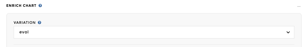
Add variation
Pretty cool right? You can also add an variation to your stacked
barchart. 😊 All you need to do is add a VARIATION column in your
data with your evolution values ; then you add this column in the
VARIATION placeholder of the advanced optional parameters. Your
variation values will be displayed for each groups within your
bars/labels in the legend.
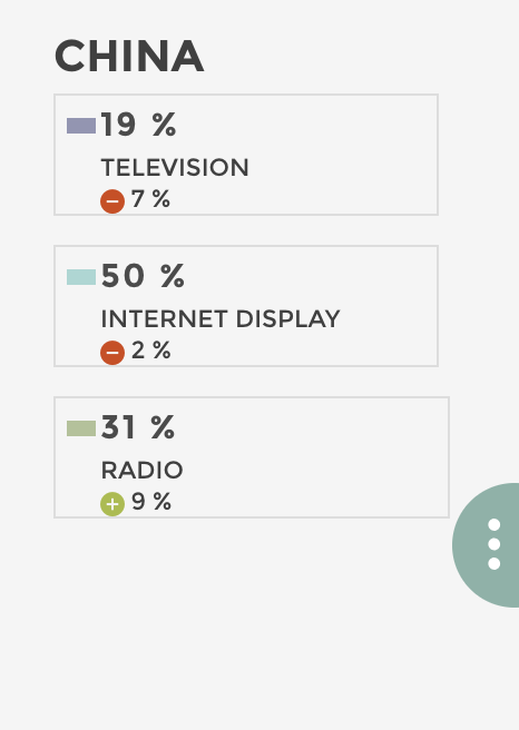
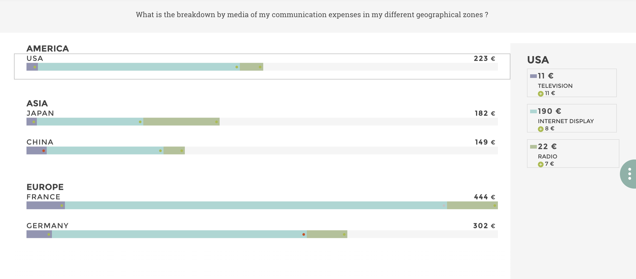
Add packs
Warning
Packs are available only on horizontal display. They are ignored in vertical mode.
If you have in your dataset another dimension you would like to add to
your chart, you can also add packs. 😊 In my example, I would like to
separate my different country markets by continent. All you need to do
is add an PACKS column in your data with your pack names ; then you
add this column in the PACKS placeholder of the advanced optionnal
parameters. Your packs will display fas follows:
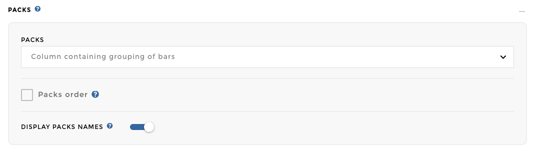
Note
Did you notice? There is a checkbox that allows you to choose if you want to display your pack names on your chart or not. It is default selected ; all you need to do is uncheck it if you wish to hide the pack names.
If you want to use a stackedbarchart with packs as a primary chart, you need to pay attention to the label on which the crossfilter is applied. In fact, you can have the same labels in different packs, the label is not a unique key on which the crossfilter could be applied. The crossfilter will be applied on a concatenation of Packs>>Label.
You can create the following VQB step in order to generate this key in
your slave chart: 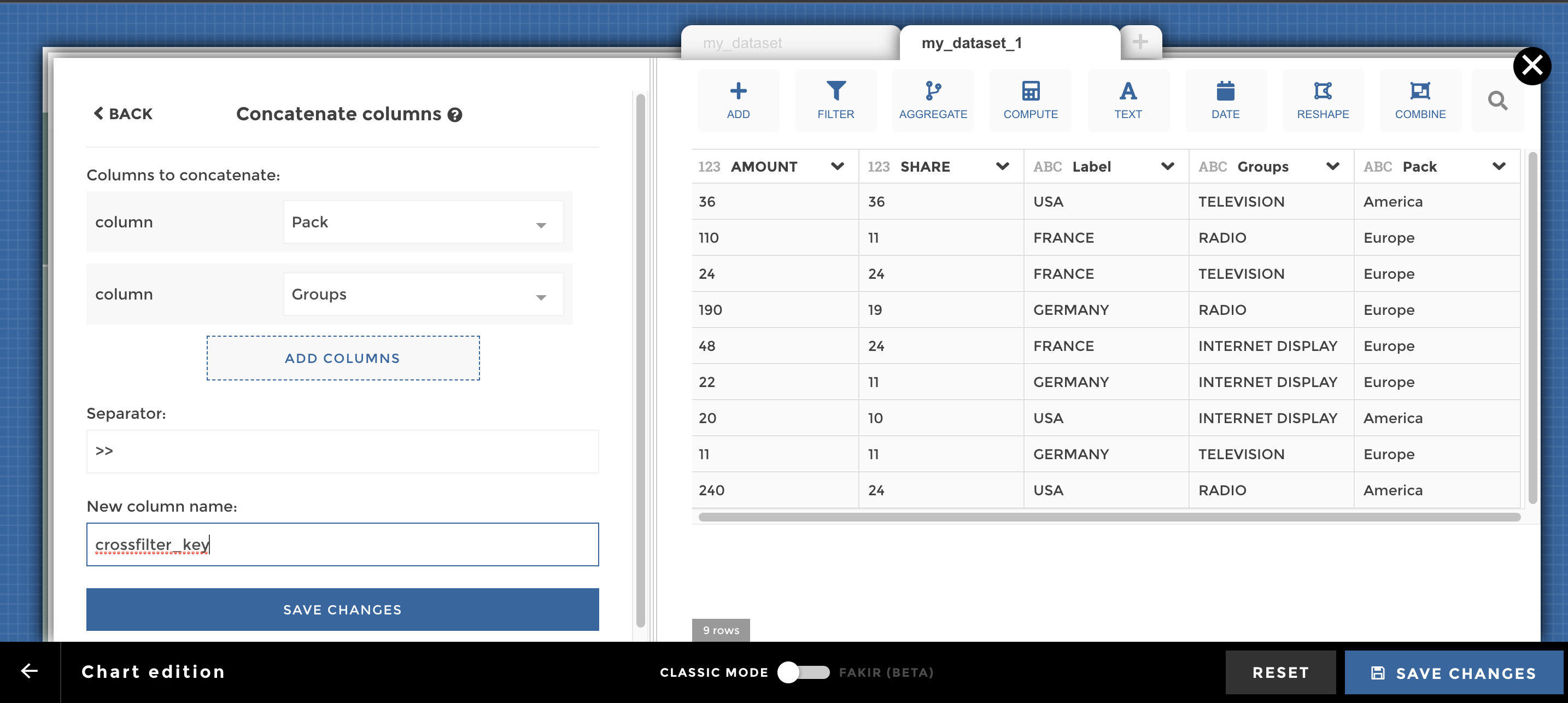
And here you go cow-boy 🤠 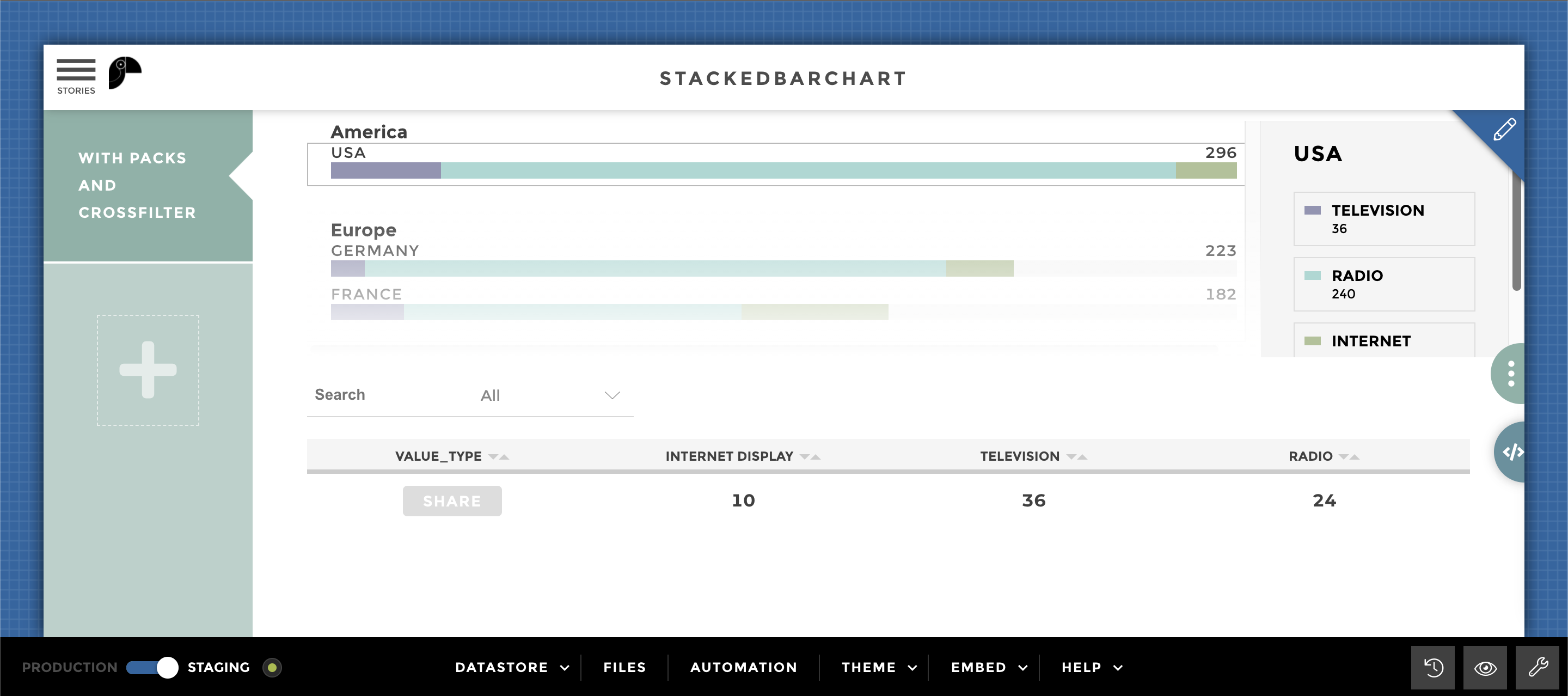
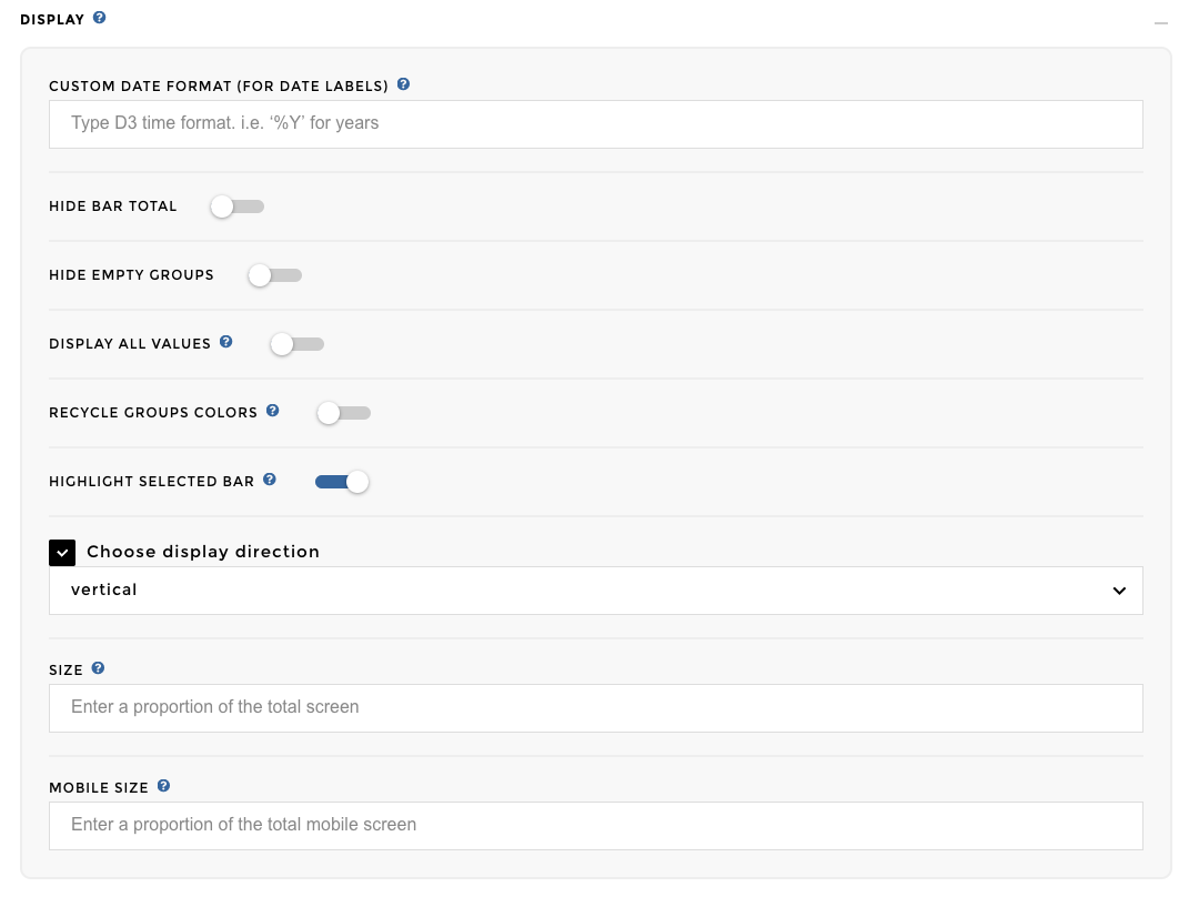
Display my stacked barchart vertically
Another trick that can be useful: I can change the display of my chart
to vertical. No need to add data for this feature, all you need to do is
change the default display direction horizontal to vertical:
Here we go! 🎉
Other configuration examples
Data Structure
Below is a subset of the dataset used for all the following examples (unless specified):
| country | genre_t ype | duration | gross_r evenue | genres | movie_t itle | budget | title_y ear | region |
|---|---|---|---|---|---|---|---|---|
| Australi a | Action | 102 | 60.23 | 16 | 16 | 39.269 | 16 | Other countrie s |
| Australi a | Adventur e | 104.6875 | 64.84097 1 | 16 | 16 | 35.597 | 16 | Other countrie s |
| USA | Action | 97.15384 | 65.31631 | 26 | 26 | 27.73 | 26 | USA |
| USA | Adventur e | 100.7692 | 91.581 | 13 | 13 | 48.446 | 13 | USA |
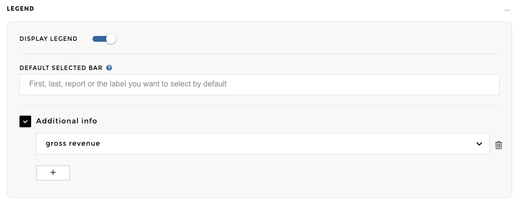
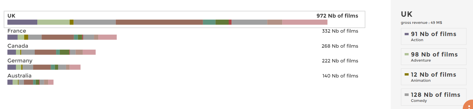
Will display a legend block at the right of your chart, please switch ‘ON’ the Display Legend parameter.
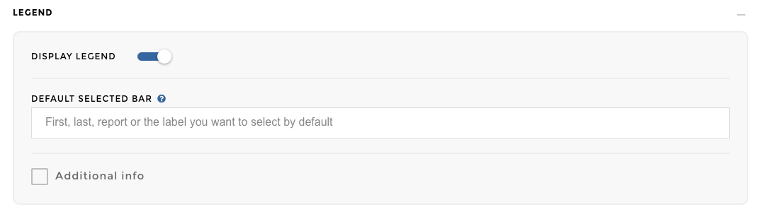
Image display legend
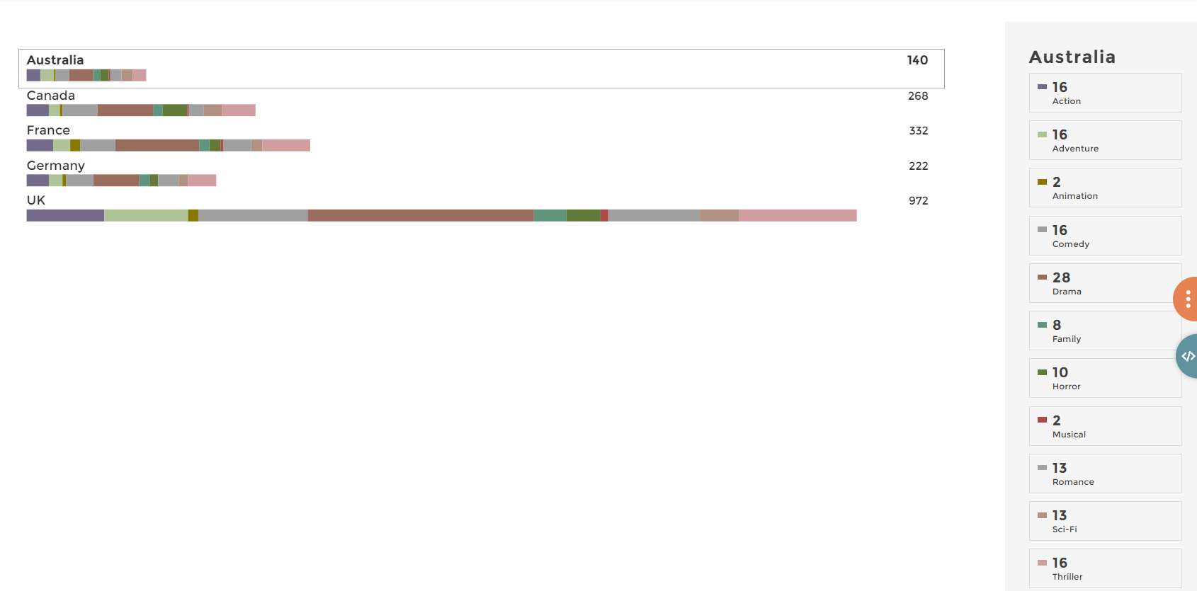
Image of chart
Will not display the empty groups (=groups with no data) in the legend, please switch ‘ON’ the Hide empty group parameter in the Display block.
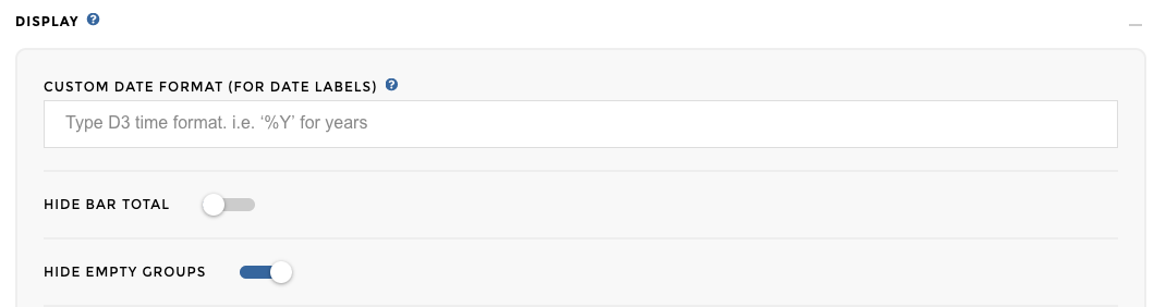
Image of emptygroup
Will not display the total of each bars, please switch ‘ON’ the Hide bar total parameter in the Display block.
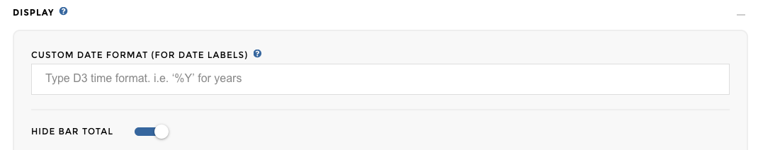
Image of chart total
Will add a descendant sort to your bars:
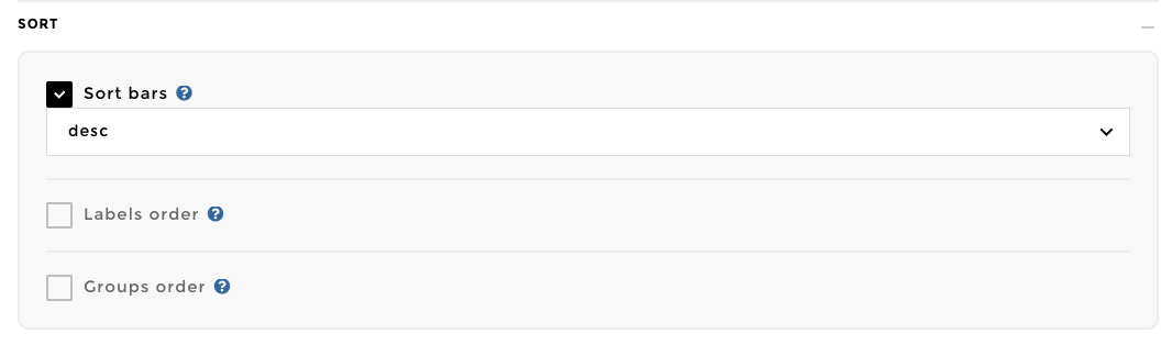
Image of chart add sort
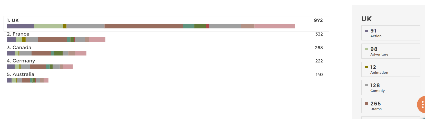
Image of chart sort
The variation will be displayed as little dot on each group.
Image of chart add var
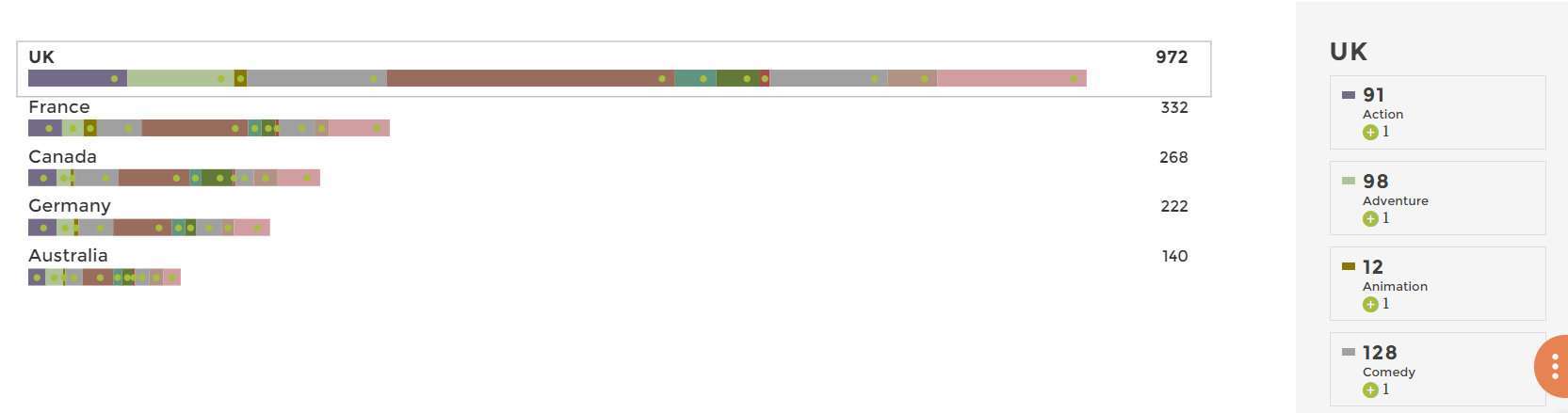
Image of chart var
Will display additionnal information, please check the parameter Additional Info, and choose the column with the additional data that you want to display.
What is the NPS?
The NPS is basically a measure of how much customers are satisfied with the product/service of a company. The NPS score is computed as follow: number of promoters - number of detractors. In between feedback are not taken into account for the copmutation of the score.
For instance if 100 people are interviewed, 40 give a score below 6, 50 give a score of 7 or 8 and 10 a score above 8 then the NPS is 10 - 40 = - 30.
Want to know more about the Net Promoter Score?
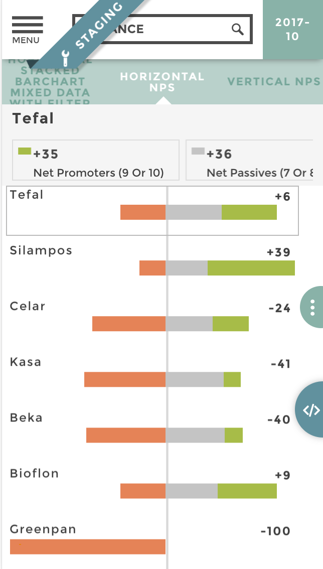
Image of chart nps
Data Structure
brand | number of answers| score group Tefal | 35 | net promoters (9 or 10) Silampos | 56 | net promoters (9 or 10) Celar | 23 | net promoters (9 or 10) Kasa | 11 | net promoters (9 or 10) Beka | 11 | net promoters (9 or 10) Bioflon | 38 | net promoters (9 or 10) Greenpan | 0 | net promoters (9 or 10) Tefal | 36 | net passives (7 or 8) Silampos | 27 | net passives (7 or 8) Celar | 30 | net passives (7 or 8) Kasa | 37 | net passives (7 or 8) Beka | 38 | net passives (7 or 8) Bioflon | 33 | net passives (7 or 8) Greenpan3 | 0 | net passives (7 or 8) Tefal | 29 | Net detractors (0 to 6) Silampos | 17 | Net detractors (0 to 6) Celar | 47 | Net detractors (0 to 6) Kasa | 52 | Net detractors (0 to 6) Beka | 51 | Net detractors (0 to 6) Bioflon | 29 | Net detractors (0 to 6) Greenpan | 10 | Net detractors (0 to 6)
The only thing you have to do is help Toucan understand what scope groups are positive, neutral or negative. To do that we use Toucan sentiments, like so:
coffee sentiment: 'score group': domain :['Net detractors (0 to 6)', 'net passives (7 or 8)', 'net promoters (9 or 10)'] range: ['negative', 'neutral', 'positive']
Be sure that each of your score group is assigned a sentiment, otherwise Toucan will by default assume a neutral sentiment. Then just use the stackedbarchart with a displayType: ‘nps’ and watch the result!
Configuration
coffee { title: 'NPS chart' level: 3 parent_id: 40 id: 40014 chartOptions: chartType: 'new-stackedbarchart' data: query: [ ] value: 'number of answers' label: 'brand' groups: 'score group' displayType: 'nps' }
When a label occurs in different packs, you can use the syntax
"Pack Name>>Label Name" to select by default a specific label in a
specific pack.
coffee { title: 'With advanced default selected' ... chartOptions: chartType: 'new-stackedbarchart' dataset: "my_dataset" value: 'my_value' label: 'my_label' packs: 'my_packs' defaultSelected: "Pack Name>>Label Name" }
That’s it champion!