Gantt Tutorials
Step by step tutorial
The user story
I’m a C-level manager in an international company.
There are different projects happening on different time frames.
- What are the different phases of the projects
- Are projects on time?
- Is there any major events I should be aware of ?
Warning
Before you start !
Make sure you added your datasource to your application. Once you’re done create a new story.
Pick some data
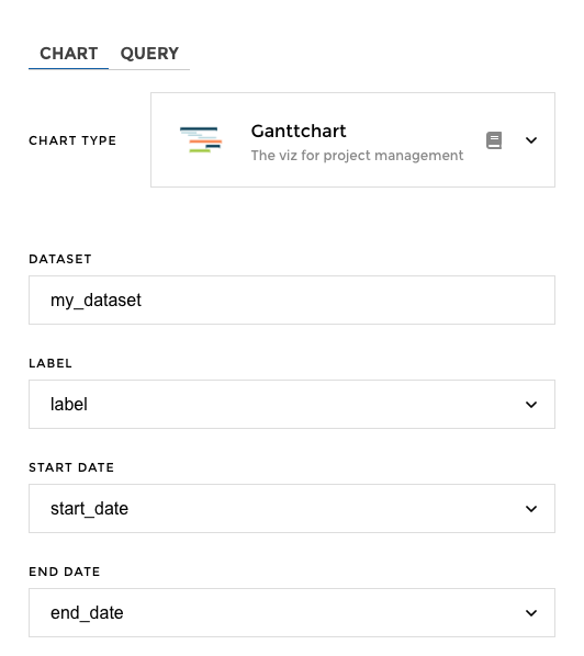
To create a nice Gantt, it’s very easy! All we need are three columns :
- a
labelcolumn: this will define the name of each project you want to visualize on your timeline - a
startDatecolumn : this will contain a date on which the project starts - a
endDatecolumn : this will contain a date on which the project ends
Many other options are available if you want to add some extra value to your viz. Here are some examples of how you can make it shine:
- a
packscolumn : this will group projects under a common title - a
groupcolumn : this will be used to identify phases or version of your project in the advanced type of Gantt. See below for detailed example - some value columns : to define a sentiment. See below for detailed example
In our example, we have the following datasource :
| label | start_date | end_date |
|---|---|---|
| Discovery | 1/1/21 0:00 | 1/23/21 0:00 |
| User Interview | 1/15/21 0:00 | 2/25/21 0:00 |
| Design thinking | 3/1/21 0:00 | 4/4/21 0:00 |
| MVP1 | 4/4/21 0:00 | 4/15/21 0:00 |
| Testing | 4/15/21 0:00 | 5/1/21 0:00 |
| MVP2 | 5/2/21 0:00 | 6/1/21 0:00 |
Chart Parameters
Once my data has been setup I can now choose to configure a gantt chart.
You just need to follow the steps, and in 3 clicks and that’s it! ✨
Tada 🎉!! Here is your gantt chart in just a few clicks :

Add packs
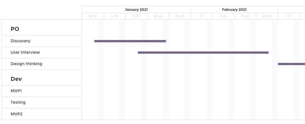
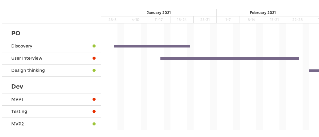
You can group projects into categories by using the packs option.
In our example, we have the following datasource :
| packs | label | start_date | end_date |
|---|---|---|---|
| PO | Discovery | 1/1/21 0:00 | 1/23/21 0:00 |
| PO | User Interview | 1/15/21 0:00 | 2/25/21 0:00 |
| PO | Design thinking | 3/1/21 0:00 | 4/4/21 0:00 |
| Dev | MVP1 | 4/4/21 0:00 | 4/15/21 0:00 |
| Dev | Testing | 4/15/21 0:00 | 5/1/21 0:00 |
| Dev | MVP2 | 5/2/21 0:00 | 6/1/21 0:00 |
🎉 And here you go :
Add sentiments
You can add a sentiment badge to your gantt chart. This sentiment badge will add another layer of information on you chart to know how your projects are doing.
Are you above the budget? At budget?
In our example, our datasources contains 2 value columns : budget
and spent.
| packs | label | start_date | end_date | spent | budget |
|---|---|---|---|---|---|
| PO | Discovery | 1/1/21 0:00 | 1/23/21 0:00 | 31 | 17 |
| PO | User Interview | 1/15/21 0:00 | 2/25/21 0:00 | 18 | 32 |
| PO | Design thinking | 3/1/21 0:00 | 4/4/21 0:00 | 39 | 39 |
| Dev | MVP1 | 4/4/21 0:00 | 4/15/21 0:00 | 26 | 46 |
| Dev | Testing | 4/15/21 0:00 | 5/1/21 0:00 | 34 | 43 |
| Dev | MVP2 | 5/2/21 0:00 | 6/1/21 0:00 | 36 | 23 |
Let’s setup a sentiment rule comparing spent amount vs budget :
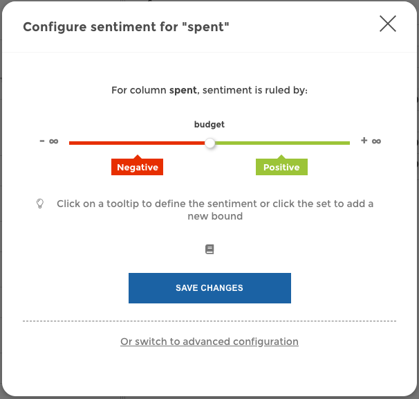
Then you just have to select the column containing the sentiment rule in
the sentiments parameter :

🎉 And here you go :
Add events
Want to add the date of a press release? An important shipping or board meeting?
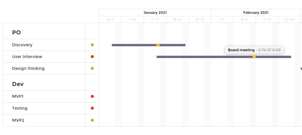
With our gantt chart you can easily identify major events by placing marker onto your project time lines.
You can manually input events or use an existing datasource to do so.
Hardcoded events
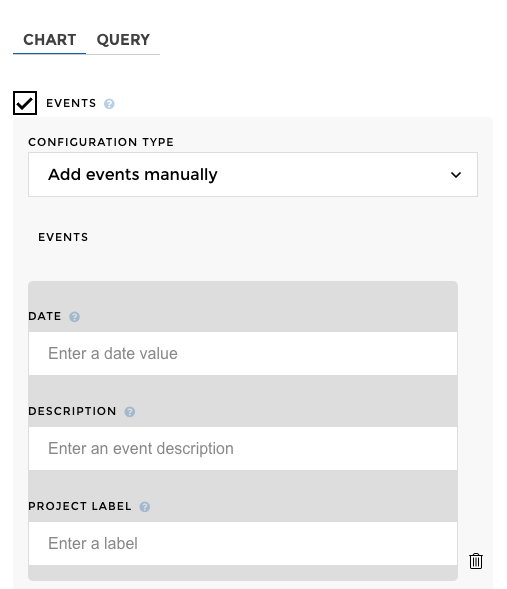
If you choose to hardcode your events, you need to input 3 information :
date: date on which the event happens, the format should match the one used for start and end datedescription: small text about your event, it will be displayed when users hover on the event markerproject label: to which project this event is attached to. You could have 2 events on the same day but regarding 2 different projects, theproject labelwill help Toucan position the event on the right project bar
You can add as many events as you’d like, but don’t hesitate to check the preview to check that your Gantt is still readable 😄
🎉 And here you go :
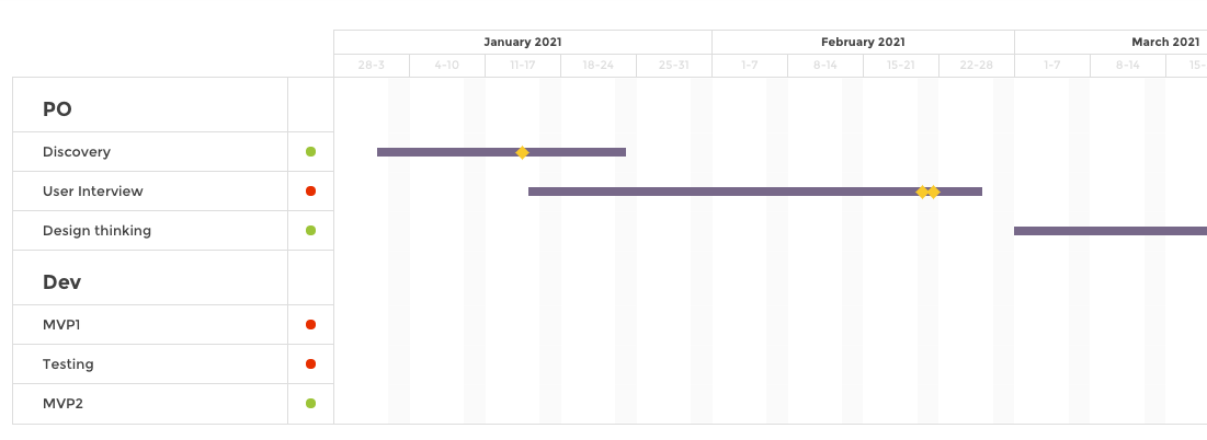
Events from another dataset
You can also add events coming from a dataset.
In our example, we have a gantt_data_events datasource that look
like this :
| label | date | comment |
|---|---|---|
| Discov ery | 1/14/ 21 | Event for Discover y |
| User Interv iew | 2/20/ 21 | Very long event,Ve ry long event,Ve ry long event,Ve ry long event,Ve ry long event |
| User Interv iew | 2/21/ 21 | Events very close |
| MVP2 | 6/1/2 1 | Event at the end of bar |
| Testin g | 4/15/ 21 | Event at the beginnin g of bar |
You need to make sure you added a second dataset to your chart
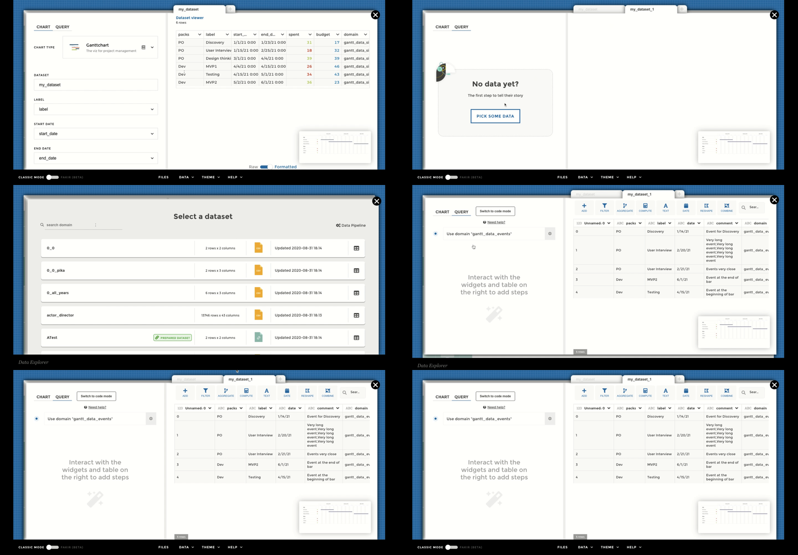
Then, you can fill up the form to add events on your chart :
dataset: should contain the name of the dataset containing your events infodate: column containing the date on which the event happens, the format should match the one used for start and end datedescription: column containing a small text about your event, it will be displayed when users hover on the event markerproject label: column containing which project this event is attached to. You could have 2 events on the same day but regarding 2 different projects, theproject labelwill help Toucan position the event on the right project bar
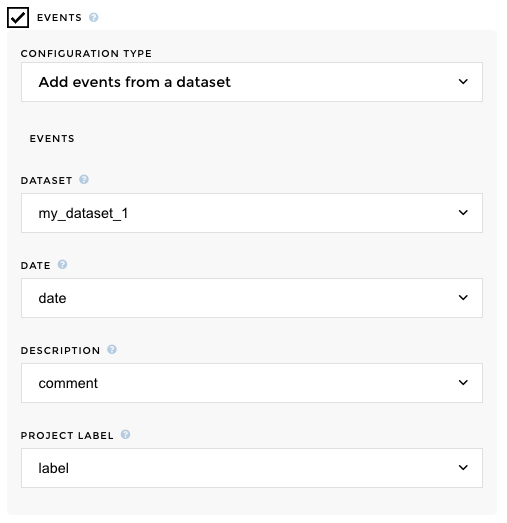
🎉 And here you go :
Change timeline display
By default the Gantt timeline will show weeks and month. You can choose
to override this my changing the Timeline Display
You can choose between the following display :
- Week/month
- Month/quarter
- Month/Year
- Quarter/year
If I choose month/quarter for example :

My chart will look like this :

Advanced type of Gantt
You want to identify phases during your project? Or compared versions? Easy as abc with our display type configuration.
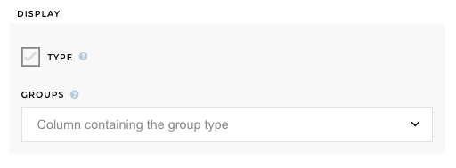
All you need is a group column in your dataset to identify the
stages or the versions. Let’s see that in details.
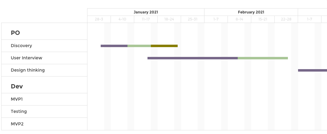
Stages
Let say you want to breakdown your projects into phases, you will choose
the stages display.
In our example, we have a gantt_data_stages datasource that look
like this :
| packs | label | start_date | end_date | groups |
|---|---|---|---|---|
| PO | Discovery | 1/1/21 | 1/8/21 | Tech |
| PO | Discovery | 1/9/21 | 1/15/21 | Design |
| PO | Discovery | 1/16/21 | 1/23/21 | PO |
| PO | User Interview | 1/15/21 | 2/10/21 | PO |
| PO | User Interview | 2/11/21 | 2/25/21 | Design |
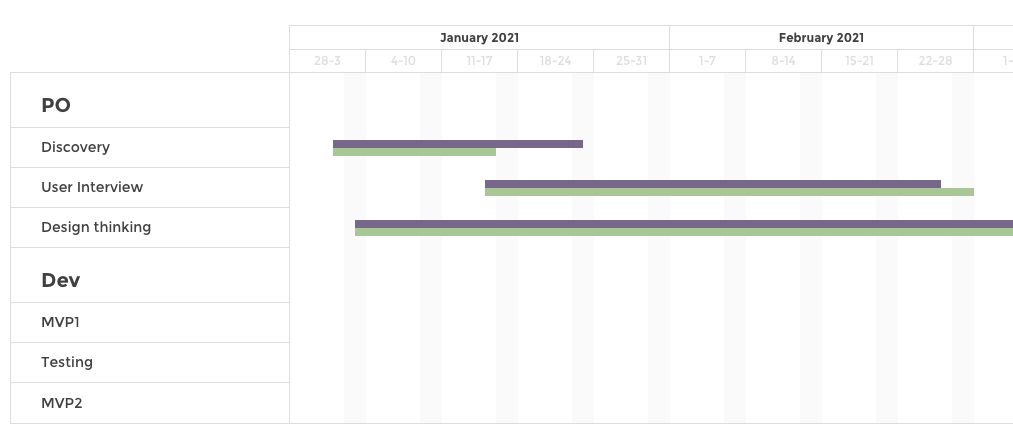
You just need to follow the steps, and in 3 clicks and that’s it! ✨
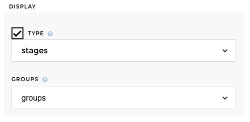
🎉 And here you go :
Compared
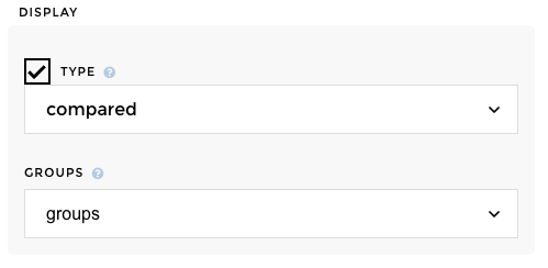
Let say you want to compare versions of your projects, like current vs
forecast, you will choose the compared display.
In our example, we have a gantt_data_compared datasource that look
like this :
| packs | label | start_date | end_date | groups |
|---|---|---|---|---|
| PO | Discovery | 1/1/21 | 1/23/21 | Current |
| PO | Discovery | 1/1/21 | 1/15/21 | Forecast |
| PO | User Interview | 1/15/21 | 2/25/21 | Current |
| PO | User Interview | 1/15/21 | 2/28/21 | Forecast |
| PO | Design thinking | 1/3/21 | 4/4/21 | Current |
You just need to follow the steps, and in 3 clicks and that’s it! ✨
🎉 And here you go :
