Tablechart Tutorials
Step by step tutorial
Upload your data
To learn how to upload data into Toucan, check out this Tutorial.
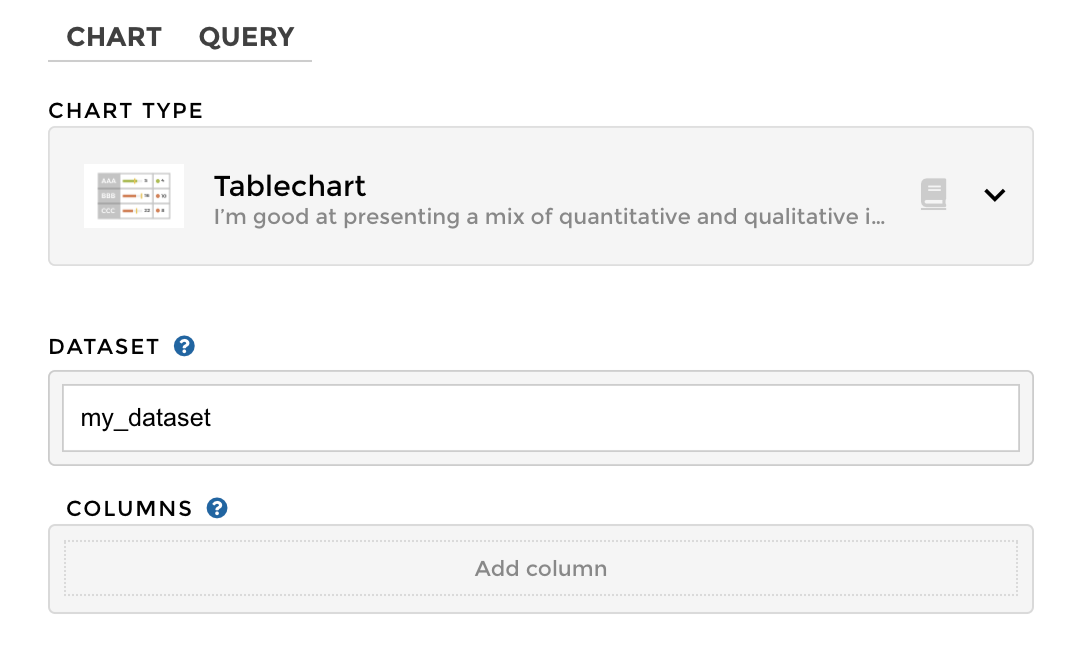
Once the data has been setup, we can head over to the CHART tab.
Tablechart selection
Create a Tag column
Let’s add our first column!
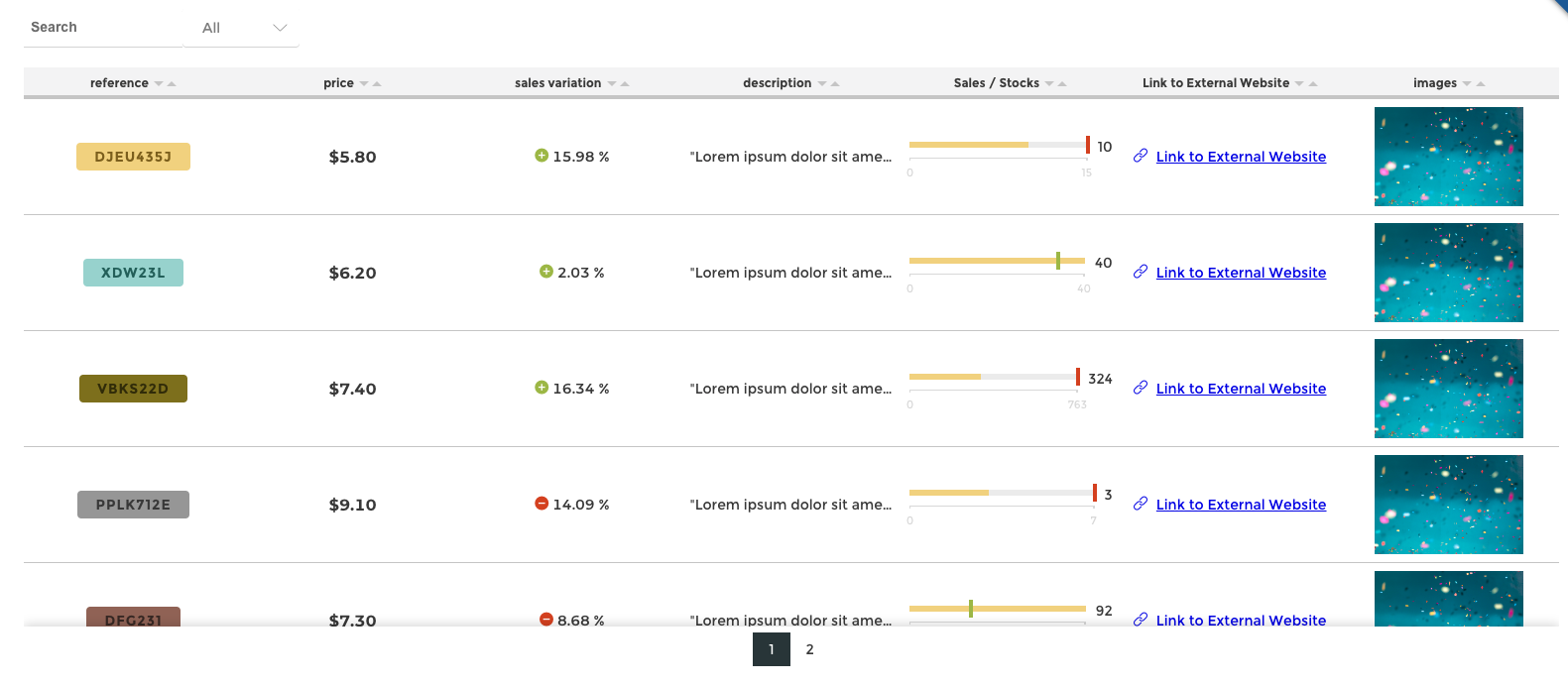
Our first column is going to be a TAG type column that will visualize our REFERENCE column. Think of this column type like a label since each value is given a color. This makes it a great way to visually see patterns and commonalities.
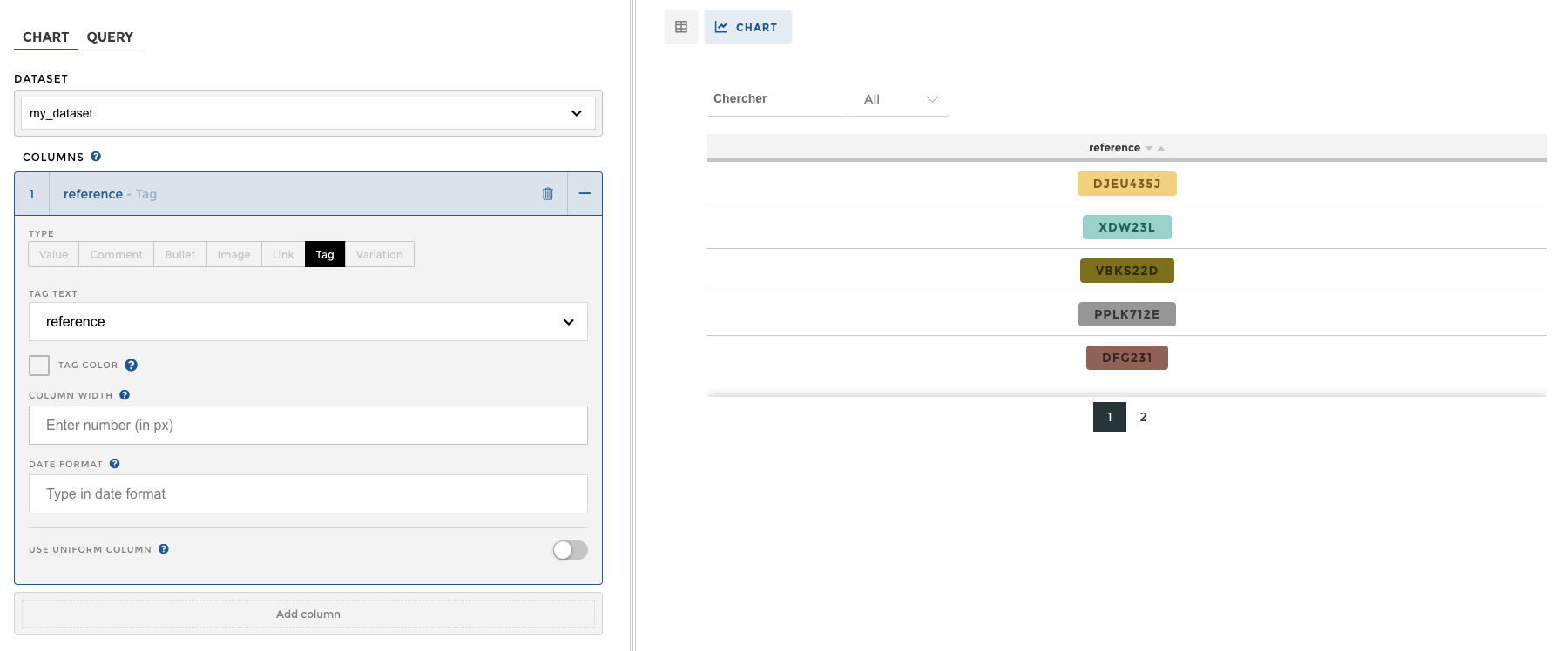
As you can see, we are building our TABLE CHART column by column.
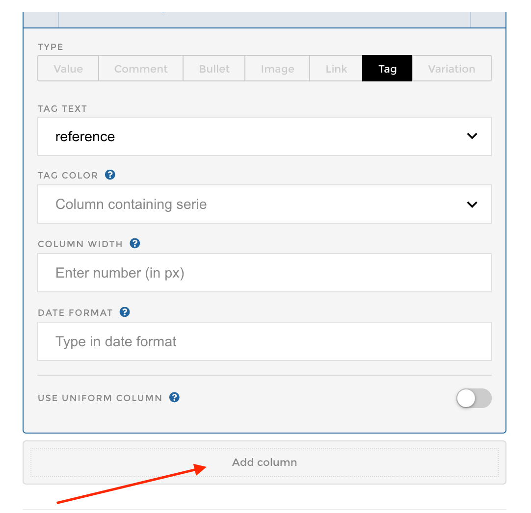
Let’s add a second column by clicking the add column button. Our second column will also be a TAG TYPE column, but it will be visualizing our TYPE column instead.
Create a Value column
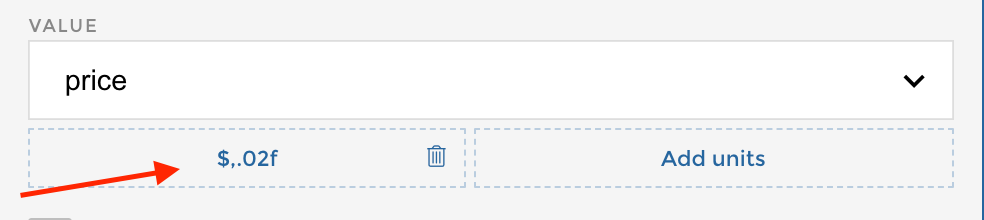
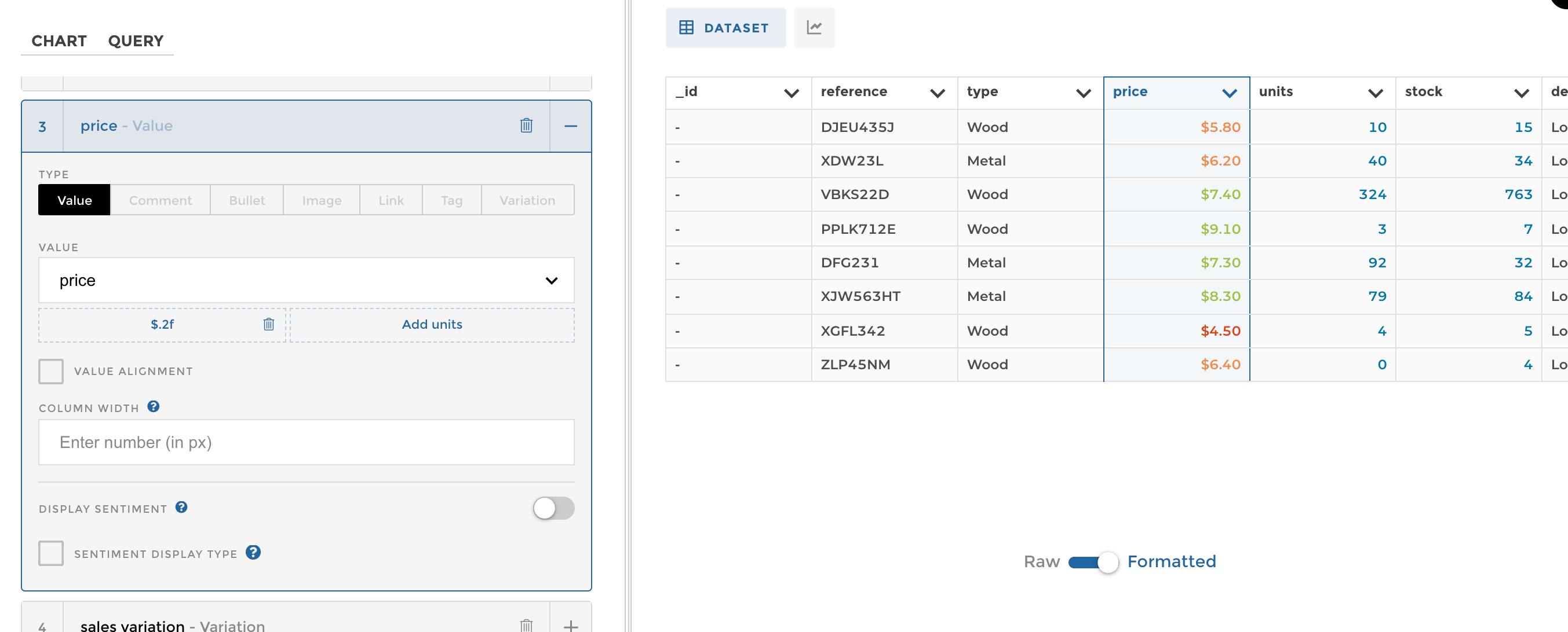
Our third column will be used to visualise our PRICE column. We’ll use a VALUE TYPE column to visualise this one.
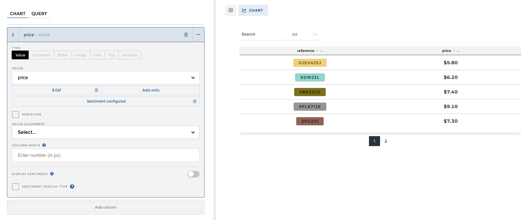
Tip
Don’t forget to add precision! Otherwise, your value will round to a whole number. Here, I used the precision $,.02f to display the values like they are above. To learn more about precision and how to use it, check out this doc!
tablechart_precision
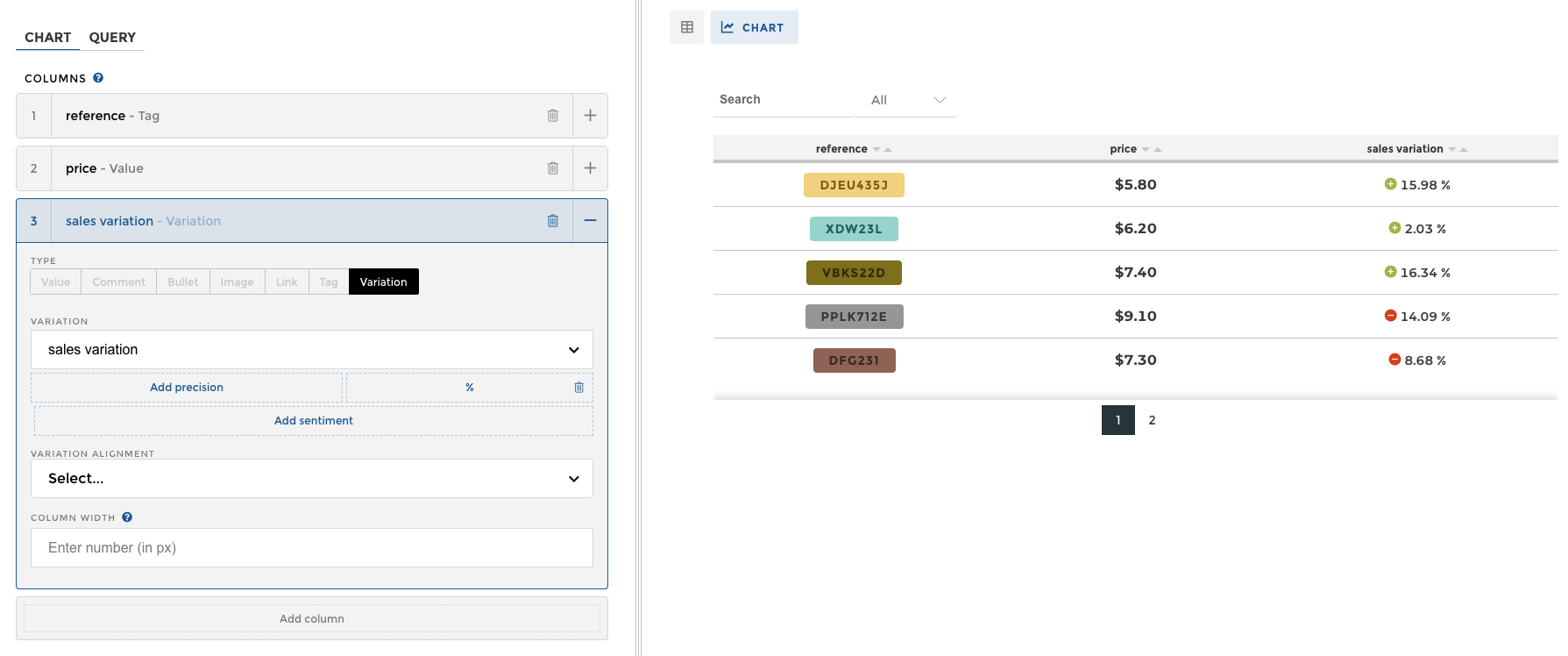
Add a Variation column
Our fourth column will be a sales variation column. For this one, we’ll be using the column SALES VARIATION inside our dataset. We’ll use the VARIATION COLUMN TYPE.
Here, we’ll add a % as a unit to ensure that it is being displayed as a percentage.
Add a Comment column
Our next column is a text column. We’ll use the DESCRIPTION column inside our dataset, and we’ll visualize it with a COMMENT TYPE column.
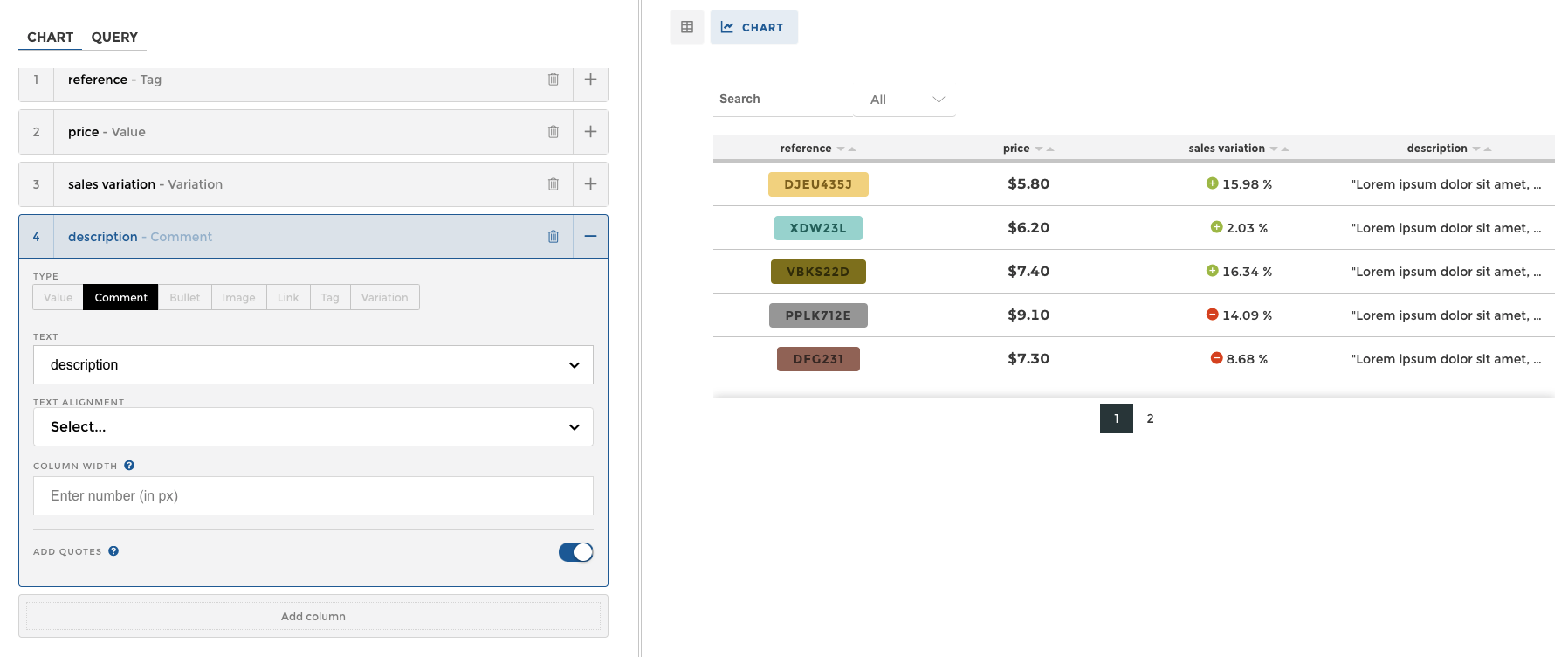
Note
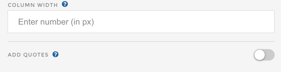
By default, Toucan will place quotes around the comment. In this case, we’ll remove the comments by making sure the ADD QUOTES option is turned off.
tablechart_quotes
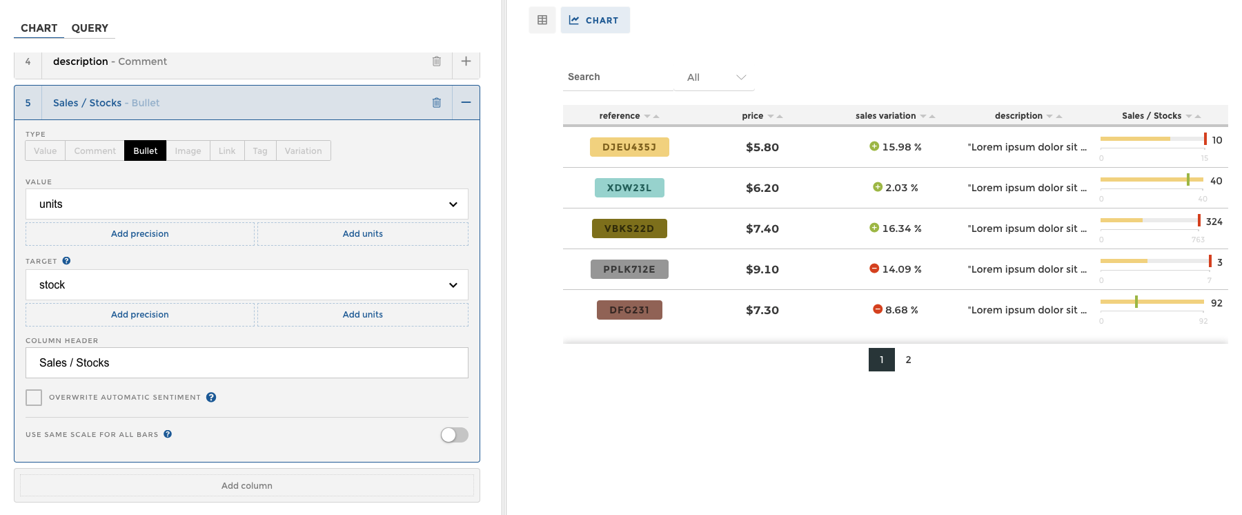
Add a Bullet column
Our next column will be used to visualize a target/goal, done so via a small BULLET CHART embedded inside each cell.
The column type for this is BULLET.
The VALUE input field is expecting the actual value we’re measuring. In this example, that can be found in the UNITS column.
The TARGET input field is expecting the goal. In this example, that data can be found in the STOCK column.
The COLUMN HEADER allows us to specify what we want this column to be called. This is value we type in. For this example, we’ll call this column “SALES / STOCK” .
Your screen should look like the screenshot below:
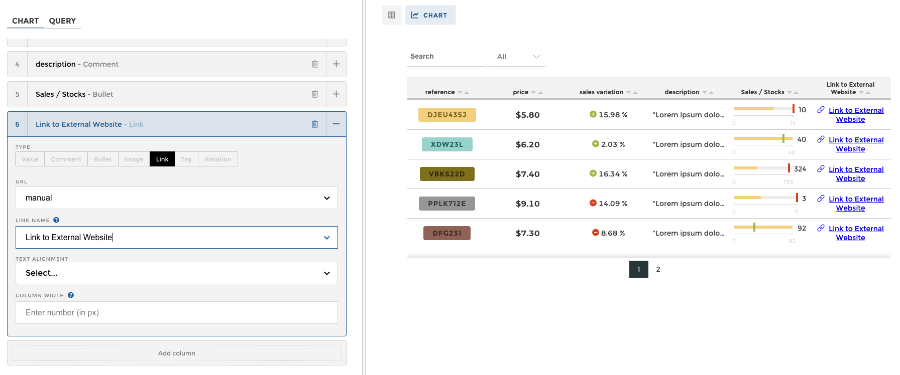
Add a Link column
Great! We only have 2 more columns to go.
Our next column is going to allow the user to click on hyperlinks.
For this, we’ll use the LINK column type. The column with links inside our dataset is called MANUAL.
We can either let the entire hyperlink show, or we can overwrite the label. In this case, we’ll overwrite the hyperlink by using the LINK NAME input field to make it more user friendly, and replace with “Link to External Website”.
Add an Image column
Great! We’re almost done!
Our last column is going to contain an image.
Let’s create a new table chart column, and click on the IMAGE TYPE column.
There are two ways to bring in images to Toucan’s Table Charts. The first is by uploading into the ASSETS MENU (Bottom Menu –> THEME –> ASSETS) and hosting them there, or by having them hosted externally.
For this example, we are going to have the images hosted in the Assets panel. To learn how to upload / manage assets, please check out this documentation.
Once the asset is uploaded, we need to make sure that our column’s contents point to an asset’s name. In this case, we have an asset named “BG-1” and that is the content of our column.
When IMAGE TYPE is set to ASSET, Toucan will automatically try to match your column’s contents to an asset that lives within the application.
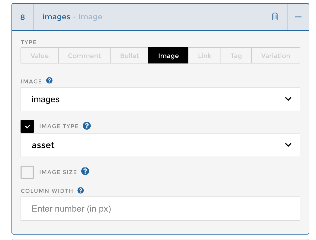
In this case, it worked like a charm!
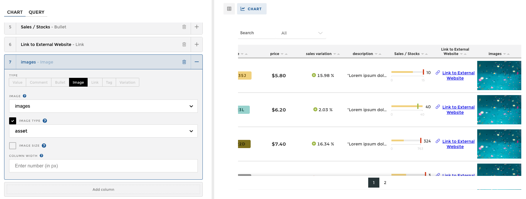
Perfect! Let’s save our changes, and we’re done! 🎉
This is how our table chart should look like:
Advanced tutorial
Tablechart Sentiment
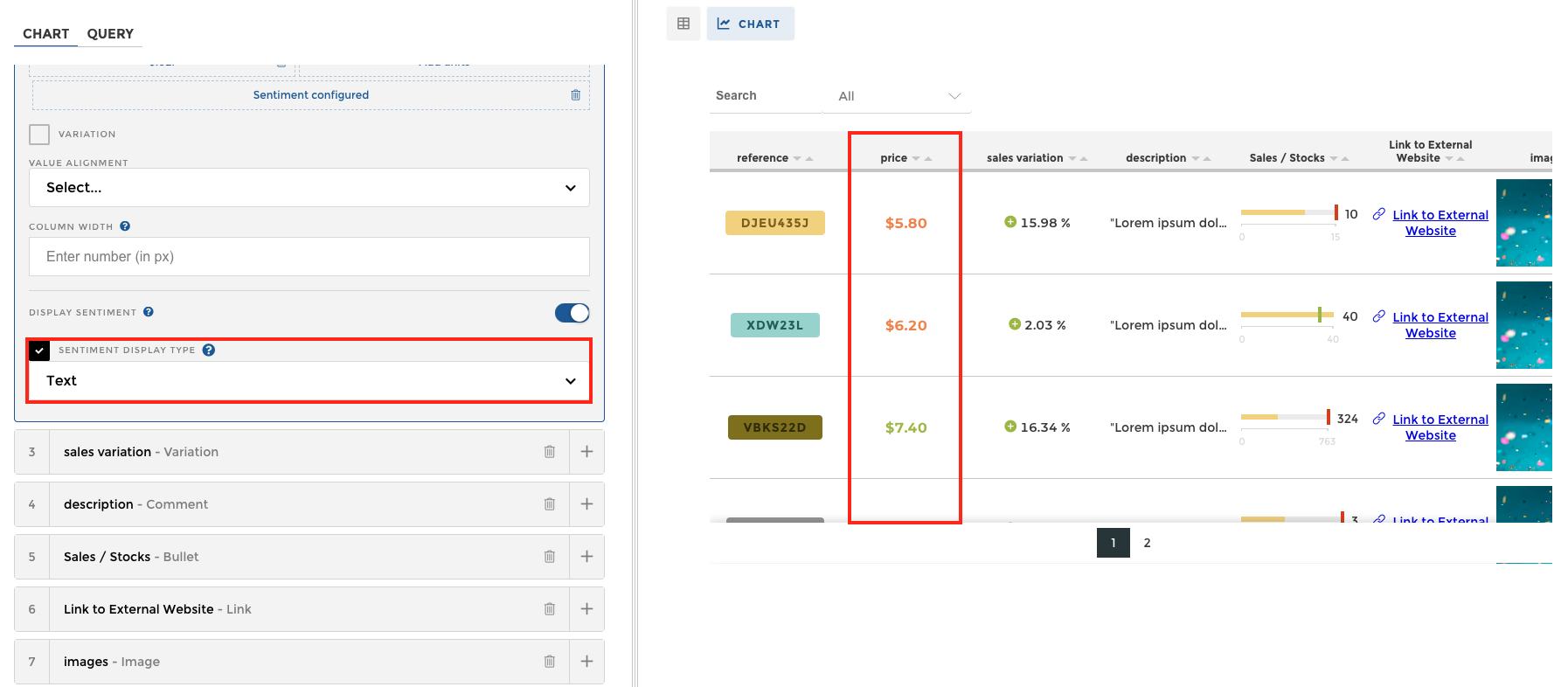
Follow this tutorial to learn how you can implement the type of sentiment as seen on the PRICE column above.
We need to first start by applying sentiment on the column itself. To learn how to add sentiment to a column, check out this tutorial.
Once you’ve applied sentiment on your column, you should see the values in your column now have colors assigned, much like this:
We now need to find that column in our table chart configuration on the left, and check the DISPLAY SENTIMENT checkmark.

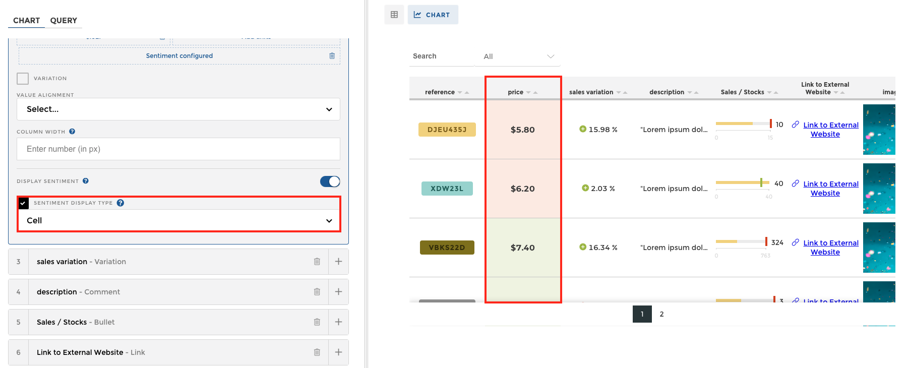
And now we’ve activated sentiment! But keep in mind that the TABLE CHART allows for two (2) different modes of sentiment.
To change the mode click on SENTIMENT DISPLAY TYPE.

You should now have access to a drop down menu that allows you to switch between TEXT and CELL sentiment types.
The TEXT SENTIMENT MODE is the standard one, and paints the numbers the colors of the sentiment shown below.
The CELL SENTIMENT MODE actually changes the color of the cell itself. See picture below.
You’re now ready to apply sentiment to your own charts! 🎉