Linechart Tutorials
Step by step tutorial
The user story
I’m a Chief Financial Officer of an important company and want to have an overview on the company’s Turnover over 2 years ! 💰💲
My Turnover increased by 27 % between 2016 and 2018 ! Awesome 🤩
However, what really happened between those two years in every quarter ?
Which quarter recorded the highest increase in Turnover ? When did the turnover decreased ? Which links can I make between the decisions made by the company and the evolution of the turnover ?
Since I need an overview of my company’s financial growth over all the quarters between 2017-2019 - let’s do a Linechart!
Warning
Before you start!
Make sure you added your datasource to your application. Once you’re done create a new story.
The dataset
Here is an example of the dataset expected to create a nice linechart:
| PERIOD | TURNOVER |
|---|---|
| Q1 2016 | 152 |
| Q2 2016 | 178 |
| Q3 2016 | 165 |
| Q4 2016 | 185 |
| Q1 2017 | 153 |
| Q2 2017 | 161 |
| Q3 2017 | 186 |
| Q4 2017 | 165 |
| Q1 2018 | 191 |
| Q2 2018 | 167 |
| Q3 2018 | 175 |
| Q4 2018 | 193 |
Very simple, isn’t it ? 😉 There is one line per time period (Quarter here) and for each line, there is the value of the Turnover !
Note
Don’t forget to add units to your turover value for each period of time to contextualize the information and give meaning to your story!
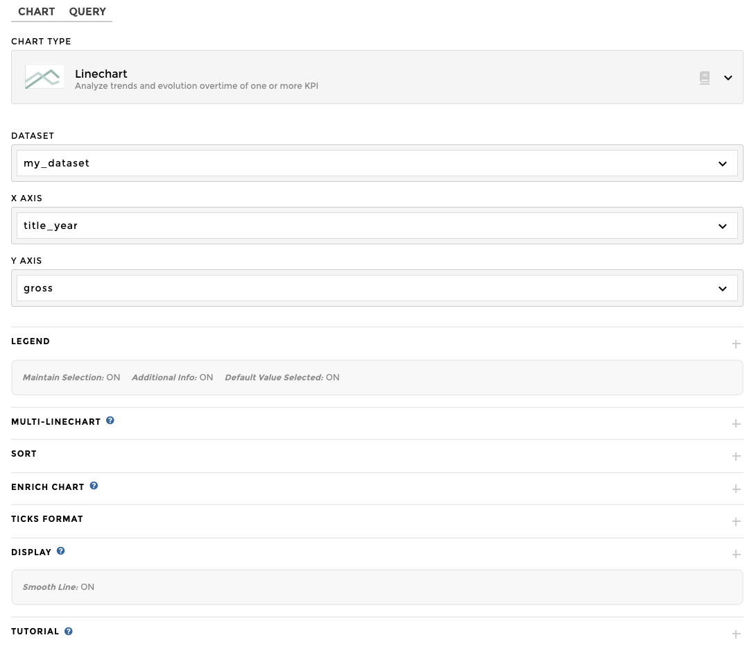
Chart Parameters
Once my data has been setup, I just need to follow the steps and in 2 clicks I’m done! ✅
I need at least :
- a
valuecolumn - that will be displayed as y axis for your linechart - a
datecolumn - that will be displayed as x axis for your linechart
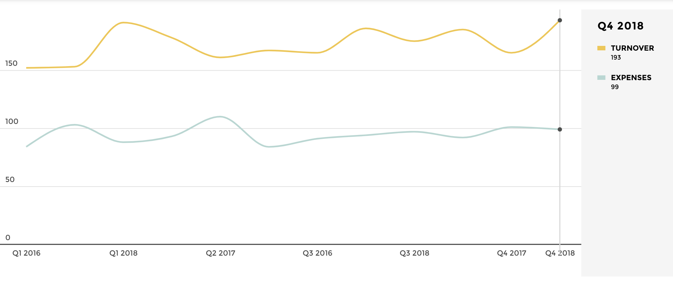
Add Multiple lines
To have multiple lines in the same chart, you need to have a slight different dataset. But no worries 😎 No major changes !
Here is an example of the dataset expected to have multiple lines in the same chart:
| variable | PERIOD | VALUE |
|---|---|---|
| TURNOVER | Q1 2016 | 152 |
| TURNOVER | Q2 2016 | 178 |
| TURNOVER | Q3 2016 | 165 |
| TURNOVER | Q4 2016 | 185 |
| TURNOVER | Q1 2017 | 153 |
| TURNOVER | Q2 2017 | 161 |
| TURNOVER | Q3 2017 | 186 |
| TURNOVER | Q4 2017 | 165 |
| TURNOVER | Q1 2018 | 191 |
| TURNOVER | Q2 2018 | 167 |
| TURNOVER | Q3 2018 | 175 |
| TURNOVER | Q4 2018 | 193 |
| EXPENSES | Q1 2016 | 84 |
| EXPENSES | Q2 2016 | 93 |
| EXPENSES | Q3 2016 | 91 |
| EXPENSES | Q4 2016 | 92 |
| EXPENSES | Q1 2017 | 103 |
| EXPENSES | Q2 2017 | 110 |
| EXPENSES | Q3 2017 | 94 |
| EXPENSES | Q4 2017 | 101 |
| EXPENSES | Q1 2018 | 88 |
| EXPENSES | Q2 2018 | 84 |
| EXPENSES | Q3 2018 | 97 |
| EXPENSES | Q4 2018 | 99 |
Once my data is set up, i just need to follow the same steps of chart parameters above and one additional optional parameters and i’m done ✅
I need as below :
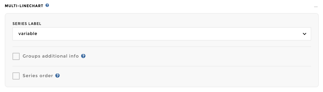
- Select the column “variable” in the “Groups: Multi-linechart” option
AND TADAAA 🎉
Add Dashed Lines
Note
Pre-Required: To set up a dashed line on your story, you need to have a multipleline chart configured (see the documentation ⬆️)
First of all, you can find the “Dashedlines” options into the advanced optional parameters
You’ve two ways to configure a Dashed Line on your multiple-linechart.
You can find the following schema: 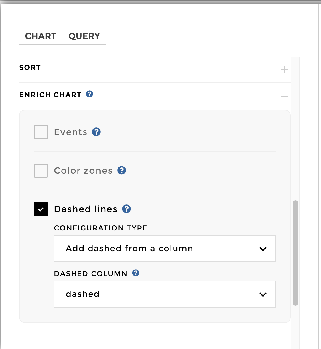
Then you need to add all the serie label you want to fill (among all
your multiple-linechart series): 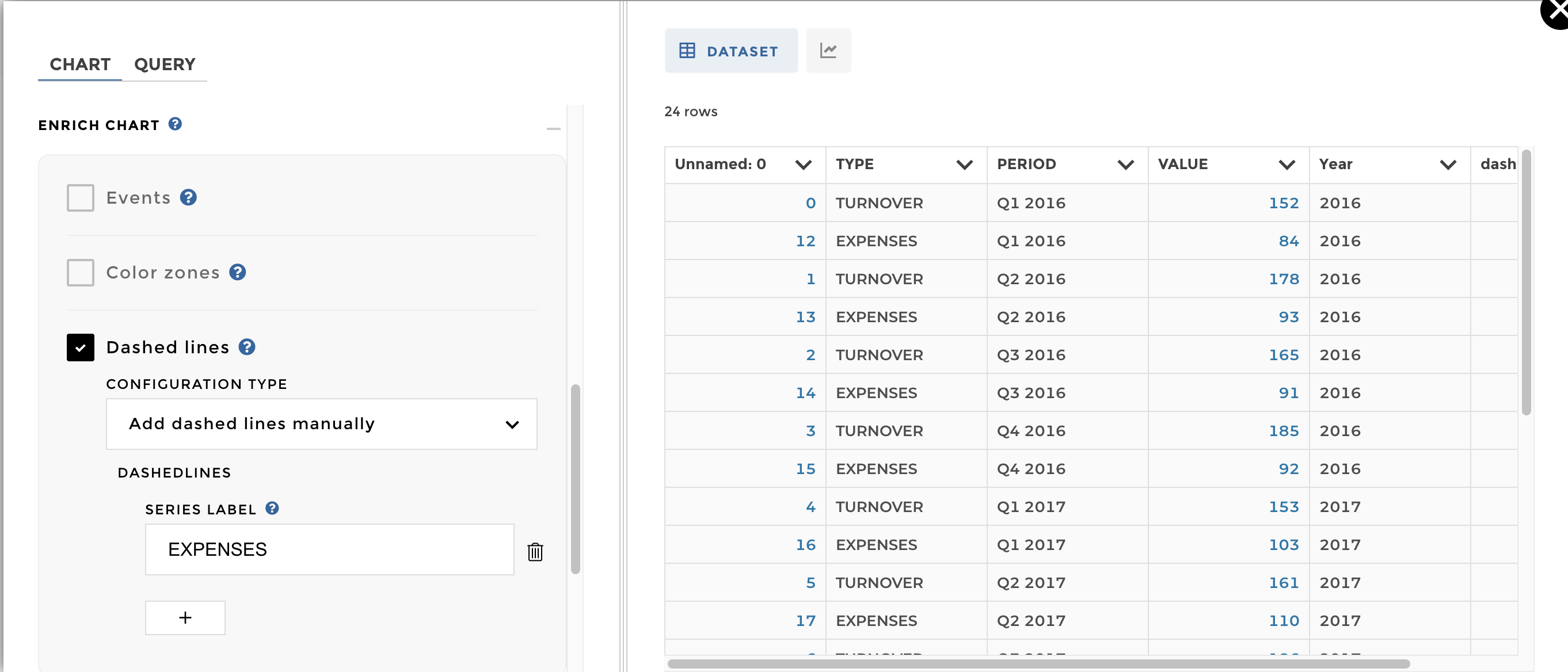
And here you go: 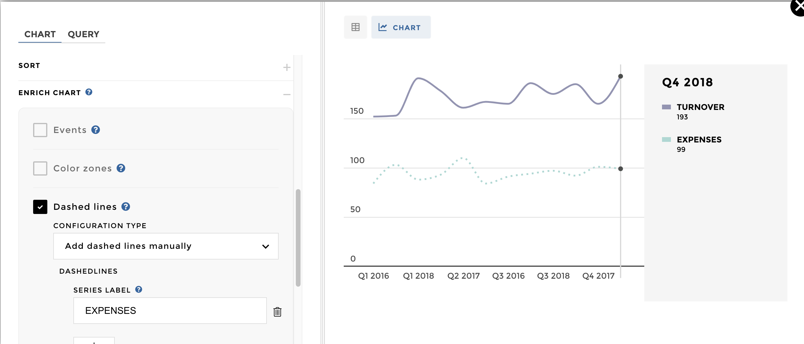
You can find the following schema: 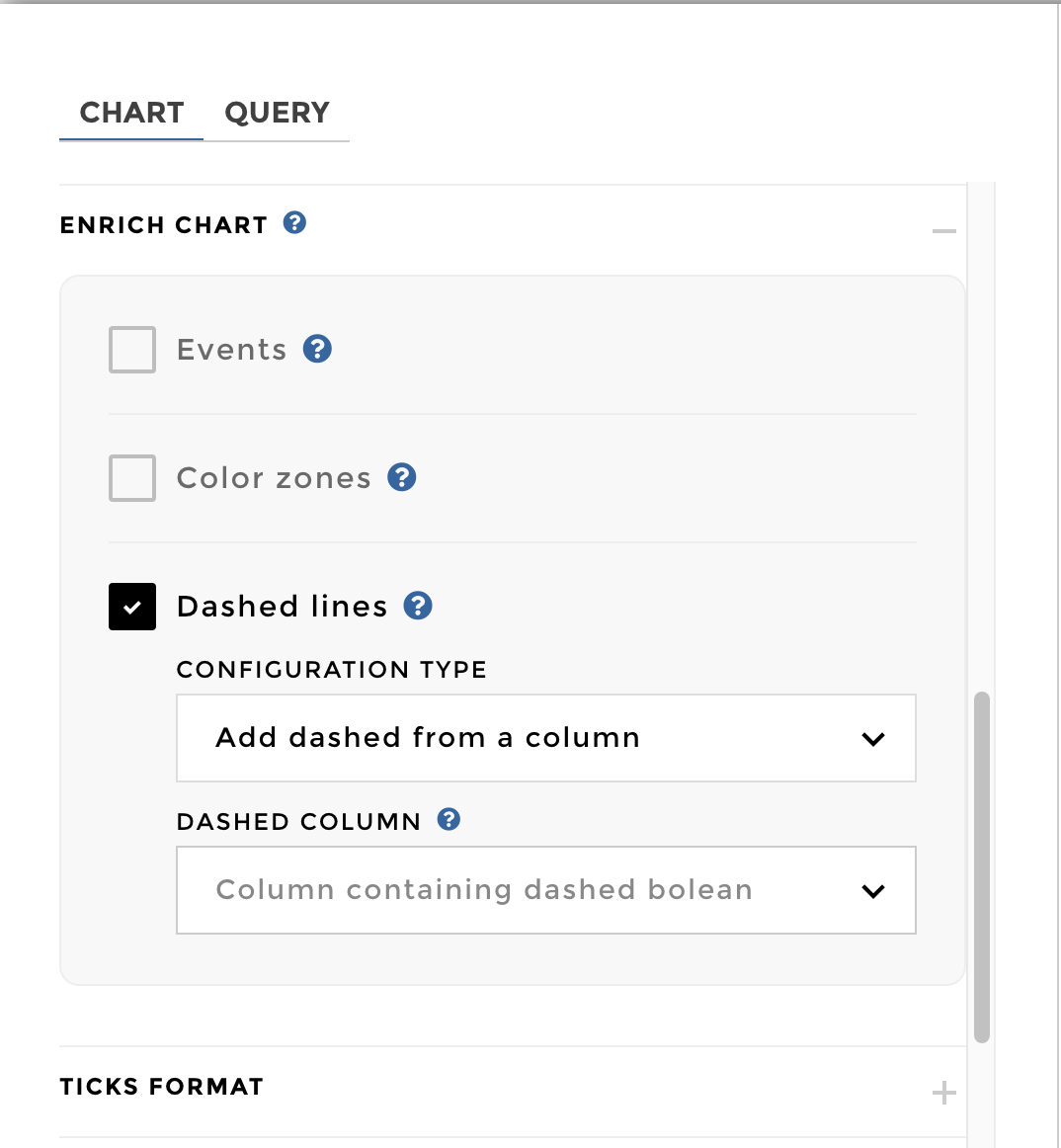
Then you need to have a dedicated column containing 1 (for dashed
lines) or 0 (for continuous one). You can add a custom column to
define the lines you want to dash or not: 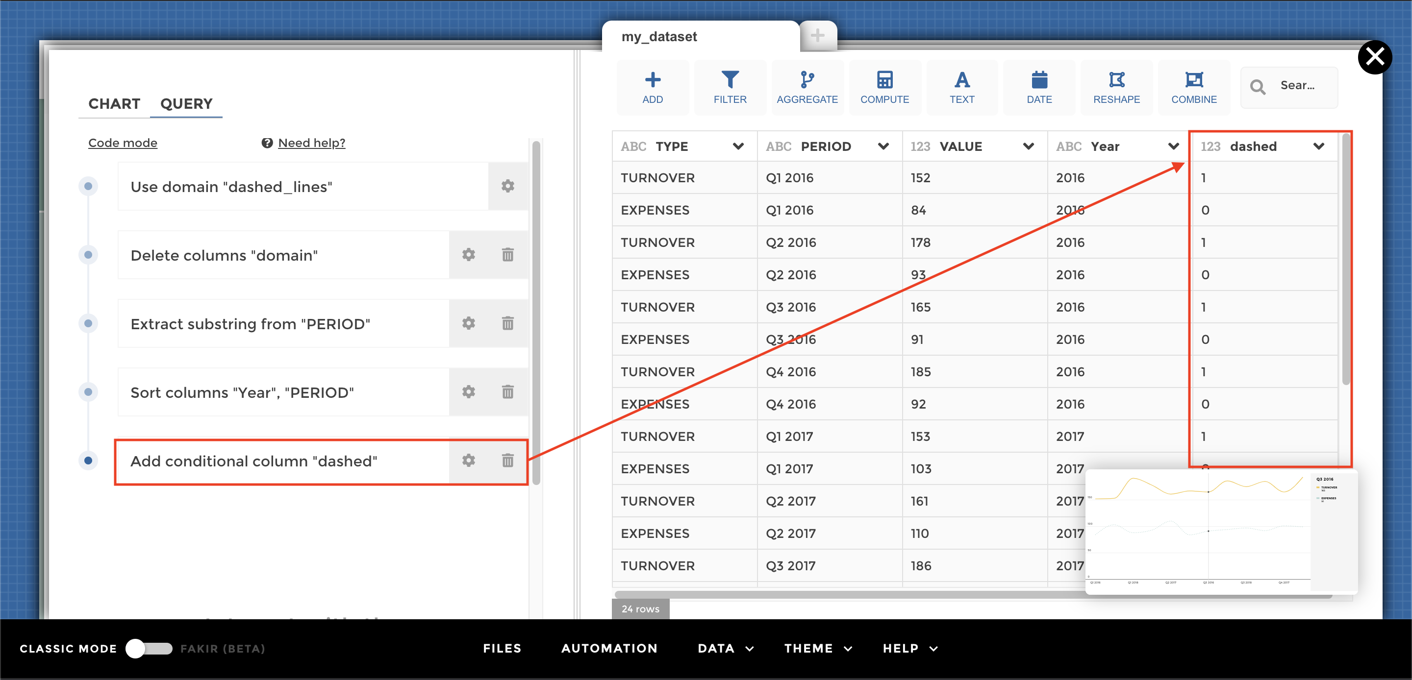
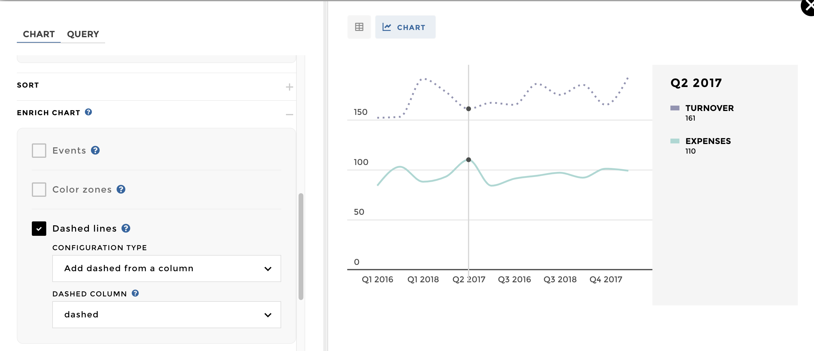
The configuration is: 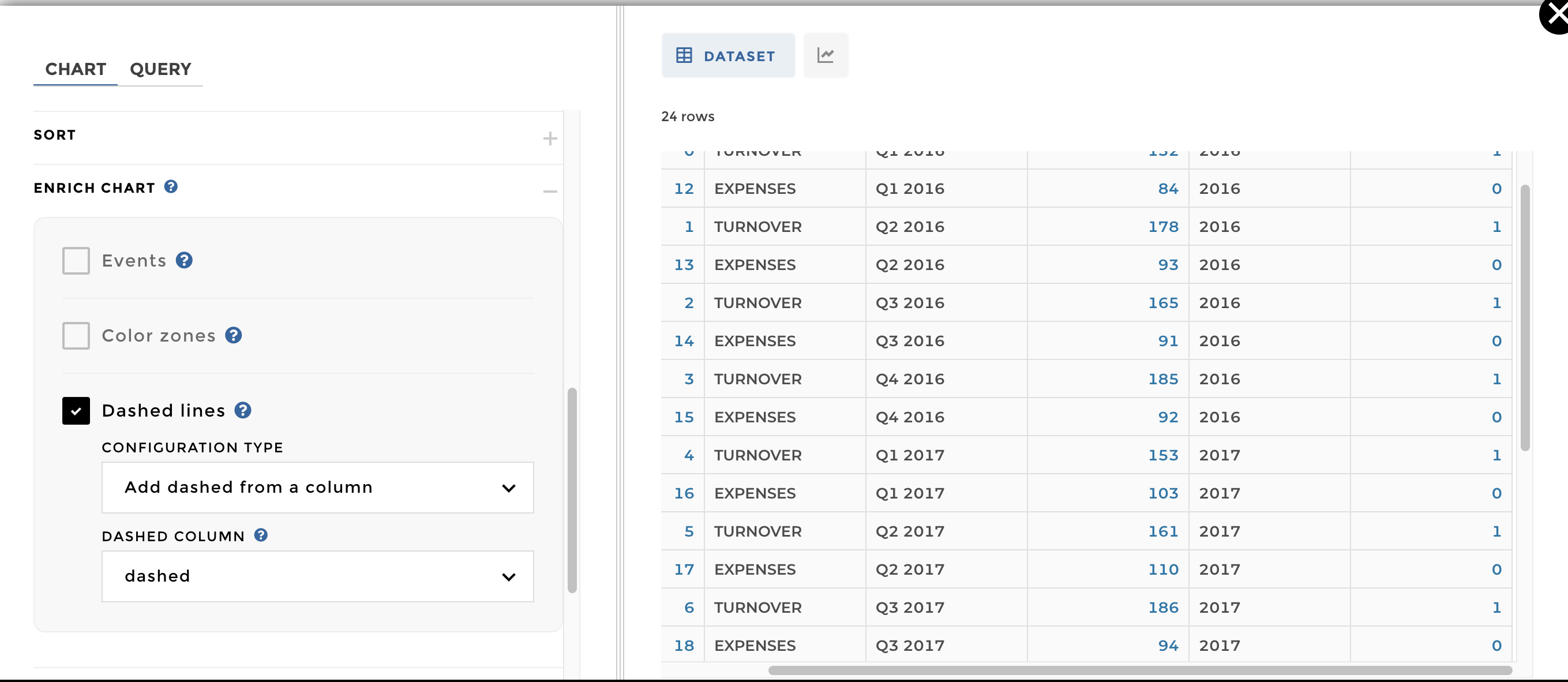
Now you can add the previous column on the schema and you’re done ✅ :
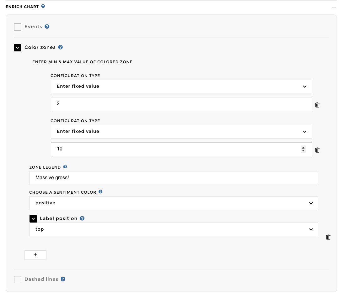
Add Sentiment Zone
You can add sentiment zones within your linechart so you can easily identify when you reached a critical value. Practical, isn’t it ? 👌
Note
You can add a sentiment zone based on a fixed value / column / dynamic value
Let’s Practice 😉 My dataset is containing the stock of my company. I
would like to follow my stock depending two other columns which are the
minimum and maximum for my stock. 
To setup my zone, I need to go into my charts options >> Enrich Chart >>
Color Zones 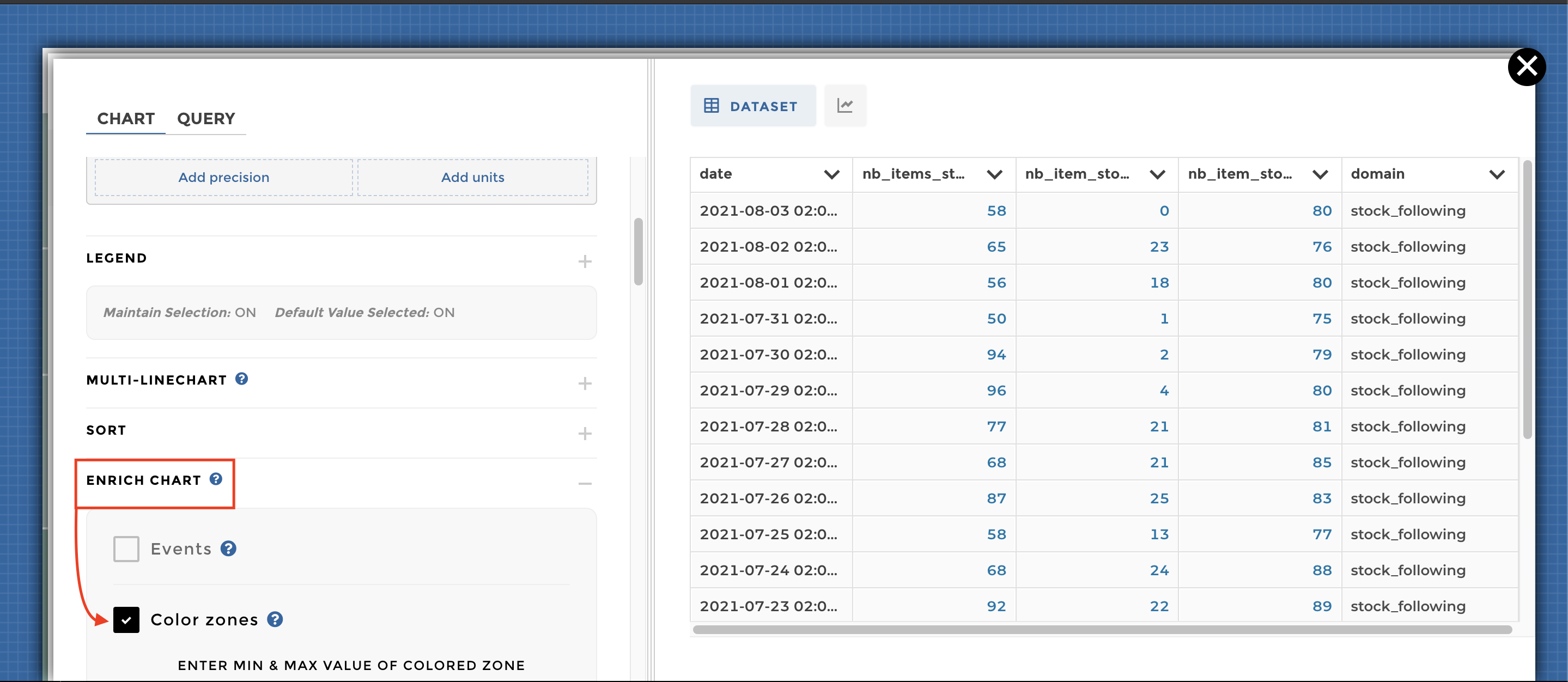
Then I can setup my zone depending two elements. It could be from a
fixed value to a column: 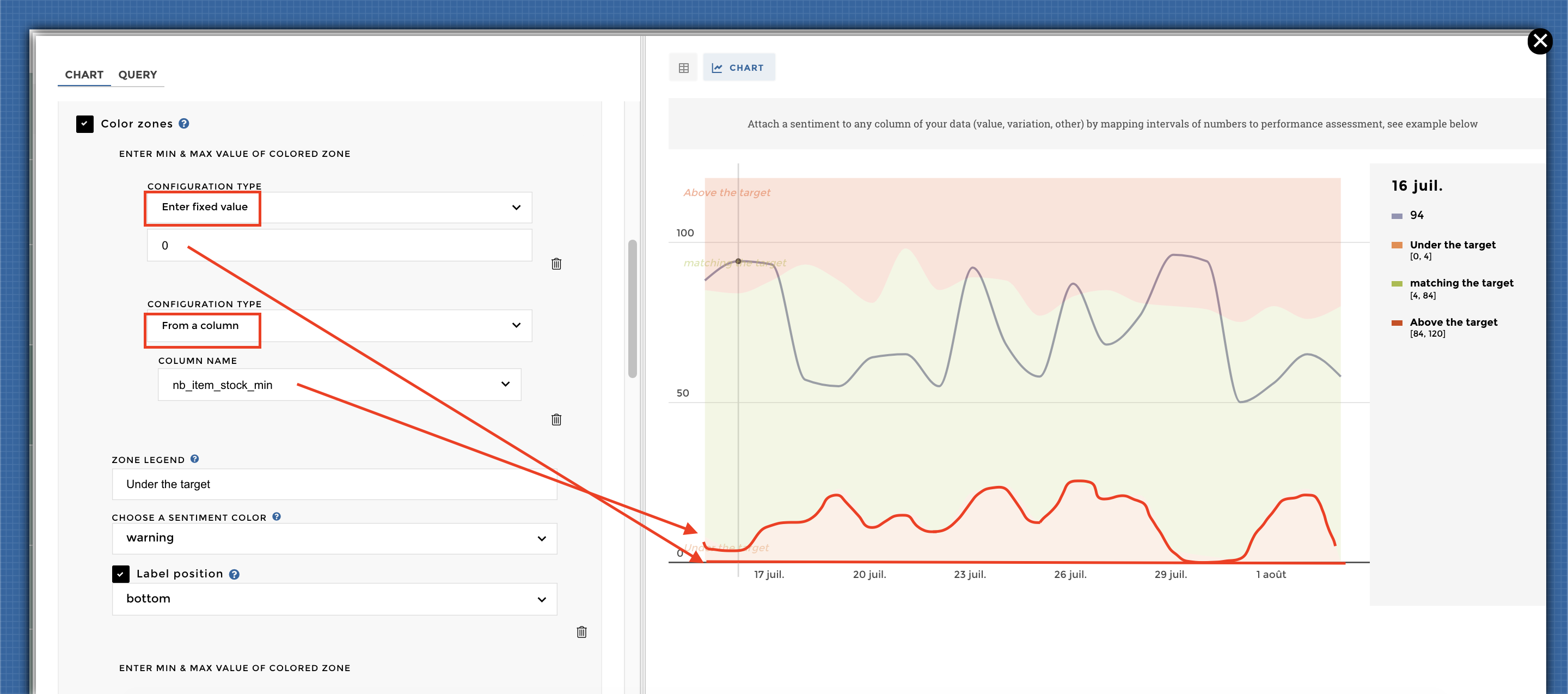
Or between two columns: 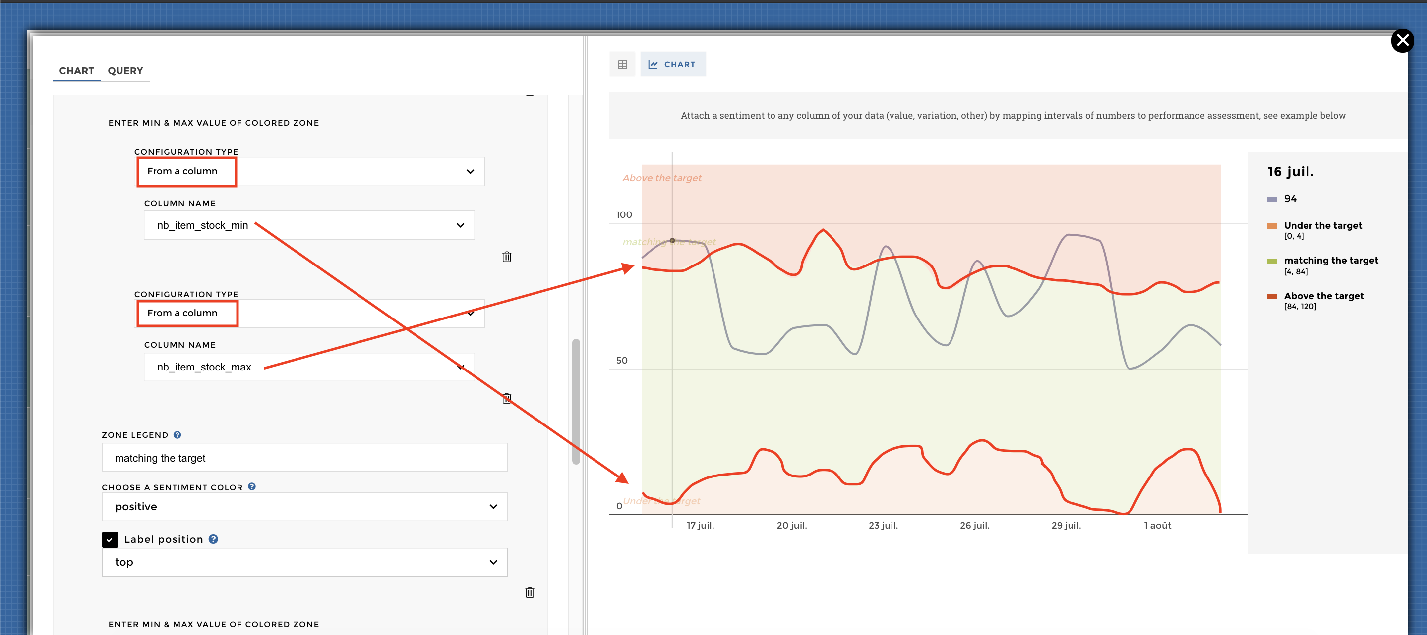
Here you go cow-boy 🤠 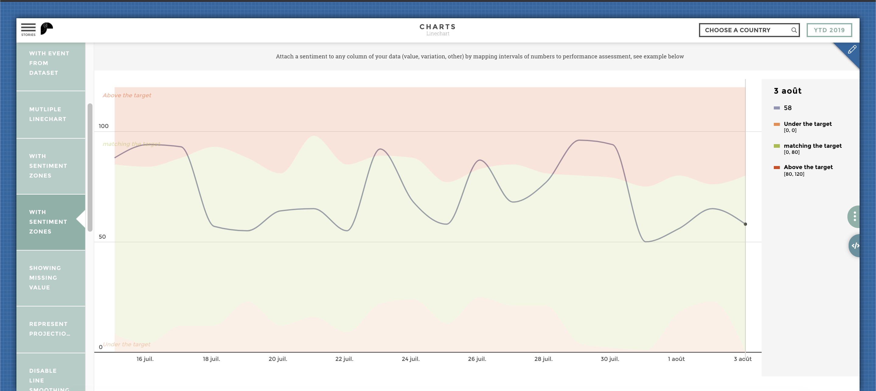
Other configuration examples
Adding a legend to the line chart
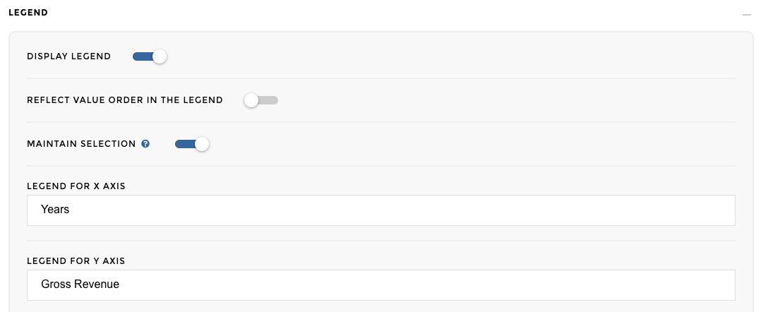
Please switch ON the Display legend parameter in the legend block like this:

With Legend options
Here we go!
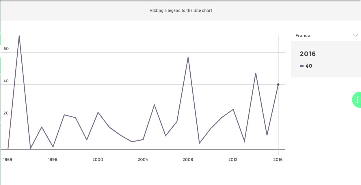
With Legend
Legend to display for the axis, column name in your data source By adding a text in the Legend for X/Y Axis in the chart options:
Axis legend linechart options
And you’re done 🎉
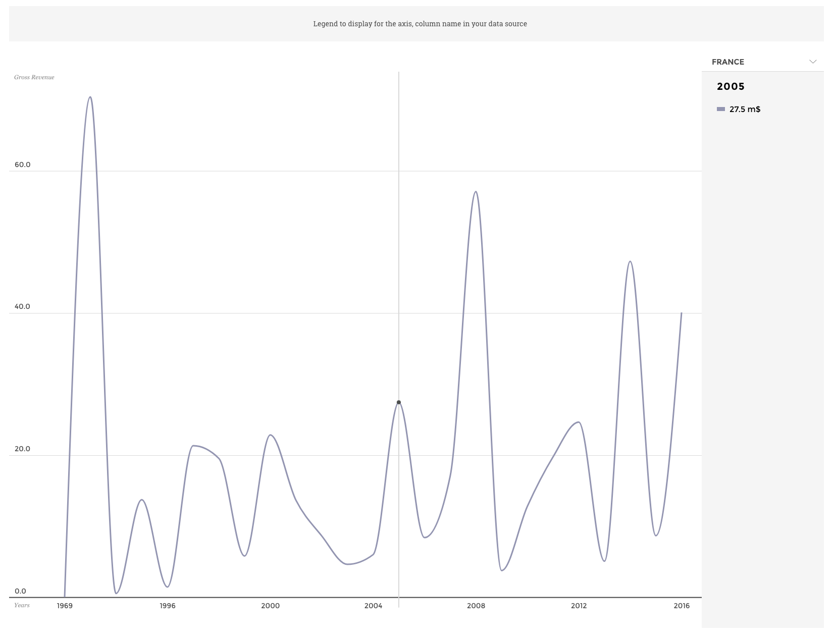
Axis legend linechart
Legend to display for the axis, column name in your data source Select the column “variable” in the “Groups: Multi-linechart” option
Attach a sentiment to any column of your data (value, variation, other) by mapping intervals of numbers to performance assessment, see example below. For this, you need to activate the ‘Color zones’ parameter in the Enrich chart block:
With sentiment zones option
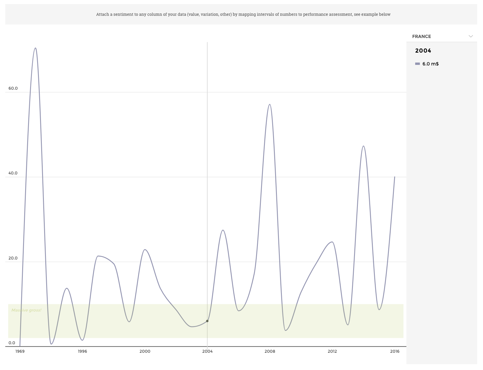
With sentiment zones
Switch ON the parameter Display missing values in the Display block to
display missing values as blank/white lines (by default missing values
are filtered out to display a continuous line). 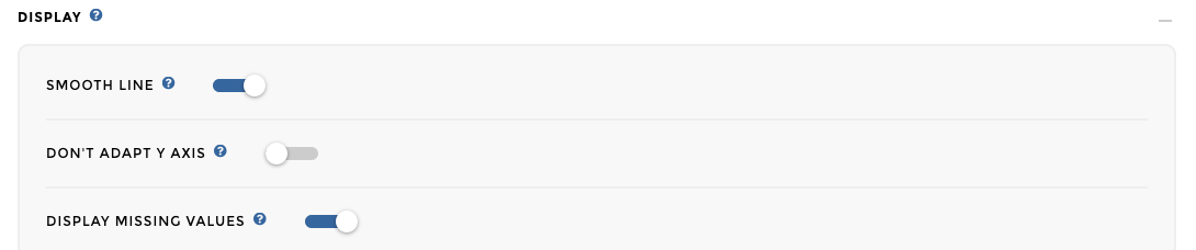
Ta daaa!
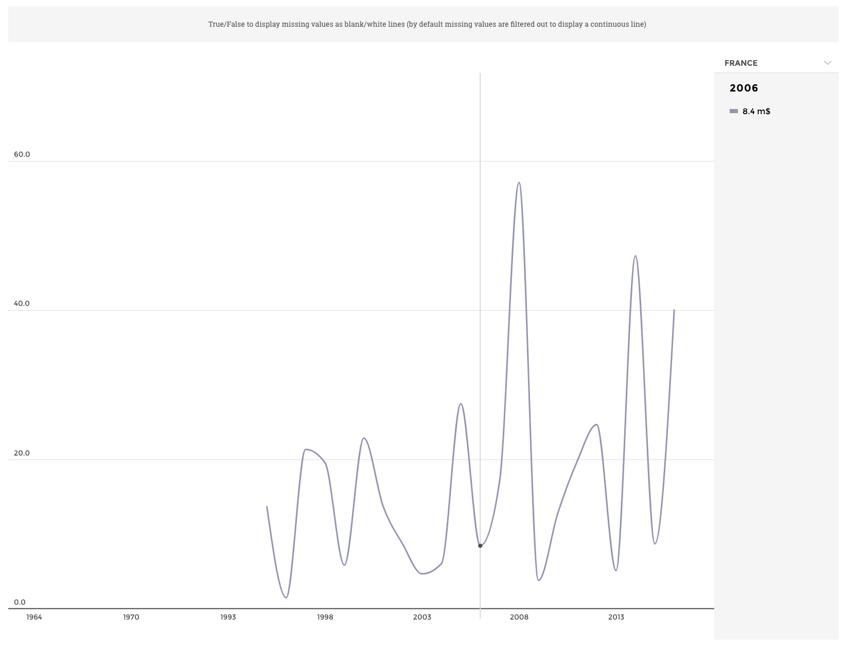
Showing missing value
Select “Add dashed lines manually” in the “DASHEDLINES” option You can
find the following schema: 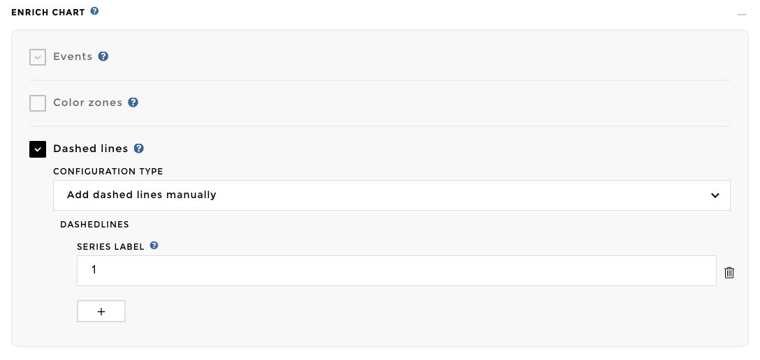
And here you go: 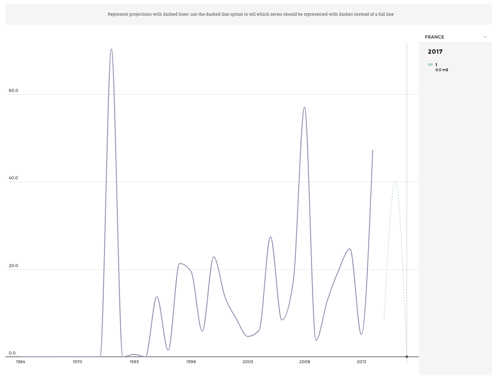
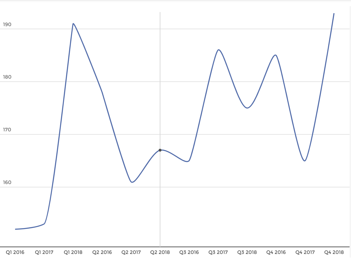
Switch ON the parameter Smooth line in the Display block to use a smooth
line display. 
Ta daaa: 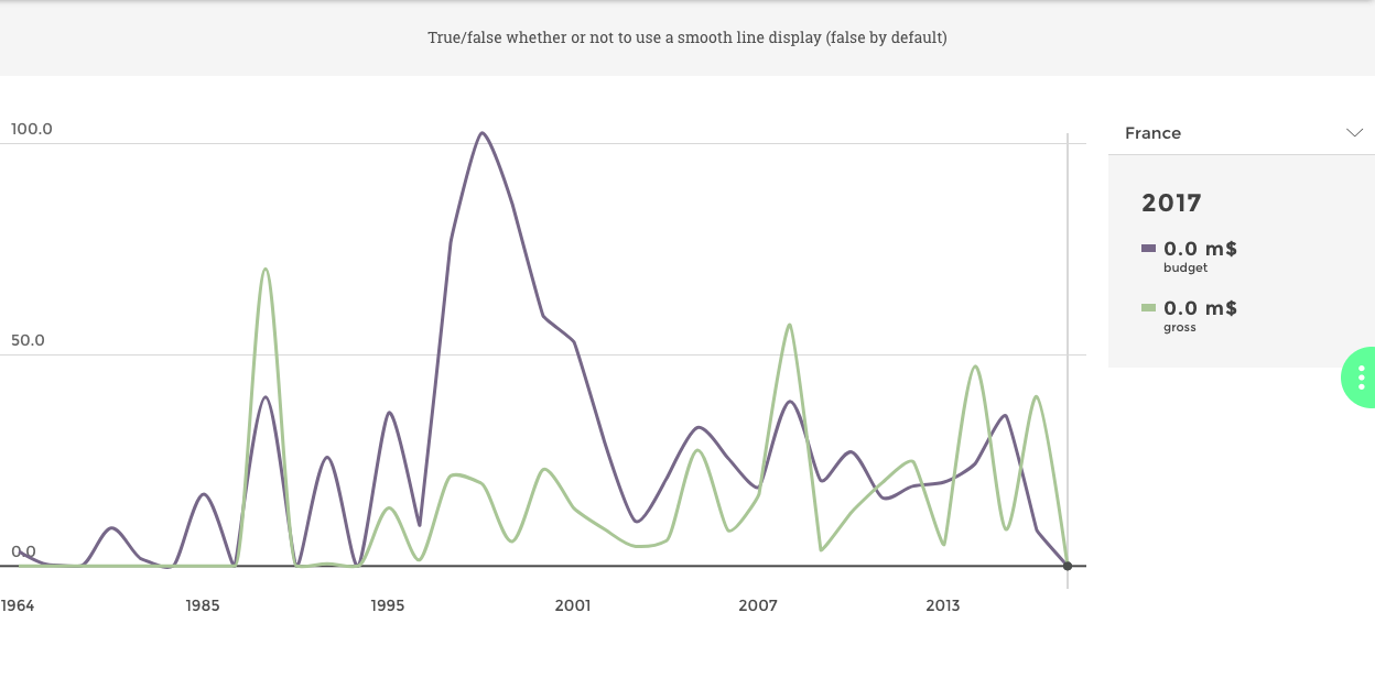
Hardcode extra information highlighted when a data point is selected.
You need to activate the Event parameter in the Enrich chart block and
fill the others fields with your needs: 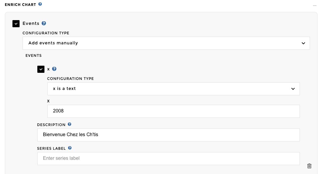
Here you go!
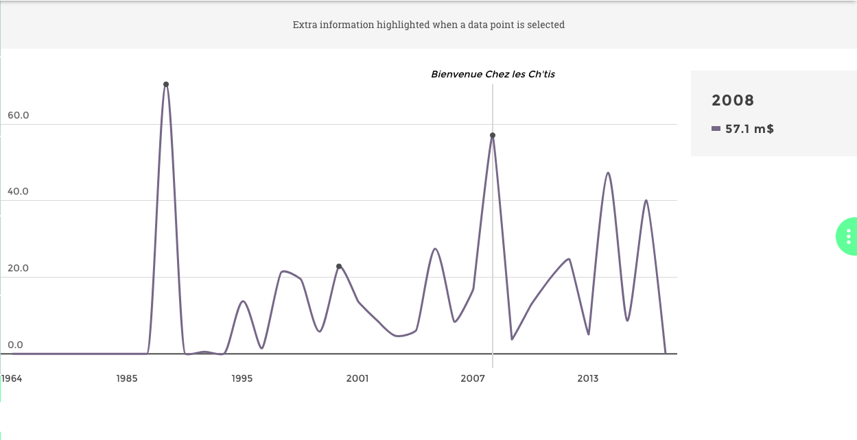
Image of chart
Warning
This example below is in code mode only
Hardcode extra information highlighted when a data point is selected.
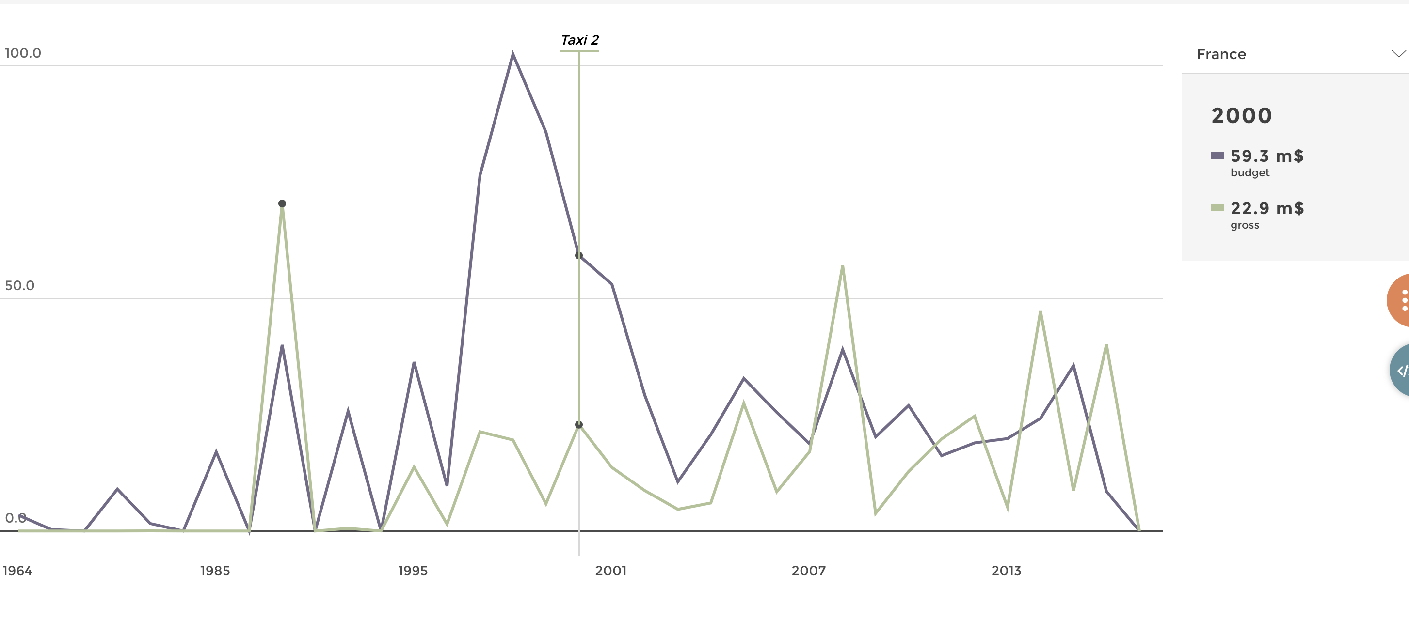
Image of chart
Data structure
| title_year  | variable    | value |
|-------------|-------------|-------|
| 2016        | gross       | 40.6  |
| 2011        | gross       | 19.2  |
| 2008        | gross       | 57.2  |
| 2015        | gross       |  8.2  |
| 2006        | Budget      | 13.6  |
| 2006        | Budget      | 13.6  |
Config file
{
  level: 3
  title: "Linechart with event hardcoded"
  parent_id: 20
  id: 2011
  commentary: "Extra information highlighted when a data point is selected"
  chartOptions:
    data:
      query:
          domain: "time_country"

      precision:
        gross:'.1f'
    chartType: "linechart"
    value: "gross"
    date: "title_year"
    smoothLine: true
    units:
      gross: " m$"
    legend: true
    "events": [
      {
        date: "2008"
        name: "Bienvenue Chez les Ch'tis"
        label: "gross"
      }
      {
        date: "2000"
        name: "Taxi 2"
        label: "gross"

      }
      {
        date: "1991"
        name: "Tous les matins du monde"
        label: "gross"

      }]
}
Enjoy!