Leaderboard Tutorials
Step by step tutorial
The user story
I’m a local manager in a national retail company. This year, my revenue has increased by 20%! 💸 Are all of my products concerned about this amazing growth? Is there some specific product categories to focus on?
What are my top/flop 20 selling products? Between all of my products, is there some specific product category that stands out?
As I’m looking for the top N elements from a category, let’s do a leaderboard.
Warning
Before you start!
Make sure you added your datasource to your application. Once you’re done create a new story.
Pick some data
To create a nice leaderboard, it’s very easy! All we need are two
columns: label and value.
- a
labelcolumn: this will define the name of each of the bars you want to display - a
valuecolumn: this will define the bar value
Many other options are available if you want to add some extra value to your viz. Here are some examples of how you can make it shine:
- an
evolutioncolumn: this will define an additional value to display on the right side of each bar - a
packcolumn: this will define the way bars will be displayed in « packs », which means they belong to a common category - an
averagecolumn: this will define an average value that can help compare some specific performance to the overall average
You can find out more about these different options here 👈.
If you don’t have any data to use, feel free to use our amazing fake data generator Design First!, which is also available in beta mode in the studio.
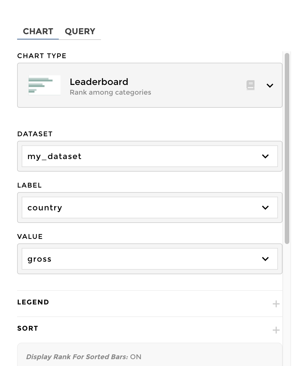
Chart Parameters
Once I have gathered the data I need, I can choose to configure a leaderboard.
I just need to fill the dataset,label and value fields,
and that’s it! ✨
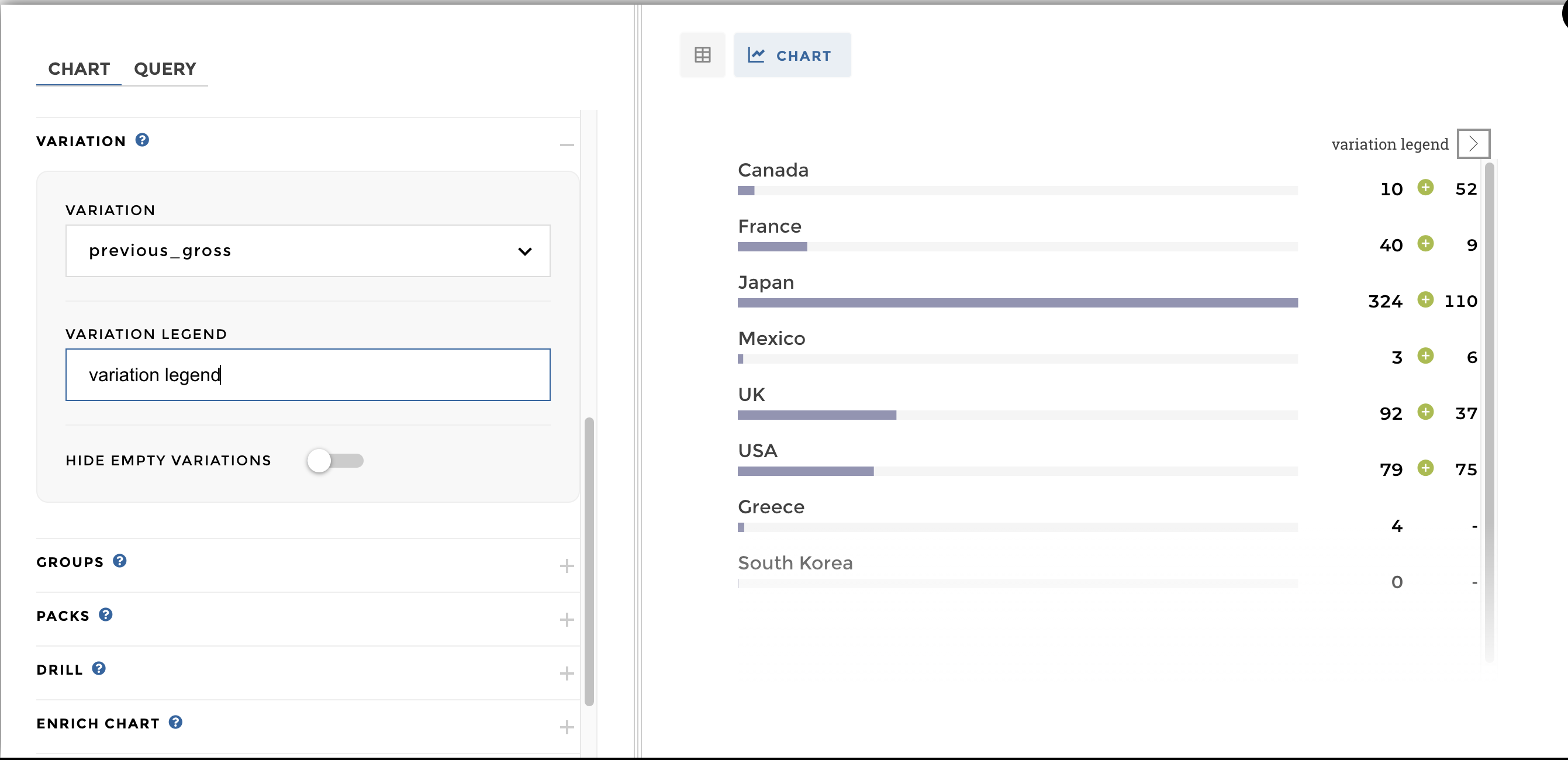
Add a variation
You can use a variation column to add some evolutions to your bars:
are your top performers forever the bests, or are they new comers? 🤔
To make the ↗️ appear, go the chart parameters menu and add the
optional parameter variation to your configuration.
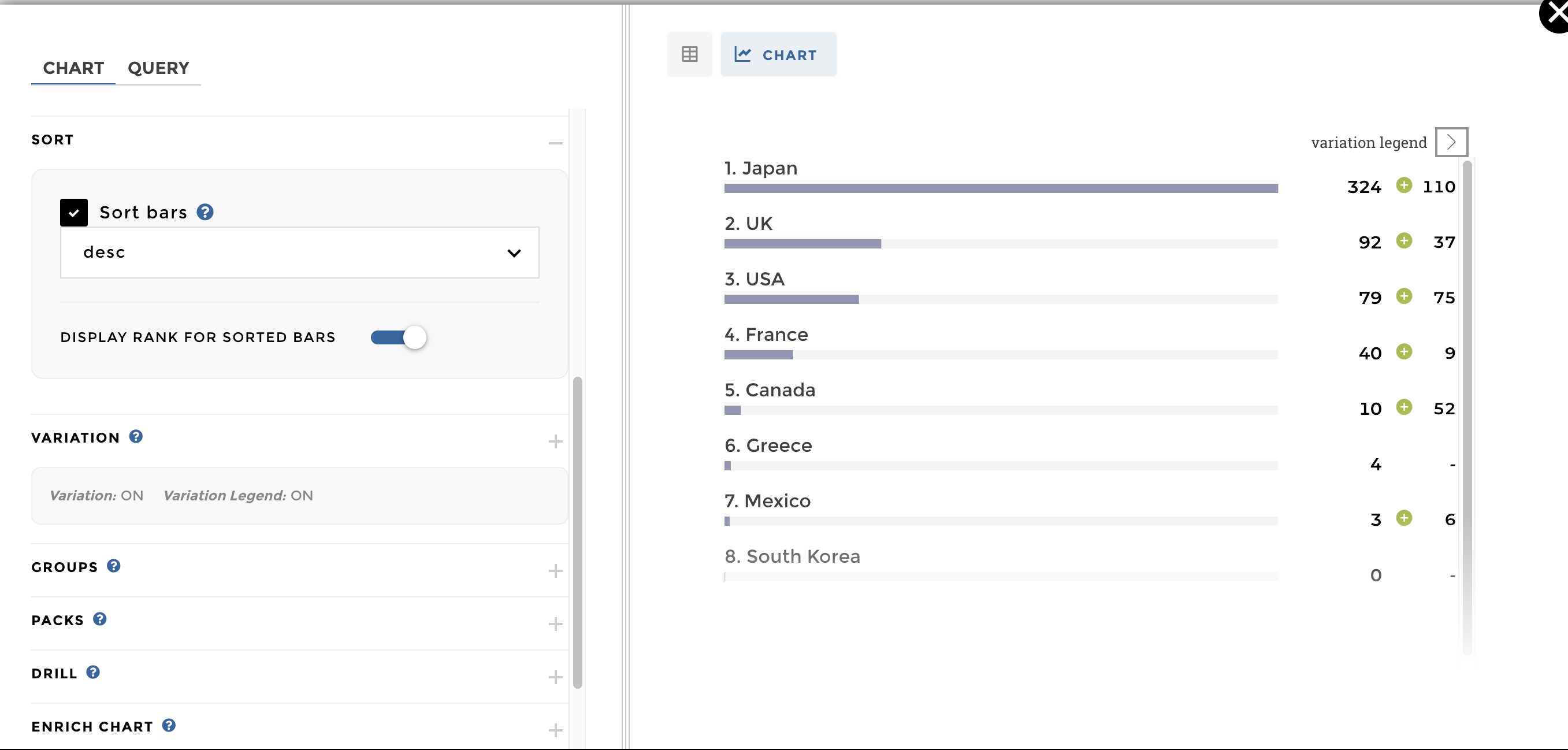
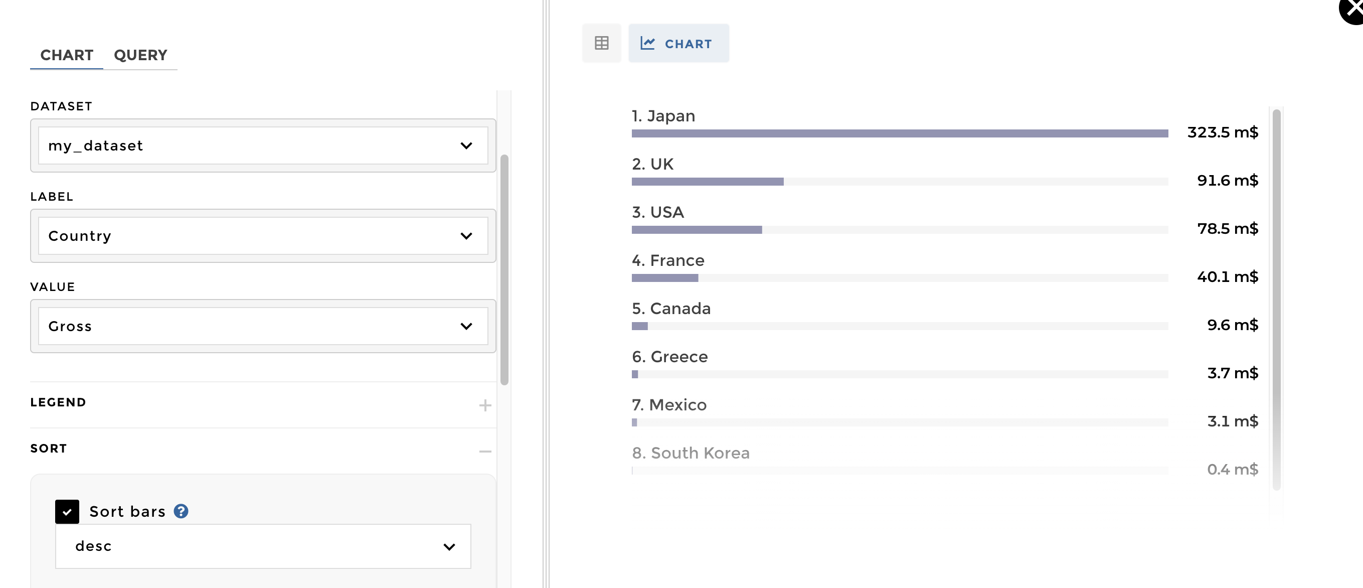
Sort descending to get the best values first
You can use the sort optional parameter to get the top / flop
results within your dataset: using desc will make the top players
pop first, and use asc to look for the ones that need to improve.
Other configuration examples
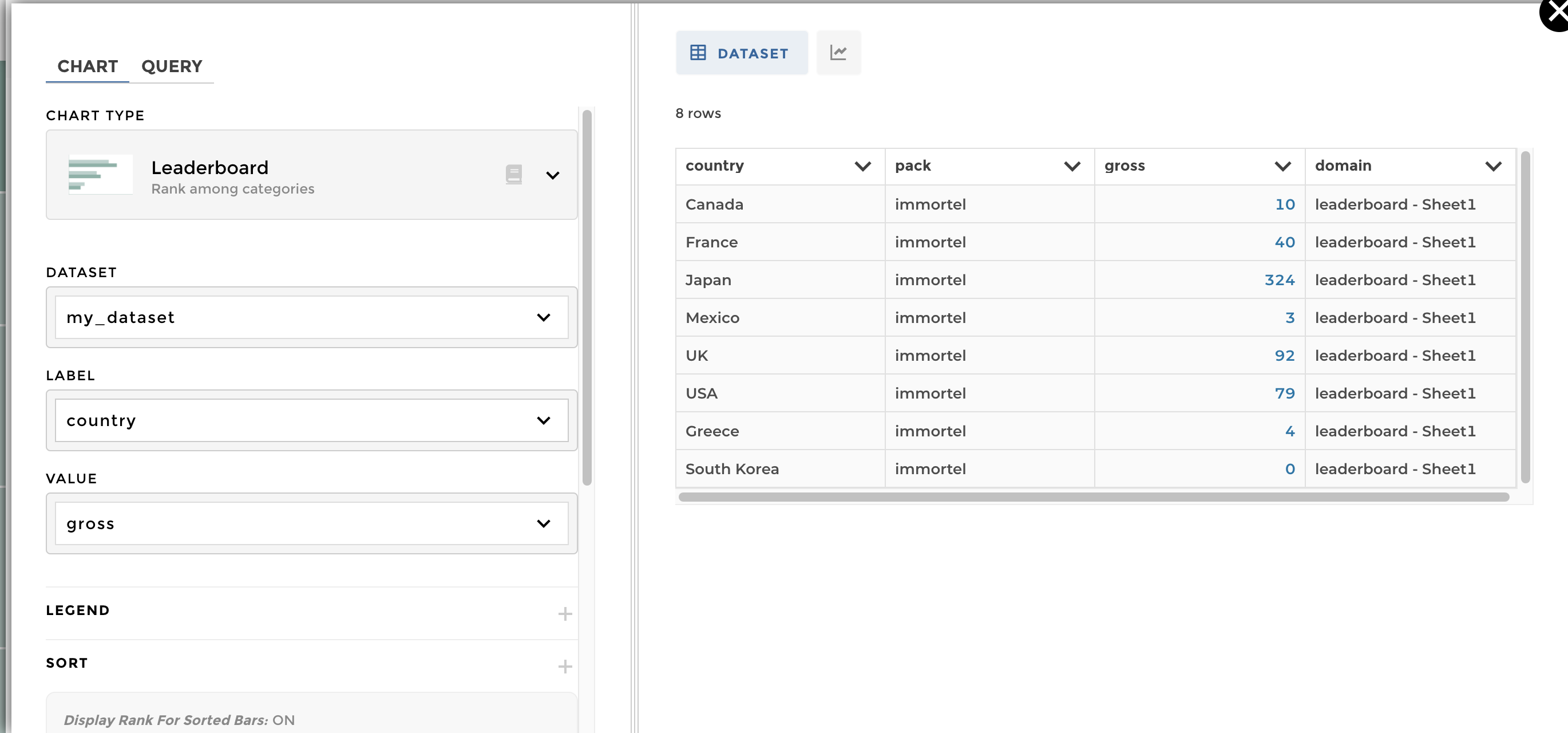
Data structure: name of the domain : time_country
| country | pack | gross |
|---|---|---|
| Canada | immortel | 10 |
| France | immortel | 40 |
| Japan | immortel | 324 |
| Mexico | immortel | 3 |
| UK | immortel | 92 |
| USA | immortel | 79 |
| Greece | immortel | 4 |
| South Korea | immortel | 0 |
You just need to fill the dataset,label and the value on
the chart configuration. Feel free to add some options to display your
data in a better way (sort, legend, meta..):
leaderboard example1
The expected result is: 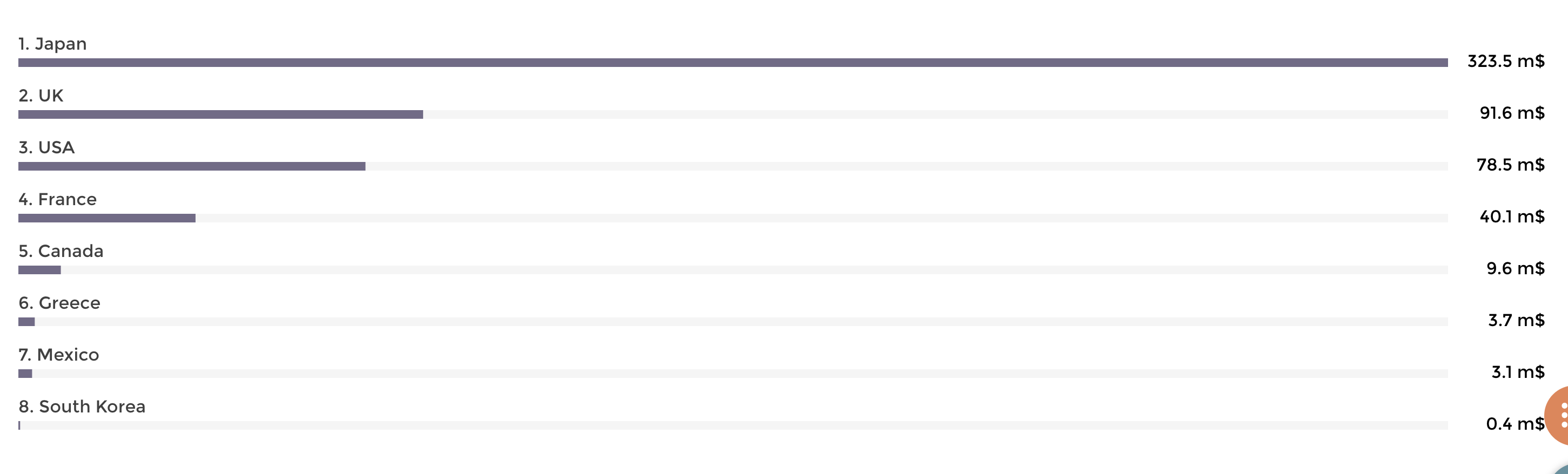
The Data structure for the domain time_country:
| Country | pack | Gross |
|---|---|---|
| Canada | immortel | 9.6108855 |
| France | immortel | 40.0879785 |
| Japan | immortel | 323.50554 |
| Mexico | immortel | 3.10526 |
| UK | immortel | 91.5875932 |
| USA | immortel | 78.543564 |
| Greece | immortel | 3.707794 |
| South Korea | immortel | 0.4011455 |
To add the unit/precision, click on the preview of your dataset and open the ‘units’/’precision’ option: Please read the following documentation if you’ve any doubt.
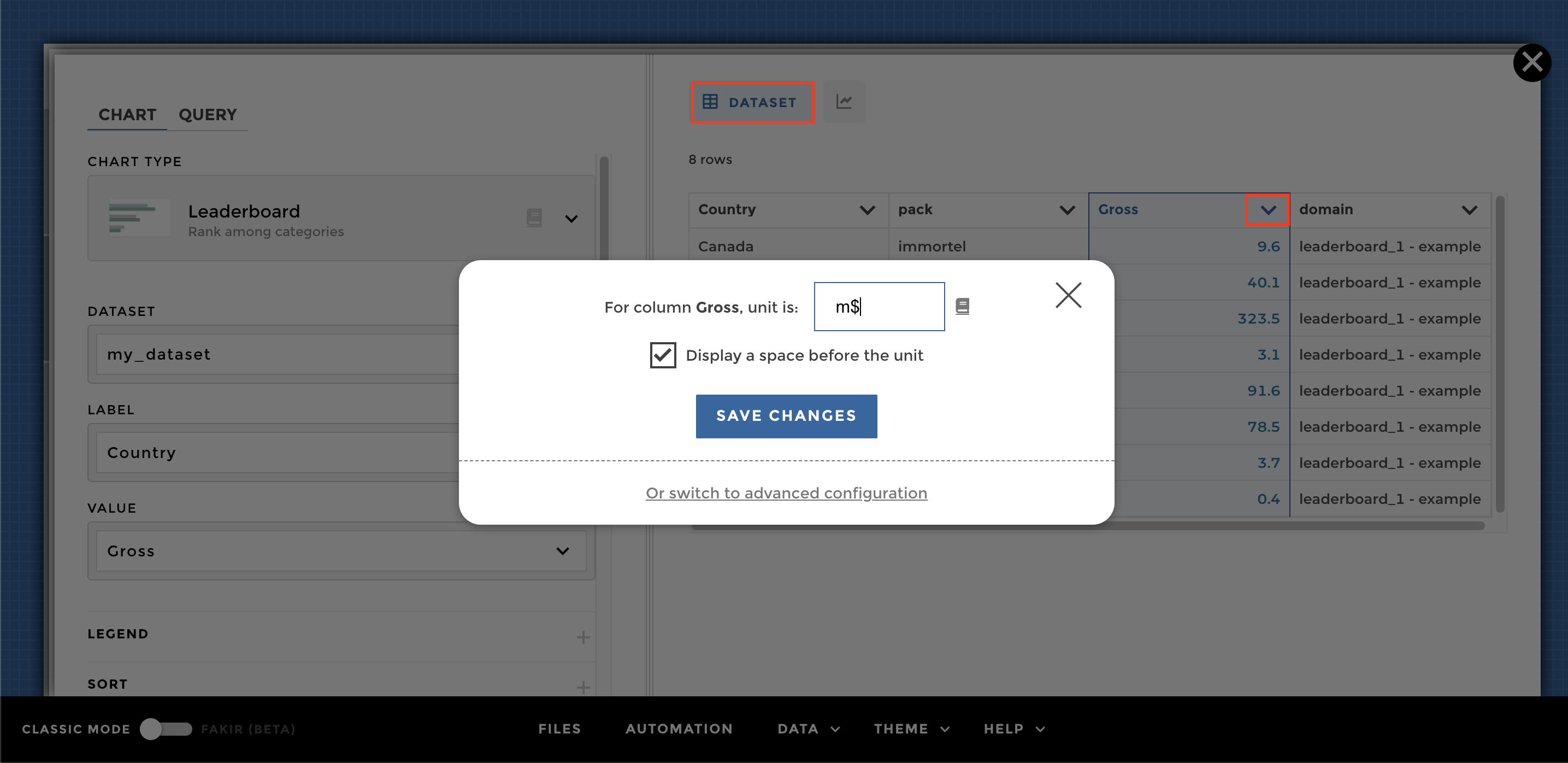
Image of chart
To sort the leaderboard, just add the sort option and tell if it is
ascendant (asc) or descendant (desc):
leaderboard sort option example 2
A leaderboard with variations
DATA STRUCTURE: name of the domain >> time_country
| country | pack | gross | gross_variation |
|---|---|---|---|
| Canada | immortel | 9.6108855 | 0.18411480279960515 |
| France | immortel | 40.0879785 | 4.616564398102196 |
| Japan | immortel | 323.50554 | 2.940738631808193 |
| Mexico | immortel | 3.10526 | 0.48366272766197 |
| UK | immortel | 91.5875932 | 2.503365780463479 |
| USA | immortel | 78.543564 | 1.053107378593496 |
| Greece | immortel | 3.707794 | |
| South Korea | immortel | 0.4011455 |
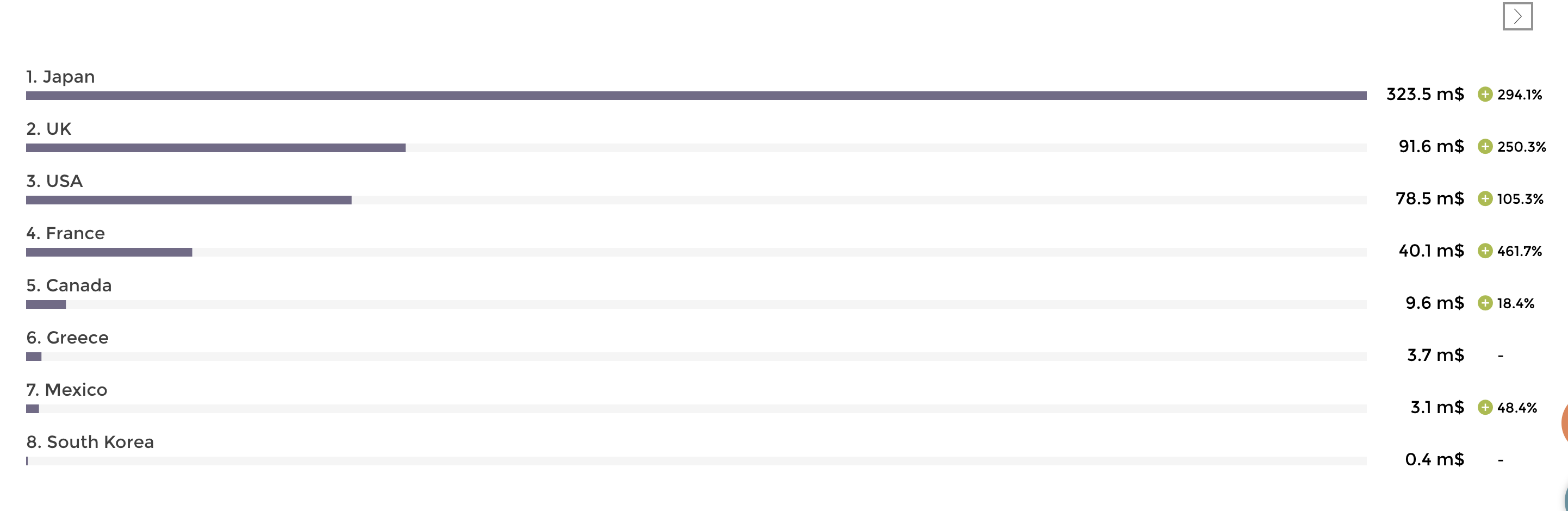
By simply adding the option
variation and select the column "gross_variation", we add the
variation value at the end of each bar:
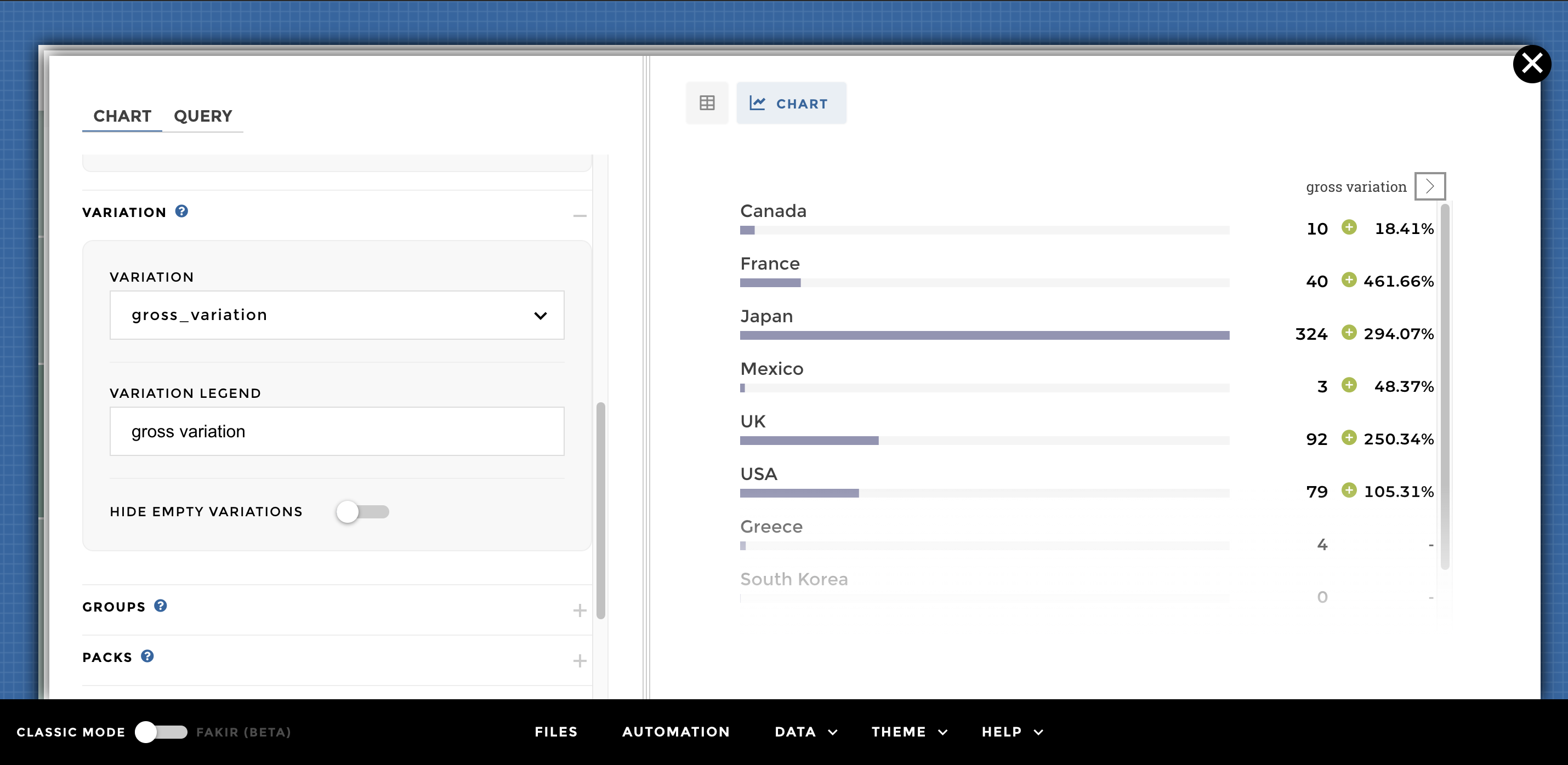
EX 3 leaderboard with variation
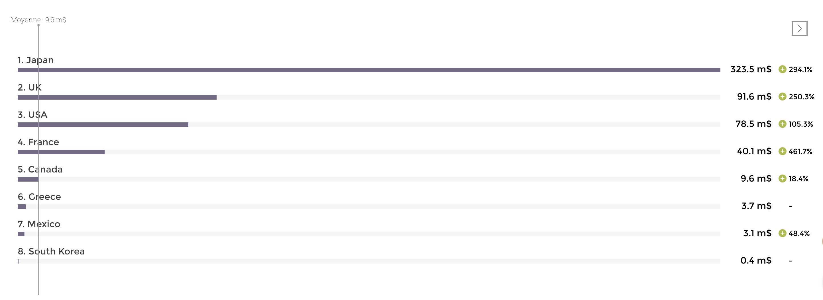
A leaderboard with an average bar
Data structure >> name of the domain : time_country
| country | gross | gross_variation |
|---|---|---|
| Canada | 9.6108855 | 0.18411480279960515 |
| France | 40.0879785 | 4.616564398102196 |
| Japan | 323.50554 | 2.940738631808193 |
| Mexico | 3.105269 | 0.48366272766197 |
| UK | 91.5875932 | 2.503365780463479 |
| USA | 78.543564 | 1.053107378593496 |
| Greece | 3.707794 | |
| South Korea | 0.4011455 |
We can add an average by going on ENRICH DATA in the chart configuration. Then you can set up the value of your average and define a legend:
leaderboard average
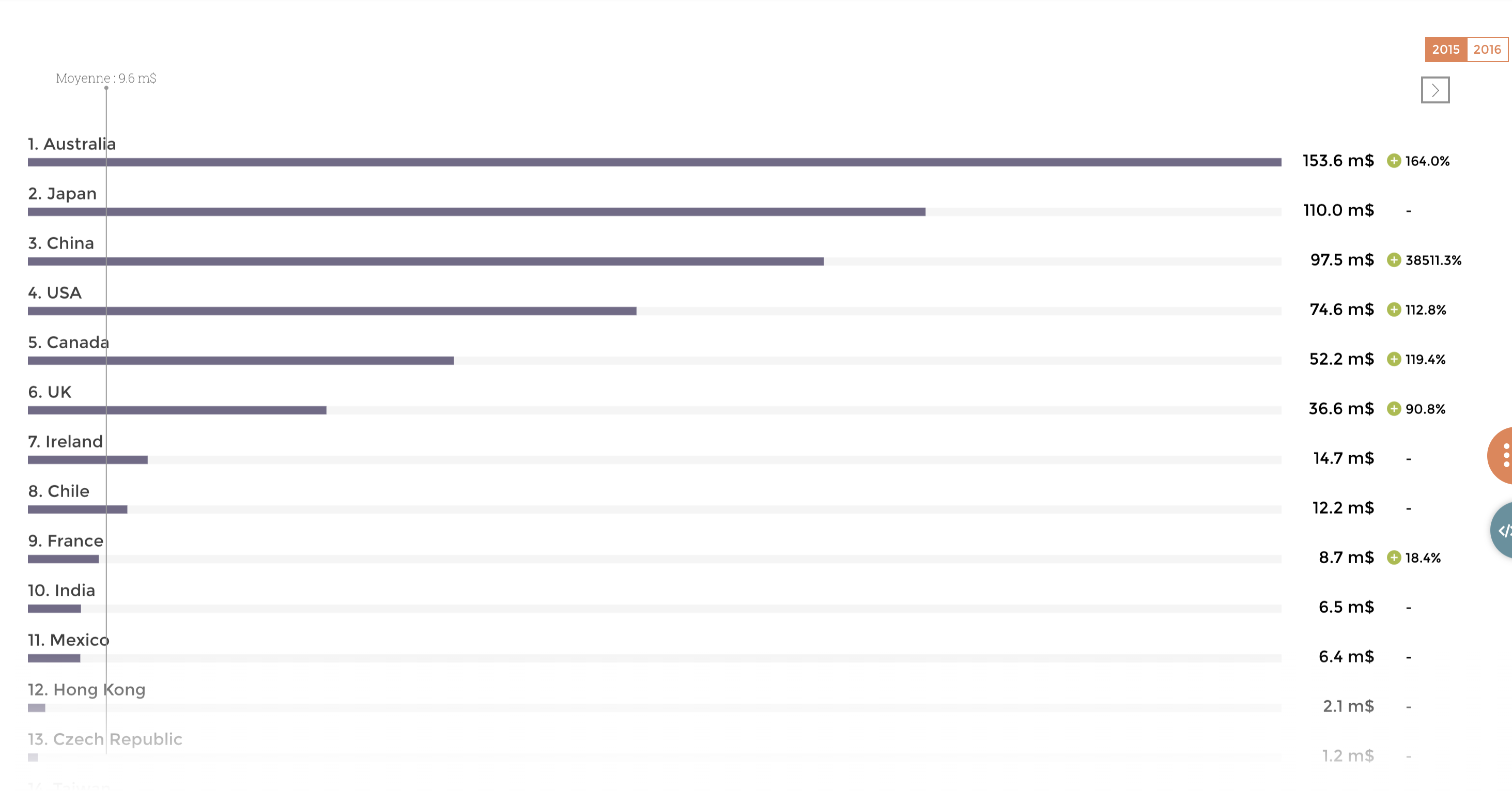
Filters on a leaderboard
Data structure >> name of the domain : time_country
| country | gross | gross_variation | title_year |
|---|---|---|---|
| Canada | 9.6108855 | 0.18411480279960515 | 2015 |
| France | 40.0879785 | 4.616564398102196 | 2016 |
| Japan | 323.50554 | 2.940738631808193 | 2015 |
| Mexico | 3.10526 | 0.48366272766197 | 2016 |
| UK | 91.5875932 | 2.503365780463479 | 2015 |
| USA | 78.543564 | 1.053107378593496 | 2016 |
| Greece | 3.707794 | 2015 | |
| South Korea | 0.4011455 | 2016 | |
| Canada | 9.6108855 | 0.18411480279960515 | 2015 |
| France | 40.0879785 | 4.616564398102196 | 2016 |
| Japan | 323.50554 | 2.940738631808193 | 2015 |
| Mexico | 3.105269 | 0.48366272766197 | 2016 |
| UK | 91.5875932 | 2.503365780463479 | 2015 |
| USA | 78.543564 | 1.053107378593496 | 2016 |
| Greece | 3.707794 | 2015 | |
| South Korea | 0.4011455 | 2016 |
Start by creating your story cf ⬆️: 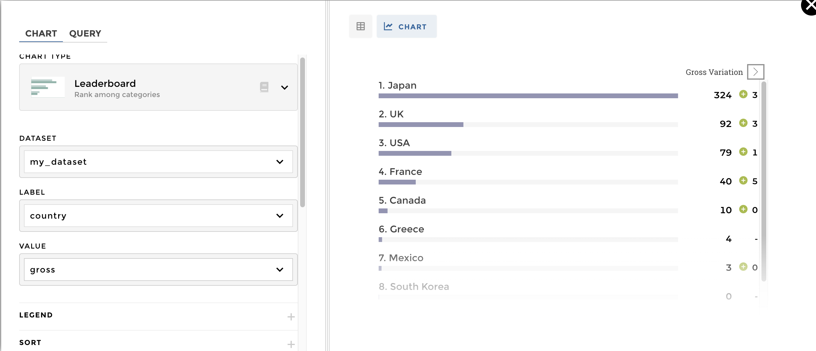
Now you can add a filter on your story (please find more informations
here
: 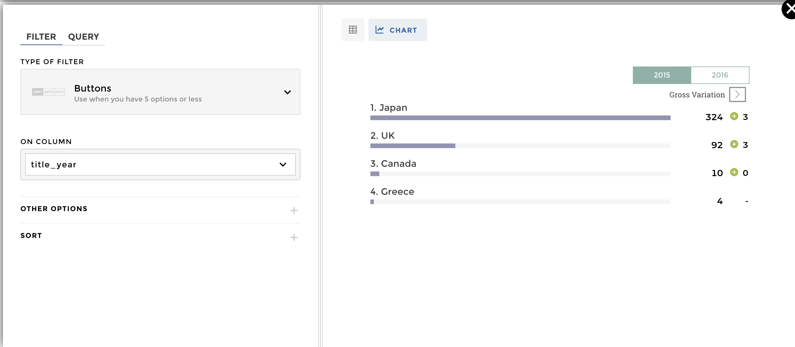
That’s so easy: 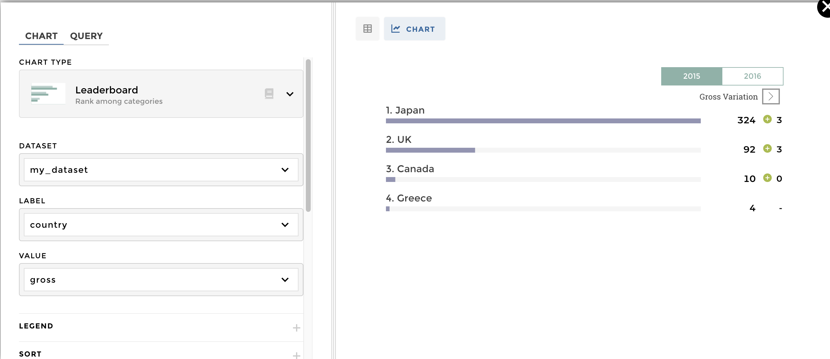
DATA STRUCTURE:
| title_year | country | variable | value |
|---|---|---|---|
| 2015 | Canada | profitability | 6.141235764705883 |
| 2016 | Canada | profitability | 1.575555 |
| 2015 | France | profitability | 0.24414739456419865 |
| 2016 | France | profitability | 4.716232764705882 |
| 2016 | Japan | profitability | 4.3134072 |
| 2016 | Mexico | profitability | 1.0350896666666667 |
| 2015 | UK | profitability | 1.0760523946078433 |
| 2016 | UK | profitability | 1.3029651677534082 |
| 2015 | USA | profitability | 1.8590738707427155 |
| 2016 | USA | profitability | 1.310916538996283 |
| 2015 | Japan | profitability | 3.143093142857143 |
| 2015 | Mexico | profitability | 0.4585942142857143 |
| 2015 | Canada | budget | 8.5 |
| 2016 | Canada | budget | 6.1 |
| 2015 | France | budget | 35.56666666666667 |
| 2016 | France | budget | 8.5 |
| 2016 | Japan | budget | 75 |
| 2016 | Mexico | budget | 3 |
| 2015 | UK | budget | 34 |
| 2016 | UK | budget | 70.29166666666667 |
| 2015 | USA | budget | 40.118187500000005 |
| 2016 | USA | budget | 59.91499999999999 |
| 2015 | Japan | budget | 35 |
| 2015 | Mexico | budget | 14 |
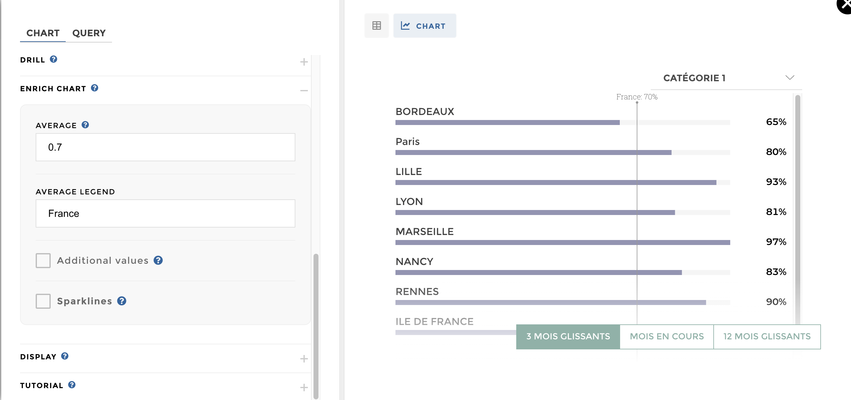
You need to add the Groups option available in the schema and select
the column where resides the different groups. 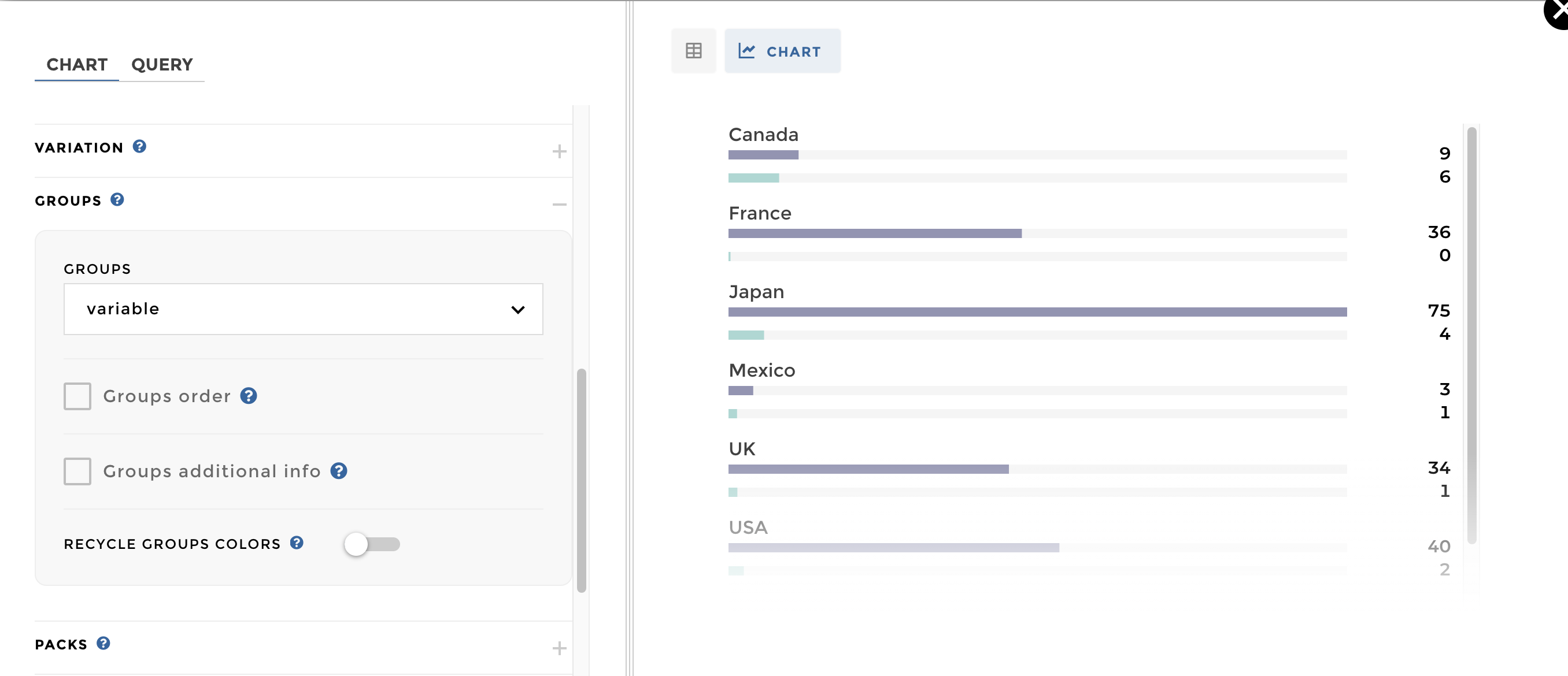
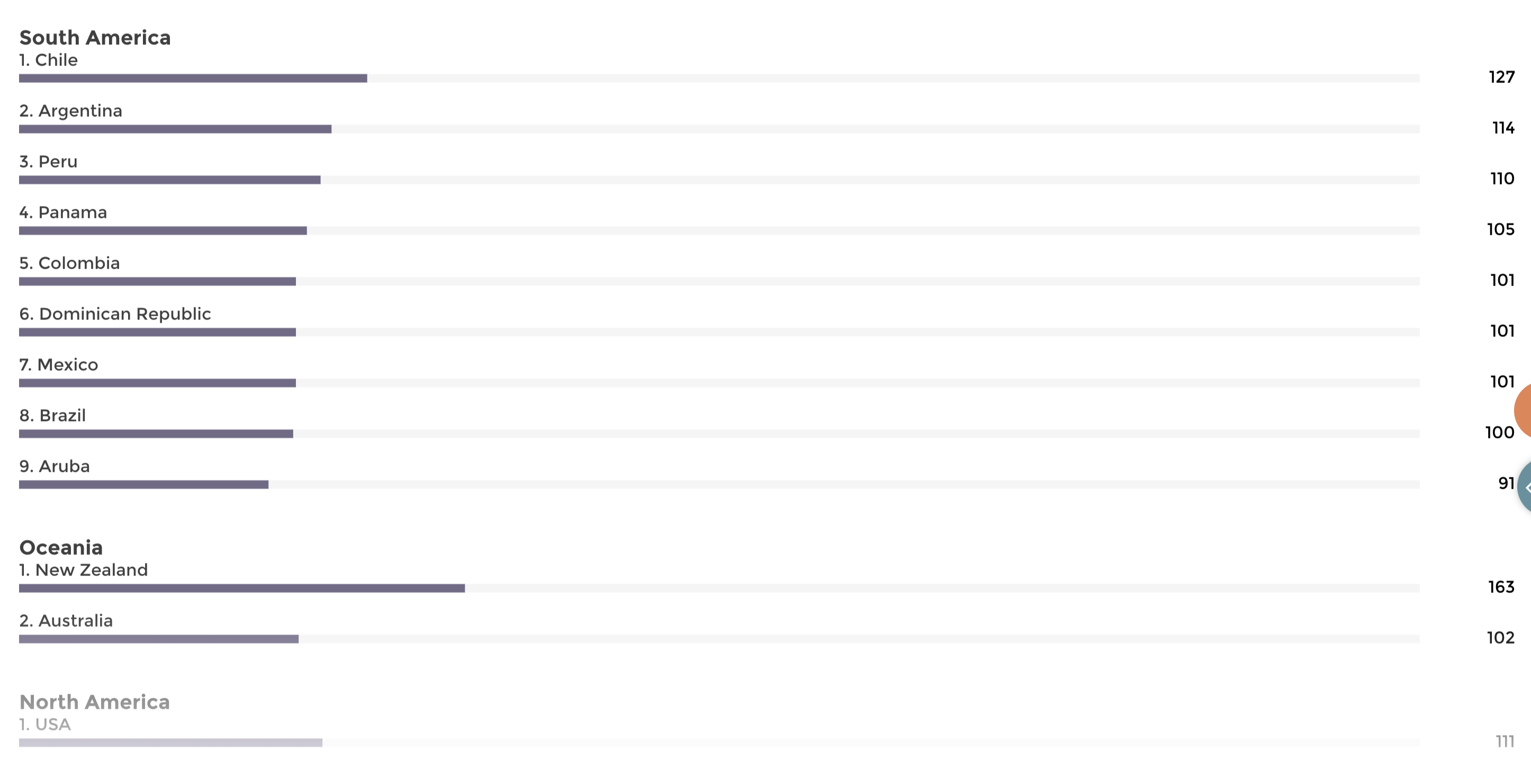
A leaderboard organized in packs
Data structure:
| country | duration | region |
|---|---|---|
| Afghanistan | 83 | Asia |
| Argentina | 121.5 | South America |
| Aruba | 91 | South America |
| Bahamas | 94 | North America |
| Belgium | 109 | Europe |
| Brazil | 100 | South America |
| Bulgaria | 109 | Europe |
| Cambodia | 100 | Asia |
| Cameroon | 104 | Africa |
| Canada | 68.33 | North America |
| China | 130.2 | Asia |
| Colombia | 101 | South America |
| Czech Republic | 113 | Europe |
| Denmark | 45 | Europe |
| Dominican Repu | 101 | South America |
| Egypt | 108 | Africa |
| Egypt | 108 | Africa |
| Finland | 93 | Europe |
| France | 100.3 | Europe |
| Georgia | 113 | Europe |
| Germany | 140.8 | Europe |
| Greece | 112 | Europe |
| Hong Kong | 100.78571 | Asia |
| Hong Kong | 113 | Asia |
Add the Packs options and select the column where resides the
different pack: 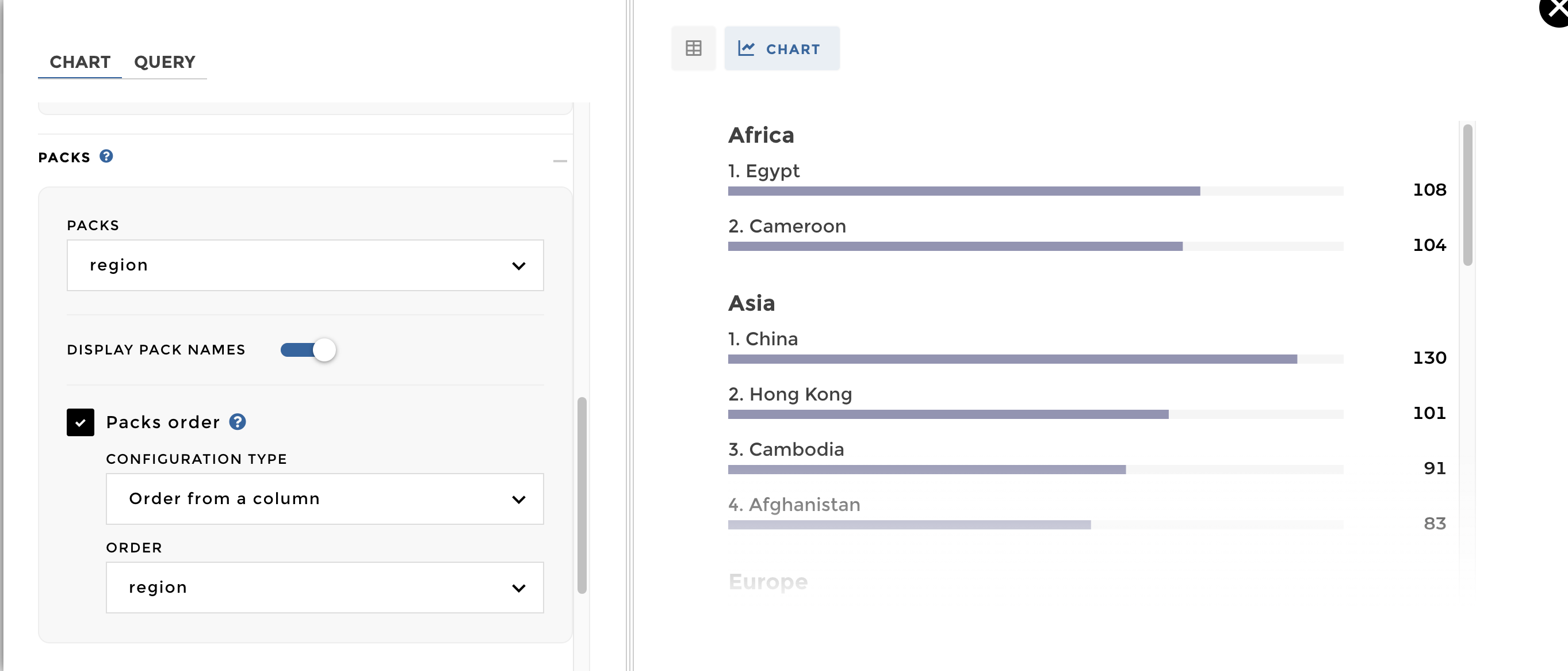
When your data structure represents a parent/child relationship, you can use the drill option to allow users to click on a parent label in the chart in order to display its children labels.
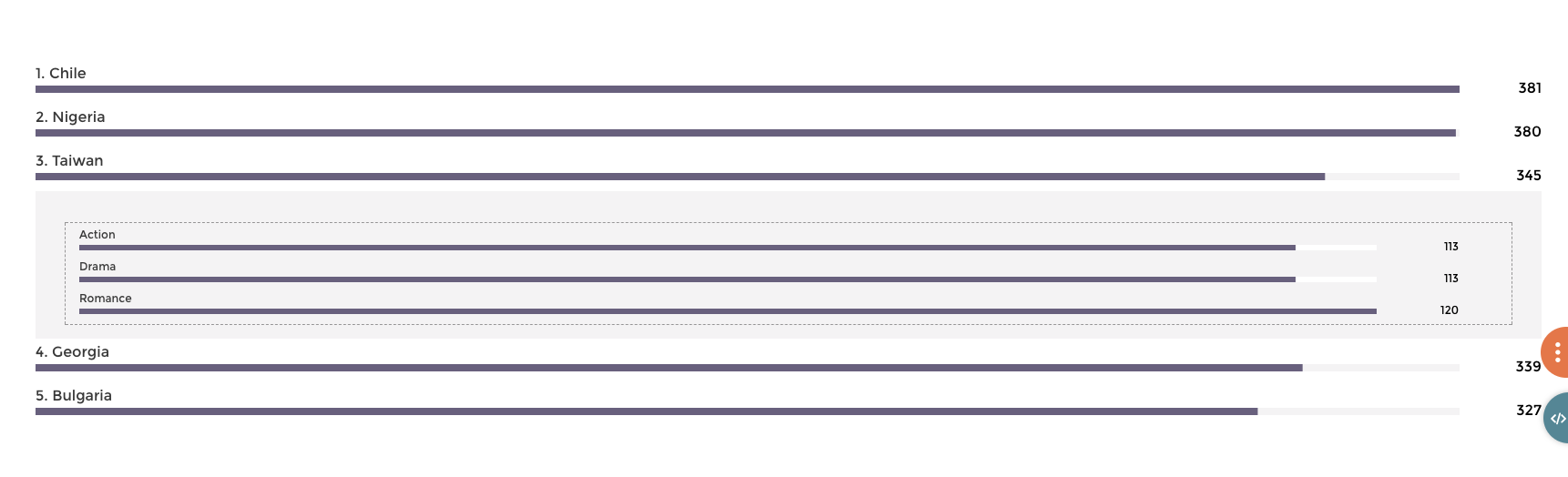
A leaderboard with a second level of info
Data structure
Note that this data structure is easy to get through a hierarchical rollup step with YouPrep™.
| label | parent | duration |
|---|---|---|
| Taiwan | 345 | |
| Bulgaria | 327 | |
| Chile | 381 | |
| Georgia | 339 | |
| Nigeria | 380 | |
| Action | Bulgaria | 109 |
| Sci-Fi | Bulgaria | 109 |
| Thriller | Bulgaria | 109 |
| Biography | Chile | 127 |
| Drama | Chile | 127 |
| History | Chile | 127 |
| Action | Georgia | 113 |
| Drama | Georgia | 113 |
| War | Georgia | 113 |
| Action | Nigeria | 95 |
| Crime | Nigeria | 95 |
| Drama | Nigeria | 95 |
| Thriller | Nigeria | 95 |
| Action | Taiwan | 112.5 |
| Drama | Taiwan | 112.5 |
| Romance | Taiwan | 120 |
Just add a Drill option and define the column containing your
parent: 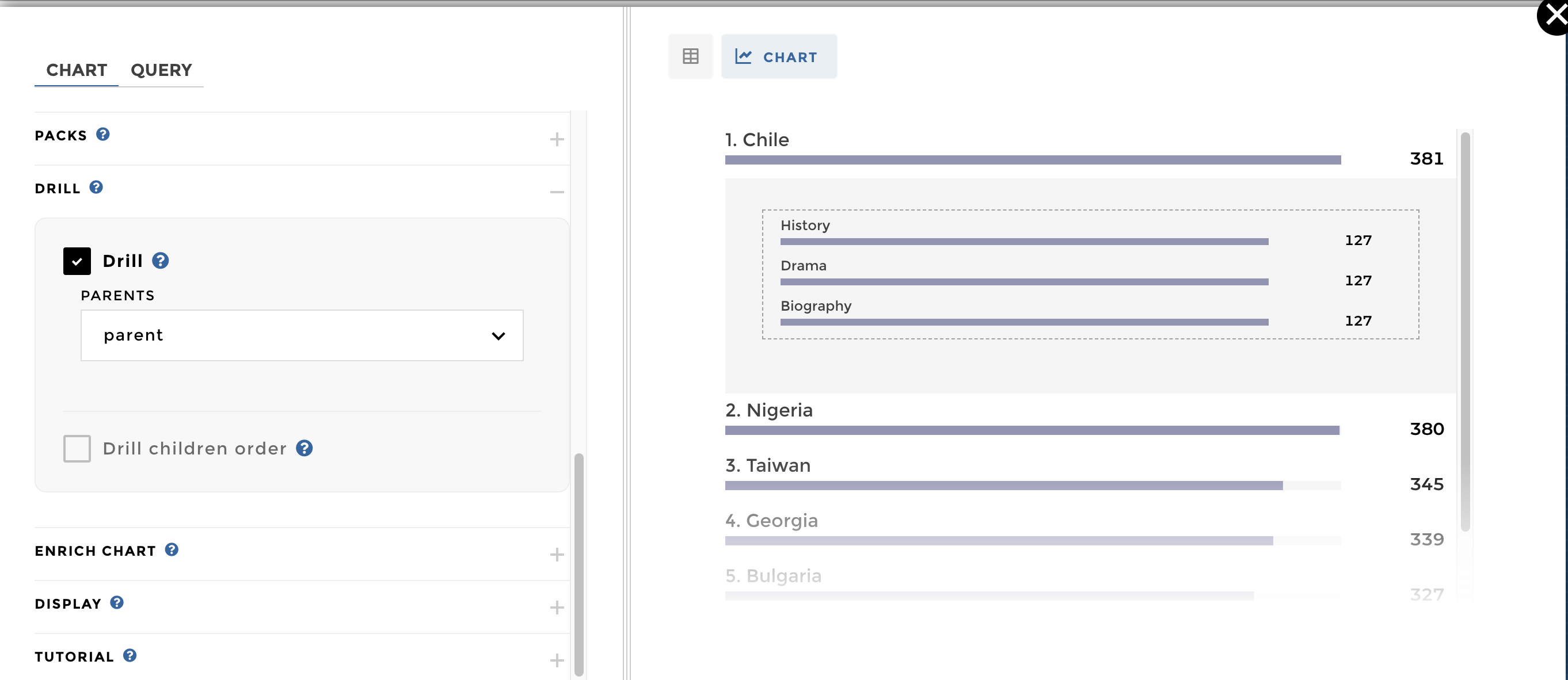
NB: By default, the order of the children will match the order of the parents. But you can set a different order for your children level on the drill options
On the Legend option, you can add a default selected view. You can
set it up by different ways: 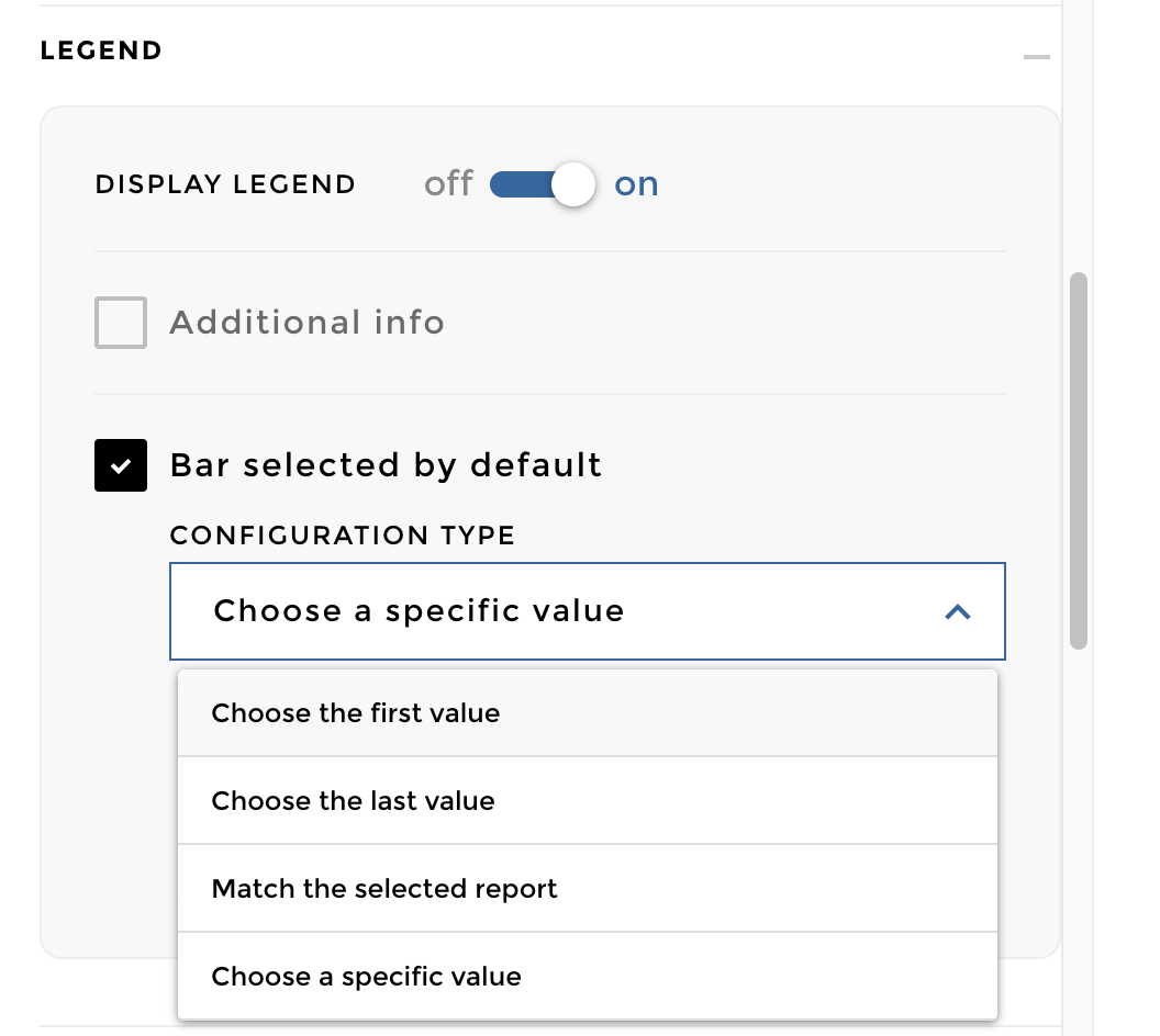
For example you can select by default the label “Nigeria”: 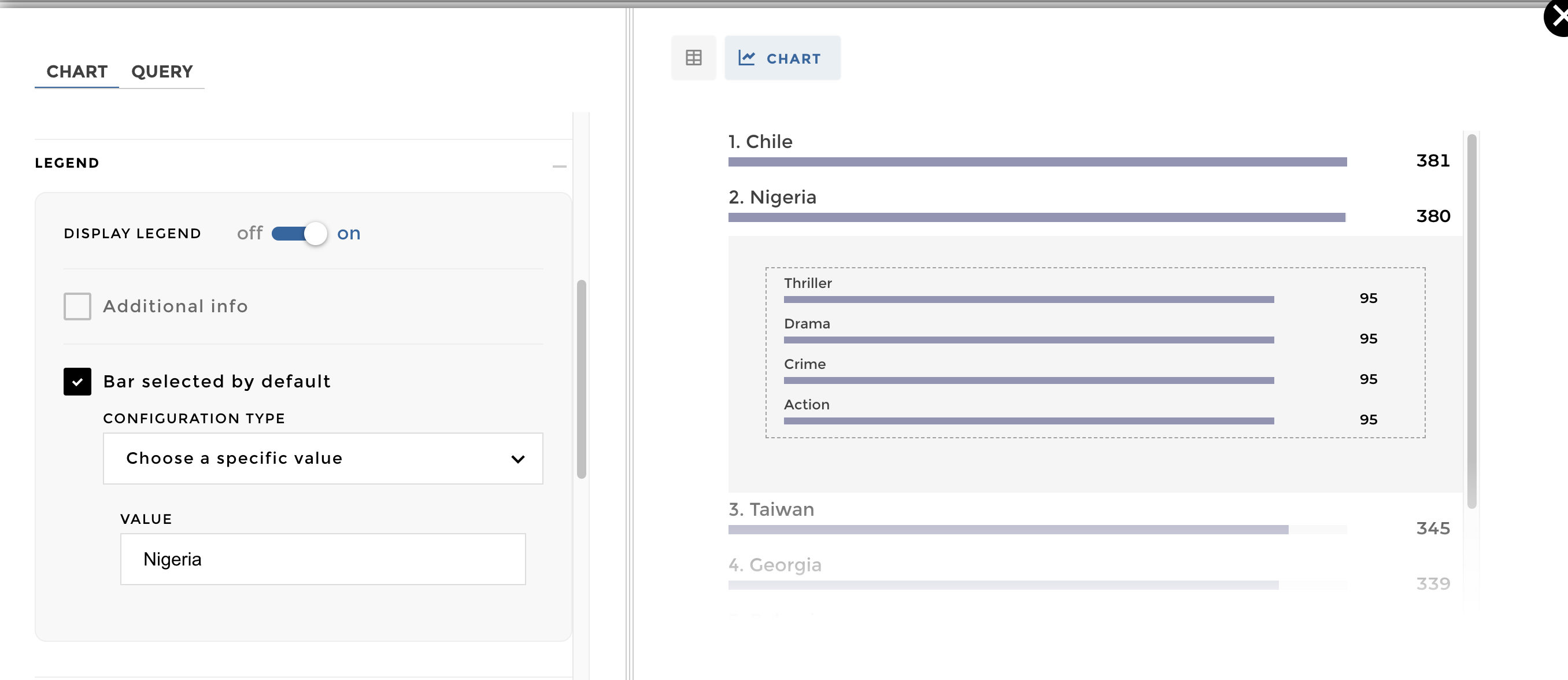
NB:When a label occurs in different packs, you can use the syntax
"Pack Name>>Label Name" to select by default a specific label in a
specific pack.
Other configuration examples in code mode
Warning
These examples are from the code mode. ⚠️ the chartOptions &
data are deprecated, make sure to use de datasets/charts
configuration.
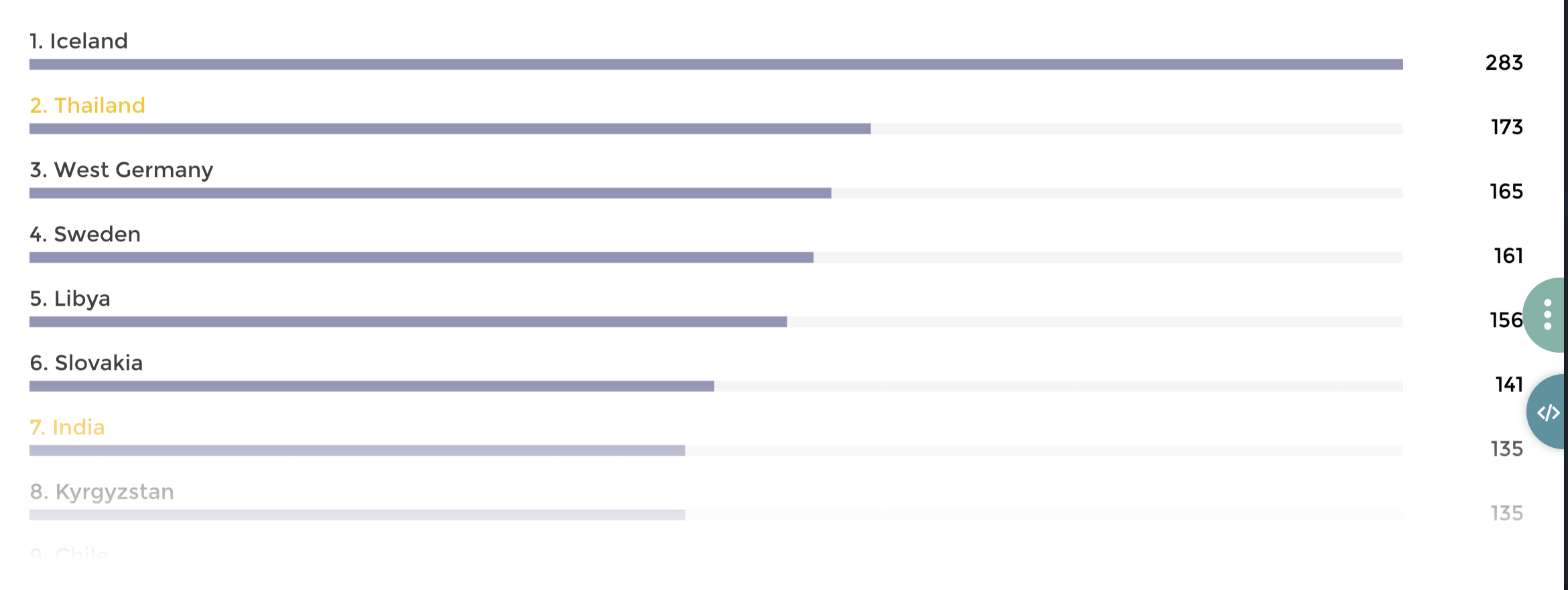
Highlighted labels on a leaderboard
Data structure:
| country | value | highlight |
|---|---|---|
| Iceland | 283 | 0 |
| Thailand | 173 | 1 |
| West Germany | 165 | 0 |
| Sweden | 161 | 0 |
| Libya | 156 | 0 |
| Slovakia | 141 | 0 |
| India | 135 | 1 |
| Kyrgyzstan | 135 | 0 |
| Chile | 127 | 0 |
| New Zealand | 122 | 0 |
Configuration:
{
    level: 3
    title: "With custom highlighted labels"
    id: 1006
    parent_id: 10

    datasets:
      my_dataset:
        query:
          domain: 'theme_country'
        highlighted: 'highlight'

    charts: [
      chartType: "horizontal-barchart"
      dataset: "my_dataset"

      value: "value"
      label: "country"
      sort: "desc"
    ]
}
A leaderboard with an average bar
Data structure >> name of the domain : time_country_filters
| country | gross | gross_variation | currency |
|---|---|---|---|
| Canada | 9.6108855 | 0.18411480279960515 | \$ |
| France | 40.0879785 | 4.616564398102196 | \$ |
| Japan | 323.50554 | 2.940738631808193 | \$ |
| Mexico | 3.105269 | 0.48366272766197 | \$ |
| UK | 91.5875932 | 2.503365780463479 | \$ |
| USA | 78.543564 | 1.053107378593496 | \$ |
| Greece | 3.707794 | \$ | |
| South Korea | 0.4011455 | \$ | |
| Canada | 8.6108855 | 0.18411480279960515 | € |
| France | 39.0879785 | 4.616564398102196 | € |
| Japan | 305.50554 | 2.940738631808193 | € |
| Mexico | 2.105269 | 0.48366272766197 | € |
| UK | 87.5875932 | 2.503365780463479 | € |
| USA | 75.543564 | 1.053107378593496 | € |
| Greece | 2.707794 | € | |
| South Korea | 0.3011455 | € |
name of the domain : time_country_average_filters
| country | gross | currency |
|---|---|---|
| average | 80 | \$ |
| average | 75 | € |
Configuration
{
  level: 3
  title: 'Leaderboard with average'
  id: 9004
  parent_id: 90

  filters: # THIS IS NEW!
    'bottom-right':
      on: 'currency'
      type: 'buttons'

  datasets:
    my_dataset:
      query:
        domain: 'time_country'
      units:
        gross: ' m$'
        gross_variation: ''
      precision:
        gross: '.1f'
        gross_variation: '.1%'
      average:
        data:
          query:
            domain: 'time_country_average'
        joins: ['currency'] # THIS IS NEW! WE SPECIFY HOW TO LINK THE AVERAGE WITH THE MAIN DATASET

  charts: [
    chartType: 'horizontal-barchart'
    dataset: 'my_dataset'

    label: 'country'
    value: 'gross'
    variation: 'gross_variation'

    sort: 'desc'

    average:
      value: 'gross'
  ]
}
We add joins: [] declaration in the dataset’s average block. If we
had 3 filters on columns filterA, filterB and filter C we would have
written:
joins: ["filterA", "filterB", "filter C"]
Here we go !