Filters & Requesters
Overview
Let the user choose what data to display by adding filters or requesters to your stories.
There are various UX components to do it: buttons, dropdowns, checkboxes or sliders.
Example
I’d like to have a button from which I can choose a country, so the chart will only display data for the selected country.
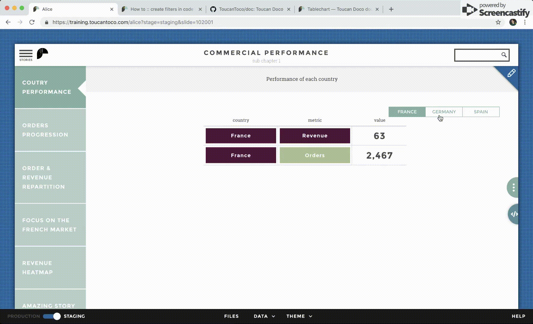
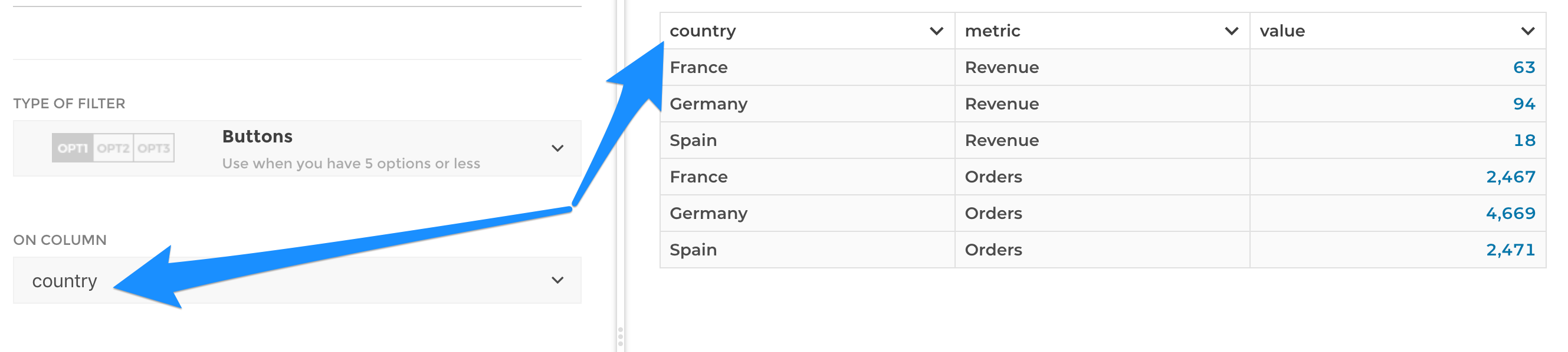
In the above example we want to slice data on the country column :
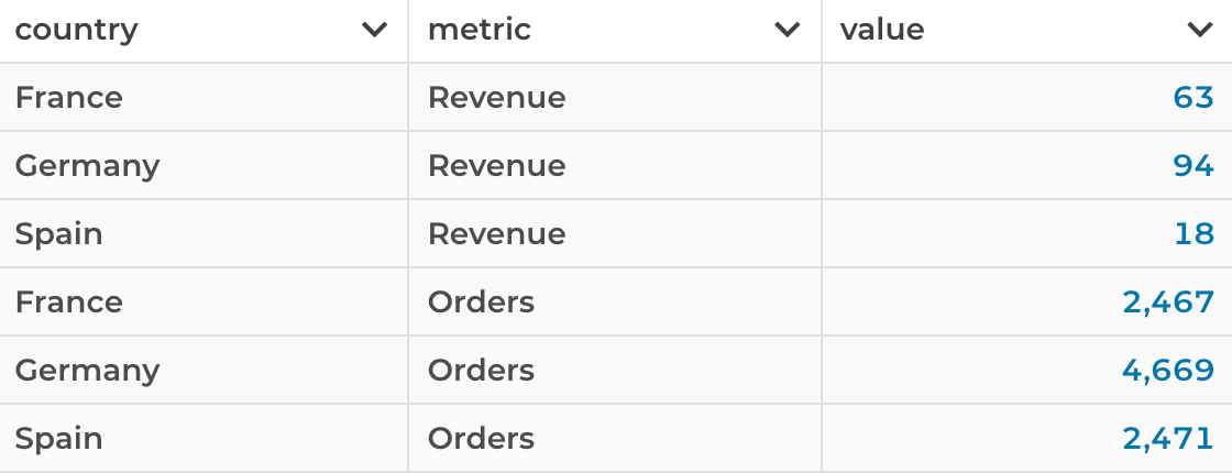
In Toucan there are two ways to do that.
Slice data with a filter
In this case, the browser retrieves the full dataset and the filtering is done client-side. Consequently :
- The transition at click is smooth ✅
- The initial query of data might be heavy if you have a large number of rows and many filters options 👎
With the following configuration you slice the domain on the on the
country column:
Slice data with a requester
In this case you are using templating to create a dynamic data query.
In this case, the browser retrieves only the dataset that will be displayed. Consequently:
- The initial query of data is lighter and the first rendering is quickier ✅
- The transition when changing the input can be less fluid as the browser has to wait for the data from the server 👎
With the following dynamic query you slice domain on the country
column:
query:
  domain:"my_domain"
  country:"<%= requestersManager.variable %>"
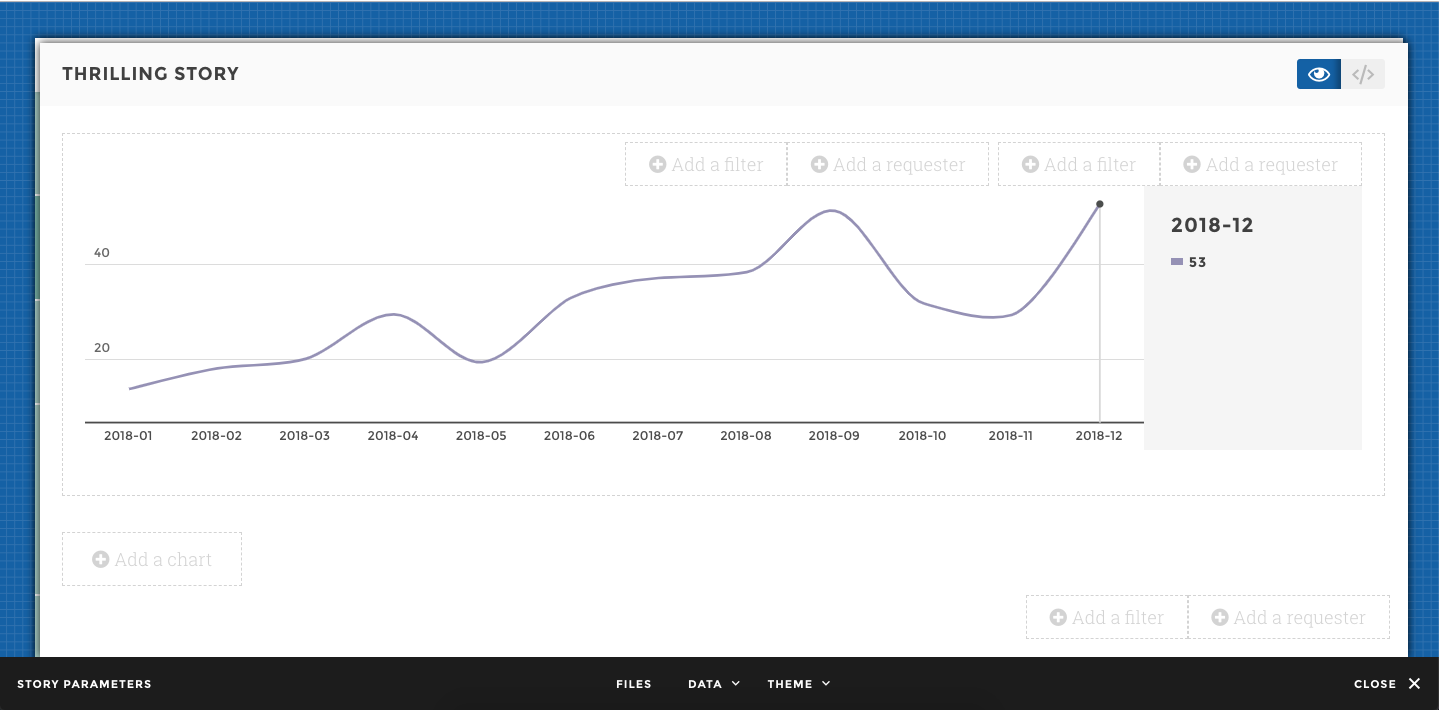
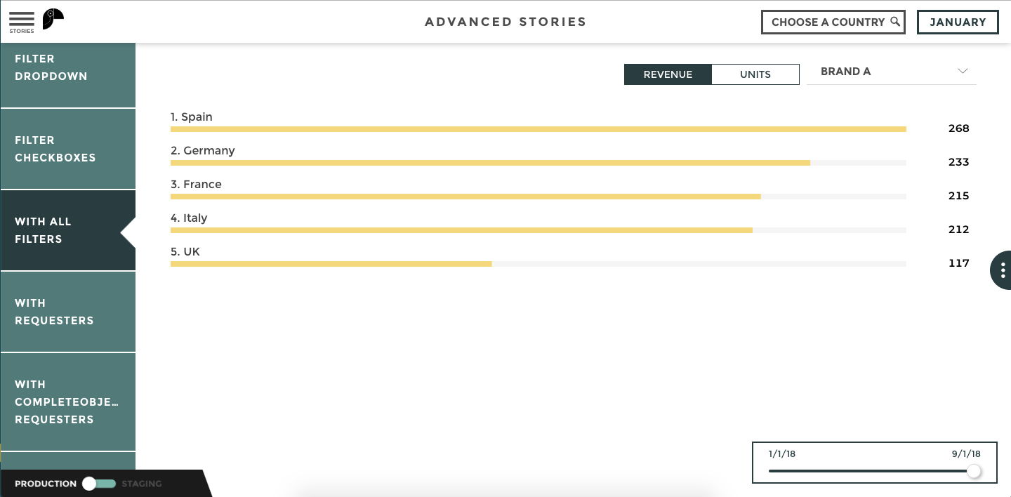
Position and types of filters/requesters
Filters or requesters can be positioned at 3 places:
- upper-right: above the legend
- upper-middle: above the chart
- bottom-right: under the chart
Filters or requesters can be:
- buttons
- dropdown
- slider
- checkboxes
- date range
Common options
These are options that are available on several filters.
reset: Adds a button to unfilter the data with the specified text.default: Choose the value that will be selected by defaultorder: by default, the order will be taken from the data. You can change that with theorderoption.dateFormat: when the values you filter are dates, you might want to specify a custom format for the display of the dates.
Let’s say you’re filtering on a column with 2 different values: “Asia” “USA”
If you also want to add a button to have all the data without filtering
on a geographic zone, you can use the reset option. Setup
reset: 'World' and you’ll have a third button with all the data.
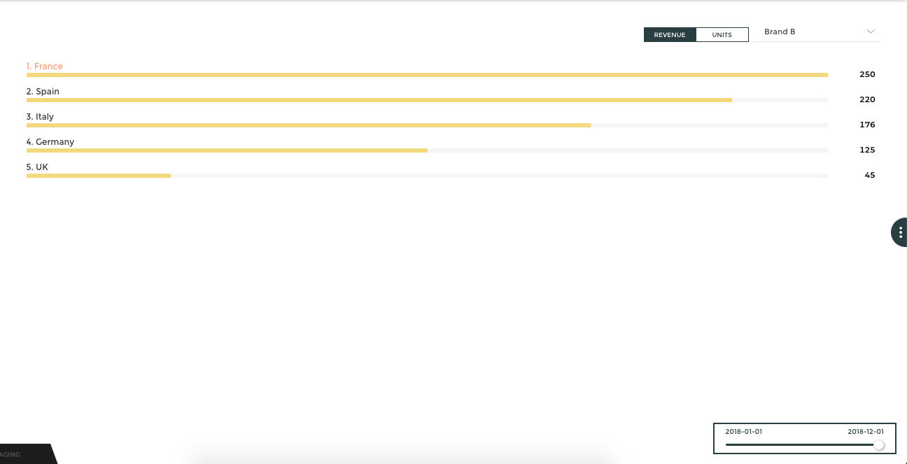
Button filters

This filter type is useful when you have a few different values to filter from.
Available options with this filter:
resetdefaultorderdateFormat
Note
Toucan’s Design Touch 🎨
We recommend maximum up to 3 values.
Dropdown filter
Use this filter when you’re filtering on more than 3-4 values. Users will be able to search through the different values with a search bar.
Available options with this filter:
resetdefaultorderdateFormat
Note
Toucan’s Design Touch 🎨
This filter type is best used in a upper right or middle position. The upwards display is not optimal when positioned at the bottom. This is why it’s called dropDOWN 😉
Slider filter

Use this filter for time-related or digital values.
Available options with this filter:
resetdefaultorderdateFormat
Slider specific option:
playStory: Use this to add a play button that will go through the different values automatically when press.playStory/activateAtInit: When the play button is activated at init, you don’t require the user to press the play button in order to have the animation.playStory/motionDuration: The duration (in ms) of each animation step, when play is activated. Defaults to 2000ms (= 2 seconds)
Note
Toucan’s Design Touch 🎨
We recommend you put the slider filter in a bottom-right position, that’s where the display is optimal.
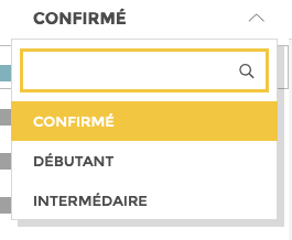
Checkboxes filter
Use this filter to compare multiple values at once
Available options with this filter:
resetdefault: The configuration for the default option is a bit special for this filter. Check below for more detailsorderdateFormat
How to configure the checkboxes default.
Let’s say the available values to filter from are : Apple, HP,
Nokia and Samsung. By default, you might want to either
include or exclude values.
- If you want all the values except
Apple:
In the studio, select the type exclude and add the value(s) you want
to exclude. Here, type Apple:
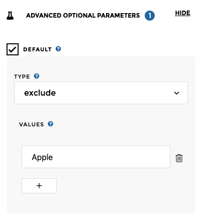
By default, your users will see:
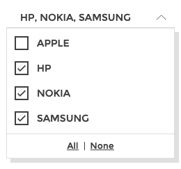
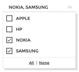
- If you want to select specific values by default, like
NokiaandSamsung:
In the studio, select the type include and add the value(s) you want
to include. Here, type Nokia and Samsung:
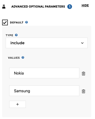
By default, your users will see:
Date Range filter (beta)
Warning
The columns used has to be Date in order to work with the “All
dates”.
When you’re handling time data, you might want to allow the user to filter on a specific date range.
Available options with this filter:
default
Date Range specific options
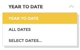
availableRanges: define the list of date ranges users will be able to choose from. By default, all ranges are computed based on today’s date. Let’s say today is: Sept. 19th 2020 Available values:Allall the dates will be selectedYTDdata from Jan. 1st 2020 until Sept. 19th 2020MTDdata from Sept. 1st 2020 until Sept. 19th 2020Last Yeardata from Sept. 19th 2019 until Sept. 19th 2020Last Monthdata from Aug. 19th 2020 until Sept. 19th 2020todaydata of Sept. 19th 2020yesterdaydata of Sept. 18th 2020customthe user will access a calendar and pick their own date range
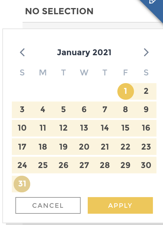
Use a custom range type to enable the calendar datepicker:
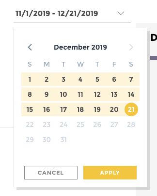
This is what the filter would look like with the ranges YTD, ALL
and CUSTOM:
referenceDatechange the default reference date. This will change how ranges are computed. By default everything is based on the current date (today), but you can use:lastDataDate: we will use the last available date in the data to base our ranges ona custom value (YYYY/MM/DD): Enter your own date.
Note
Date handling
This filter is only available on column of type “date”.
To declare a column as date, check the data query tab, “DATE” option button on the right part of the screen.
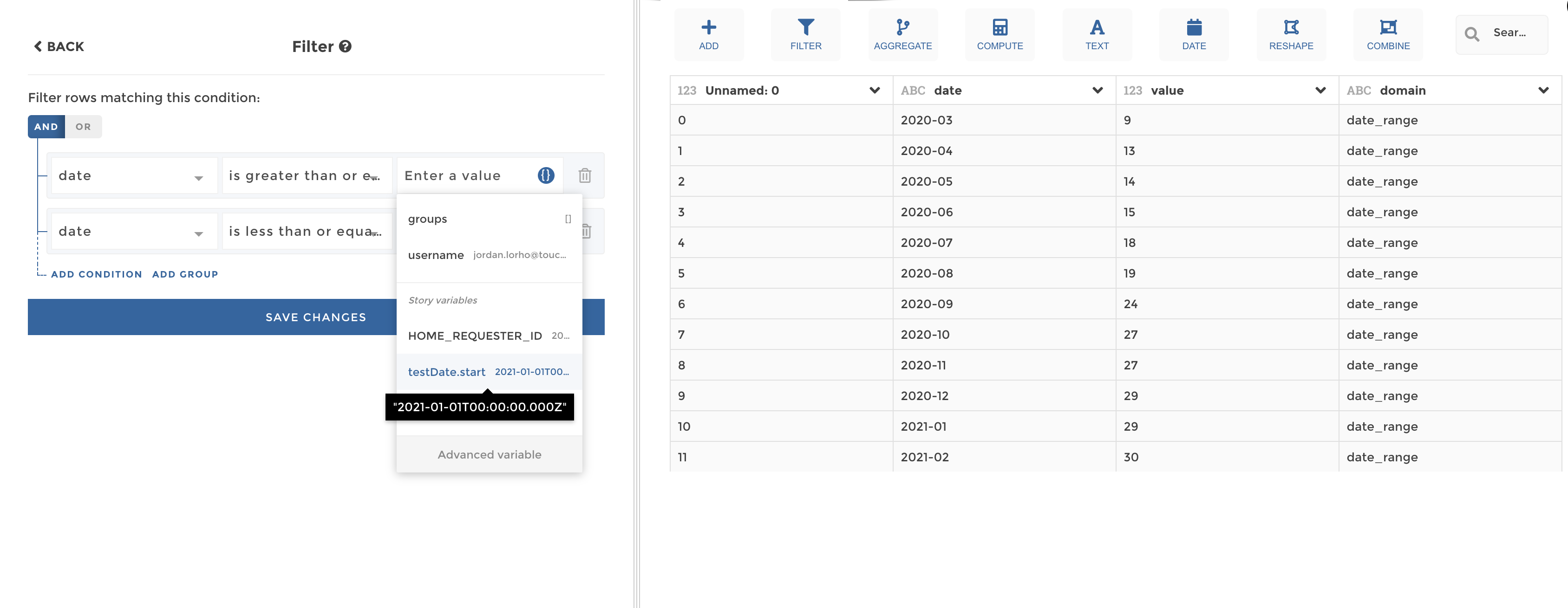
Date range as a requester
When configuring a date range as a requester, it will expose a start
and end key that give use possibilities to compare with our chart’s
dataset.
Let’s say that’s my date range requester dataset:
| date |
|---|
| 2021-01-01 |
| 2021-02-01 |
| 2021-03-01 |
And I allow user to use date picker.
We can now filter our query with date range values. In our example:
start=2021-01-01end=2021-01-31
date picker filtering
That behavior is totally compatible with completeObjectMode
(all columns available). For instance with that dataset:
| date | week |
|---|---|
| 2021-01-01 | 01 |
| 2021-02-01 | 05 |
| 2021-03-01 | 09 |
we could use the date range requester as:
testDate.date.start=2021-01-01testDate.week.start=01