Linechart
📖 Options Reference | 👩🏫 Tutorials
Purpose & Application
Generally, this visualization is used for temporal data.
📝 For example, I want to see the evolution of my sales across the year.
Linecharts are used to display a quantitative value, over a continuous duration.
Concerning this chart therefore, most often, it is used to show trends and interconnections. Linechart also help to provide a global vision of a given interval, to assess its growth over a certain period of time.
When using a line chart, it is advisable to limit the chart to 3 lines, to keep the reading simple and easy.
Toucan USP
What makes this chart a killer story?
Link 2 charts! The linechart is the perfect master chart. While navigating on your timeline, update the second chart of your story 🔄.
You have context or event explaining a change in the trend you are visualizing? Add events to your linechart 🗓️.
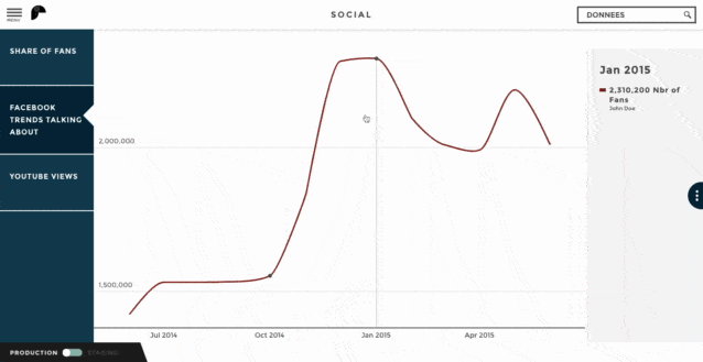
For example, we are looking at the evolution of the number of fans of a social media page. We can see an impressive increase in the number of fans. Why?
What happen to make this sudden popularity increase? Oh yes! The community management campaign! Let your user know.
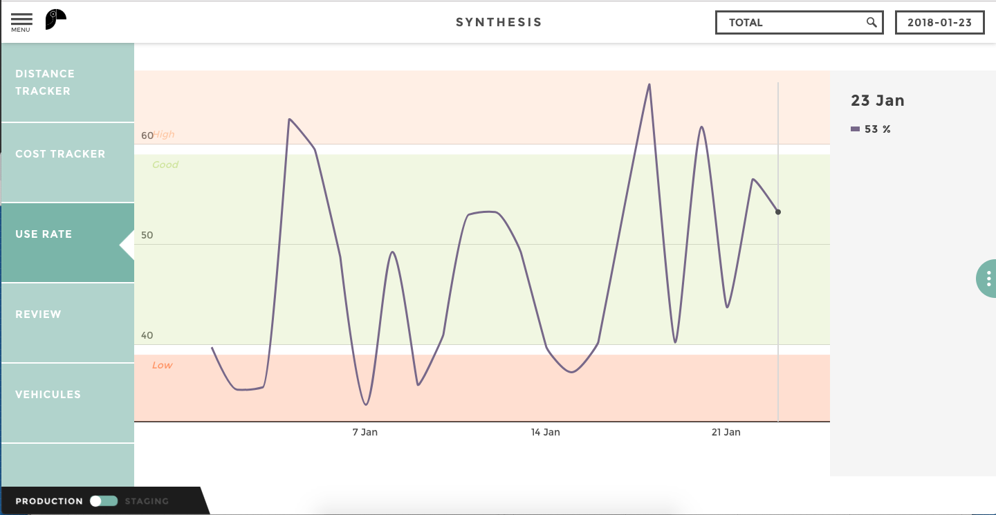
🚦 Color coding makes it easy to identify best/wosrt performer without even reading the numbers. Add sentiment zones to your linechart to identify easily when you’ve reached a critical value.
For example, I’m tracking the usage rate of new device I gave to my sales team. I can set up an expected usage rate range and analyze day by day the usage of my team on the field.