The Story
Once your users are done with your home page, they’ll move on to stories to get more detailed insights.
What is a Story?
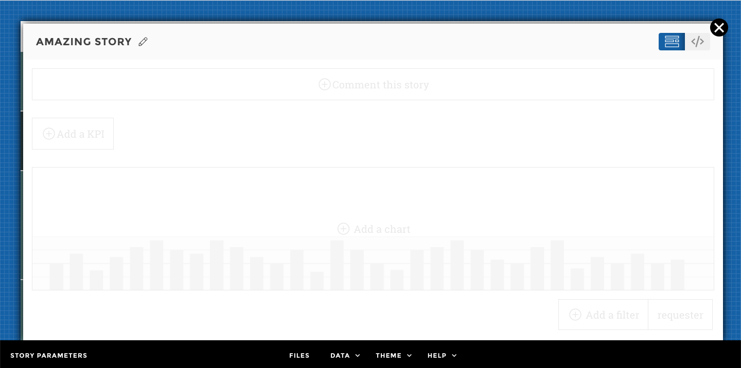
A story is a viz/chart plus some context elements (narrative, tips, sources…).
Reading a story, I should be able to serve a clearly established business need. As a contributor or data storyteller, we are familiar with what we’re doing, so things appear evident. It may not be the case for your users. Teach them, take them by the hand, and make them comfortable reading complex information.
With the Studio, in just a few clicks select some data and a type of viz. Follow the Studio’s guidelines to customize your viz with all the available options.
The Chapter
Stories belong to a chapter and sometimes even to a subchapter. This structure is very important in your data story telling, it helps the users read important and complex information.
Chapters are available in the left-hand panel (expand by clicking on the burger icon).
Your Story title
Warning
⚠️ The HTML content is sanitized for safety reasons and some tags or attributes are forbidden. <br/> Those forbidden tags and attributes are escaped hence some raw HTML code may be rendered. We recommend not using deprecated HTML tags and attributes (see the https://developer.mozilla.org/en-US/docs/Web/HTML/Element#obsolete_and_deprecated_elements).
Don’t forget to name your story 🙂
Choose an explicit, short title that helps the users understand what they will be looking at.
Your Chart
Just like for tiles, you create a chart in 2 steps:
- By choosing data from the Dataset Editor
- By configuring your viz from the Charts Parameters
Note
Dataset Editor
- 📝 I want to show the evolution of my revenue, which dataset contains this information?
Get a clear overview of your data and carry out small adjustments to help your user understand what he/she’s looking at.
- 📝 Is my revenue in $ or M$? Is it worse or better now than last month?
From the interface, click on the column header to configure:
- units
- precision
- sentiment/color coding
- and much more…
Use the dataset viewer window to see the results of your configuration in real time.
💡 Did you know?
You can use Toucan Toco to adjust and enrich your data? Need to add calculations to your existing dataset? Want to add evolution to a specific metric? Merge datasources? 📖 Check out the data section of our documentation.
But just so you know, you will not find a tutorial in the trial session. Nonetheless, you can find all the informations following this link : 🙂
Chart Parameters
This is where you choose which chart you want to use.
Start by selecting a type of chart from the dropdown menu.
.
Then follow the placeholders to enter the chart’s parameters. Don’t forget to use the preview window to check your changes in real time.
.
These are parameters required for the chart to be drawn.
- For example, you can not create a chart without a
valuecolumn.valueis the column containing the data. - The
linetile will not show up without adateparameter
These are, well, optional parameters you can configure to enhance your chart.
- For example, in the leaderboard I can choose to sort my bars
Enrich Your Story
Help your users understand what they are looking at. Pedagogy and context are very important.
You can add the following context :
- Glossary : define terms, or explain KPIs from the collaborative menu
- Narrative : explain how to read the story.
- Source : tell where the data is coming from.
- Tip : add videos, external links, or push recommendations from this menu.