The Home
What makes a good Home ?
The Home is the first thing your users will see. Sometimes, it can also be the only thing they’ll have time to see.
Imagine your manager going into a meeting and in the elevator he/she wants to see the latest numbers.
Think of the top indicators that will make your user a rock star in any situation.
Here are a few tips for you to keep in mind when building a home page:
- Understand your user’s needs before you start
- A home page is not exhaustive, it can change and be updated
- Choose meaningful indicators that tell a story
- One indicator = one message
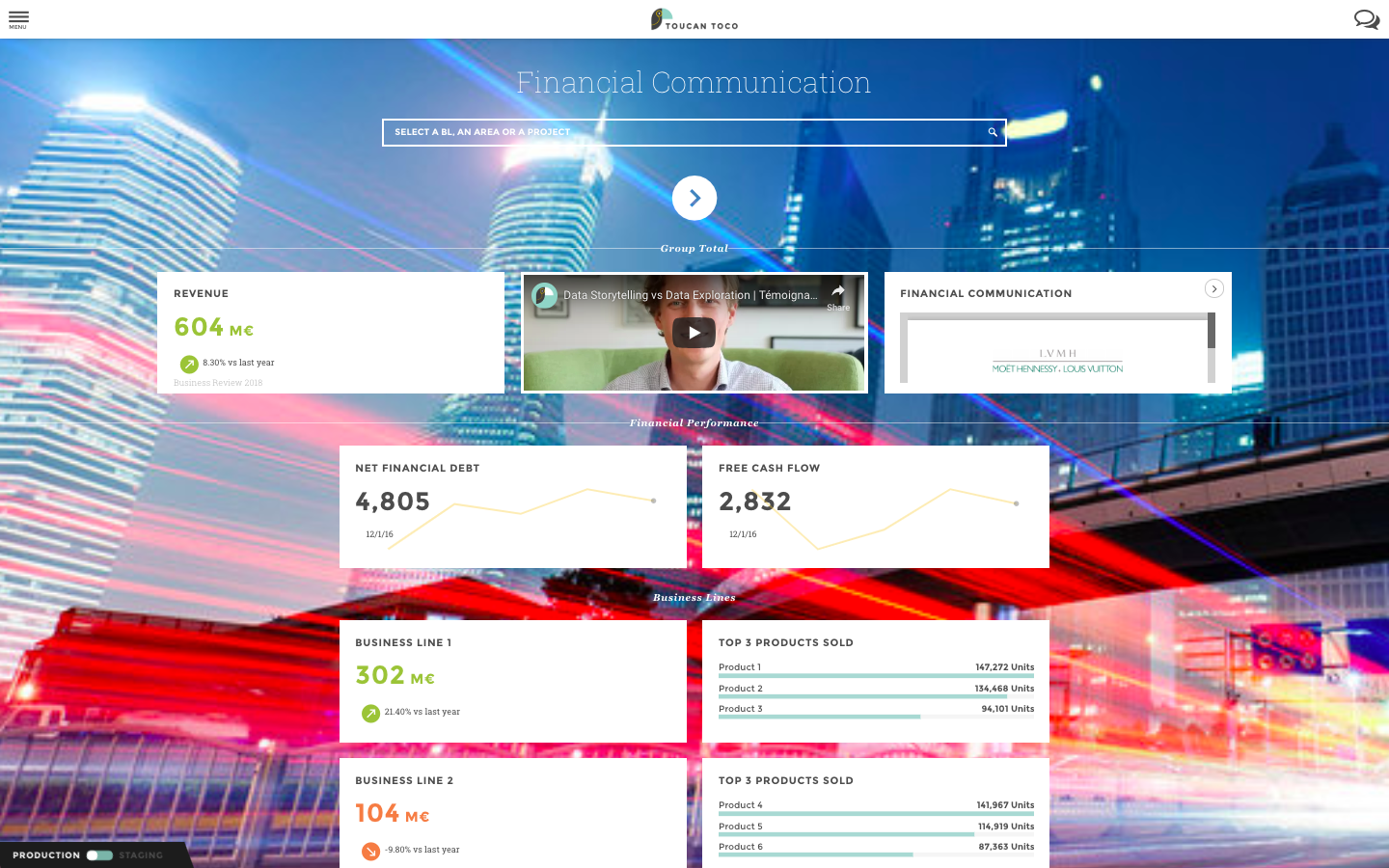
Your Home title
Would you read a book without a title?
Give your home a title in a few cliks. Let your users know what this is all about.
- Are you doing some “Retail monitoring”, some “Brand management”?
Your Home categories
To be readable and understandable by all, your home page should be organized.
Use categories as a reading grid to help your users better navigate through all the indicators at their disposal.
Your Home tile
What is a Tile?
A tile is a small box containing data you want to display. See it as a mini viz/chart with limited options that will be displayed on the home page.
Tiles are not only diagrams, but can also be media or editorial content like text, images or videos.
Several indicators are presented on the homepage. As a consequence, the homepage needs to be as clear and concise as possible to catch the user’s attention. Therefore, you cannot use regular charts that require more space here like you would in stories. We’ve crafted a set of small visualizations specially designed to be overseen and yet understood in a glimpse: we’ve called them tiles.
Tiles are a much more limited than regular charts to make sure you keep your home as lightweight as possible.
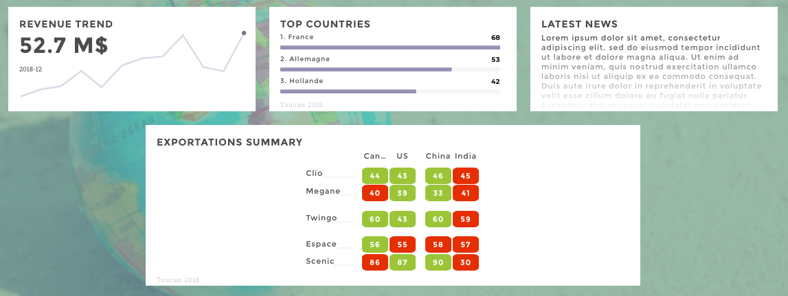
tiles
How to Create a Tile?
You create a tile in 2 steps:
- Choosing data from the dataset editor
- Configuring your tile’s parameters
Dataset Editor
- 📝 I want to show the evolution of my revenue, what is the dataset containing this information?
Get a clear overview of your data and carry out small adjustments to help your user understand what he/she’s looking at.
- 📝 Is my revenue in $ or M$? Is it worse or better now or last month?
From the interface, click on the column header to configure:
- units
- precision
- sentiment/color coding
- and much more…
This is important to help your users understand what they are reading.
Use the dataset viewer window to see the results of your configuration in real time.
Did you know?
💡 You can use Toucan Toco to adjust and enrich your data Need to add calculations to your existing dataset? Want to add evolution to a specific metric? Merge data sources? 📖 Check out the data section of our documentation.
Tile Parameters
This is where you choose which chart you want to use. Start by selecting a type of tile from the dropdown menu
Then follow the placeholders to enter the tiles’s parameters. Don’t forget to use the preview window to check your changes live.
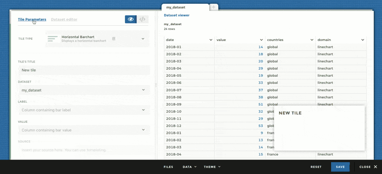
tiles menu
These parameters are required for the chart to be drawn.
- For example, you can not create a chart without a
valuecolumn.valueis the column containing the data. - The
linetile will not show up without adateparameter
These are, well, optional parameters you can configure to enhance your chart.
- For example, in the leaderboard I can choose to sort my bars
📖 Go further and learn More about all tiles options from the reference.