Guided exercises
Find below guided exercises to help you get started on the studio.
Tiles exercises
Let’s create 3 tiles together that you’ll be able to customize with your own data later on.
- Click on Add a tile
After clicking on Pick some data select the tile-trend dataset.
Then go to the Tile to configure a line tile (select line from the dropdown menu)
- Add a title like “Revenue Trend” for example
- Do not touch the
dataset: my_datasetparameters. This is how the chart knows which data to use - For value, select the column of the dataset containing the line value; value
- For date, select the column of the dataset containing the line dates; label
- Check out the preview and Save when you’re done!
It should look like this:
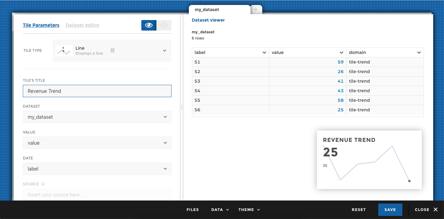
tile line
- Click on Add a tile
No need for a dataset to build this type of tile, go directly to the Tiles.
- Select a video tile from the dropdown menu
- Choose Youtube as a video provider
- Copy paste this video id to add a nice Toucan video to your app: fM6356ZAdM4. Note that the id of a video can be found in the video’s url, right after the equal sign: https://www.youtube.com/watch?v=fM6356ZAdM4
- Check out the preview and Save when you’re done!
It should look like this:
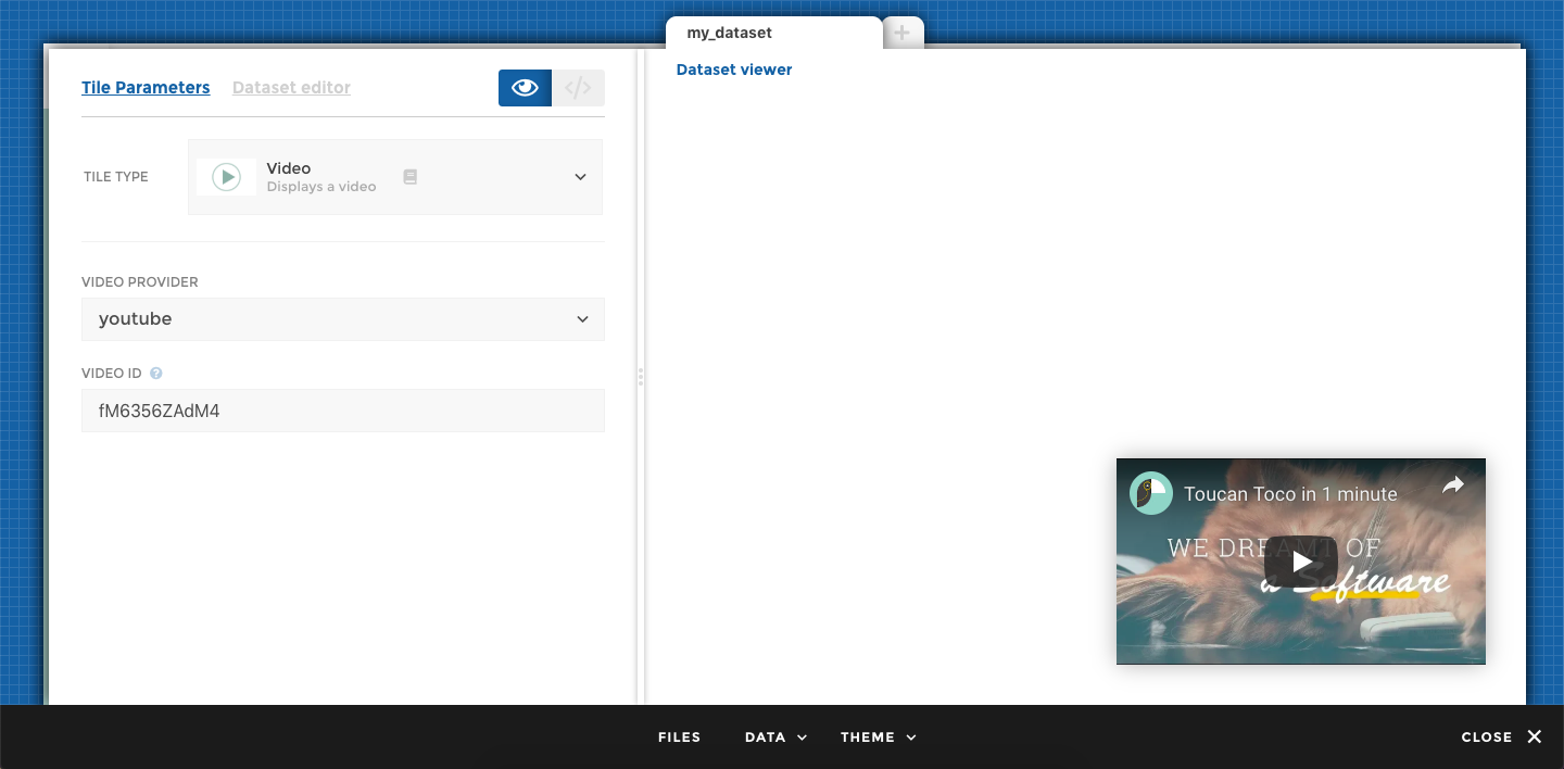
tile video
- Click on Add a tile.
No need for a dataset to build this type of tile, go directly to the Tile.
- Select a text tile from the dropdown menu
- Add a title like “Monthly newsletter” for example
- Add a text to display, something like this for example: “This can be a lovely newsletter written by your team! Amazing!”
- Check out the preview and Save when you’re done!
It should look like this:
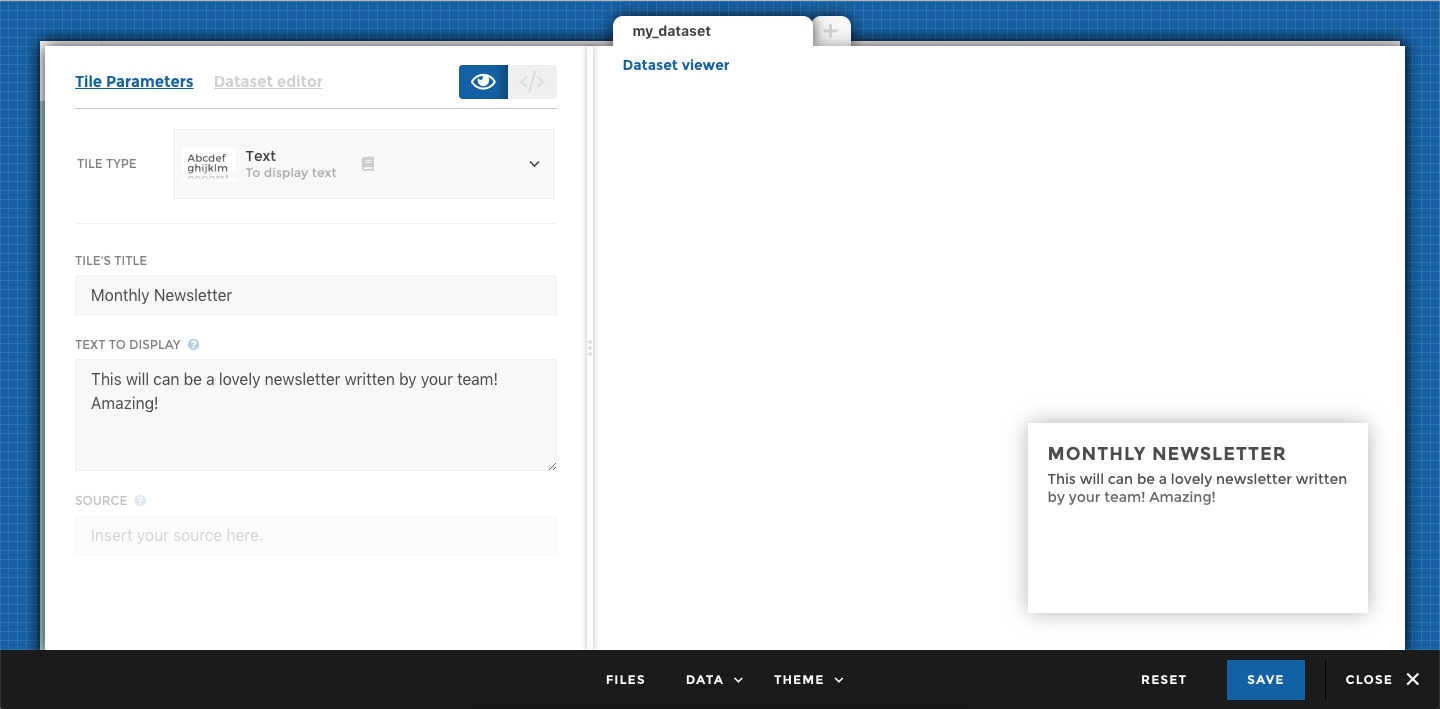
tile text
Charts exercises
👥 User stories : I’m a Sales manager and I would like to see my revenue trend.
📐 Design : I need to see a trend of my revenue, let’s do a line chart !
- Click on Pick some data and select the story-trend dataset
- Get a preview of what the data looks like before moving on
- Let’s add some units to tell the user the revenue is in $
- Click on the revenue column header
- Select Configure units
- Type in ” $” (make sure to leave a space before the $)
- Click on Chart
- From the dropdown menu choose to create a line chart
- Do not touch the
dataset: my_datasetparameters. This is how the chart knows which data to use - For value, select the column of the dataset containing the line value; revenue
- For date, select the column of the dataset containing the line dates; weeks
- Check the preview to take a look at your awesome chart!
- Click on Close to finish editing your chart
Note: You can click on the doc/book icon to get more info on this chart
- Add a Narrative: “Weekly evolution since January”
- Add a Source: “Toucan Toco”
- Check the box to add a Tip:
- Type in the following Title: “Info”
- Type in the following Text: “You can add images and video, or links to other information. Made for action! This is Toucan!”
- Click on Save to save your all story
- Open the on Action Menu on the right hanside of the story preview to create a Glossary
- Click on Add new definition:
- Type in a Term name, let say “Revenue”
- Add a definition, “All stores combined” for example
- Un-check the option to “Make entry available on all stories”
- Don’t forget to admire your work 🙂
See how fast you created a powerful story: a meaningful viz with context info to help your user and without having written a line of code!
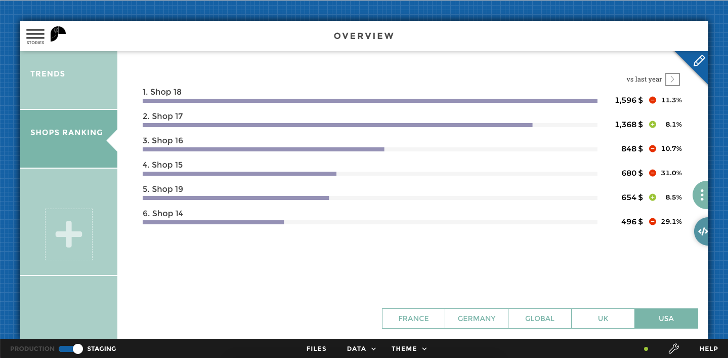
👥 User stories : I’m a Sales manager and I would like to know which stores are performing best globally and regionally
📐 Design : I need to rank my shops, and I need to be able to select a specific country. Let’s do a leaderboard and add filters on my region
- Click on the big + sign, on the left, to add a new story.
- Rename this story: “Shop ranking”
- Click on Edit a story to continue the adventure!
- Click on Add a chart and follow the steps below to create your very own leaderboard!
Let’s continue with the data:
- Click on Pick some data and select the story-performance dataset
- Get a preview of what the data looks like before moving on
- Let’s add some units to tell the user the revenue is in $
- Click on the revenue column header
- Select Configure units
- Type in ” $” (make sure to leave a space before the $)
- Let’s add some precision to tell the user the
evolutionis in % - Click on the evolution column header
- Select Configure precision
- Type in “.1%”
Let’s continue with the chart:
- Click on Chart
- From the dropdown menu choose to create a horizontal bar chart
- Do not touch the
dataset: my_datasetparameters. This is how the chart knows which data to use - For label, select the column of the dataset containing the name of the shops; shops
- For value, select the column of the dataset containing the value to be represented by the bars; revenue
- Click on Show Optional Parameters
- Add a variation using the “evolution” column
- Add a variation legend, “vs last year” for example
- Sort your bars
- Check the preview to take a look at your awesome chart!
- Try using the arrow above the evolution to resort your shops based on their evolution vs last year. Pretty cool…
- Click on Close to finish editing your chart
Crazy how fast you created a viz truly “made for action”, right? We can go even further.
Remember: You can click on the doc/book icon to get more info on this chart
Let’s add a filter to the chart:
- At the bottom-right of the chart, click on Add a filter
- You can see on the right the preview of the dataset used to created your leaderboard above
- You can select between several type of filter. Today let’s keep the button type
- We want the user to select a specific region to rank the shops, so let filter on column “region”
- Click on Save
- Check out the preview!
Feel free to add Story parameters just like you did above
After doing your final changes, check out the preview, and click on Save when you’re done.
tile line
What Did You Accomplish?
- As a Sales regional manager you can now easily rank your best and worst performers overall and by region
- You can give direction and make appropriate business decisions
- Users know how to get the best out of the chart thanks to the narrative and they know the source of data
- We can tell that Shop 21 is your best performer but shop 2 made the most progression, when I select Global from the filter
- We can also identify that shop 5 is losing a lot of revenue
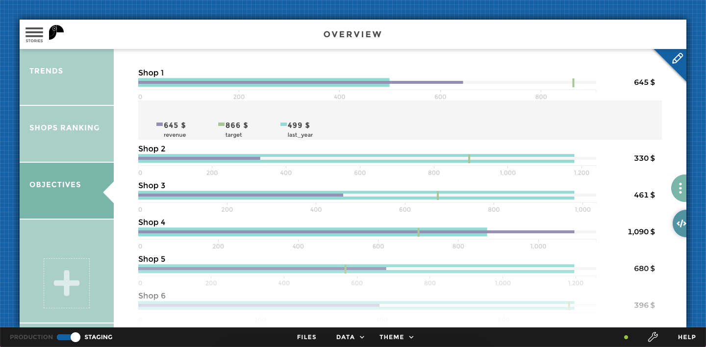
👥 User stories : I’m a Sales manager and I would like to know if my stores are reaching targets and last year’s numbers.
📐 Design : I need to align results against a target and another comparison value, let’s do a bullet chart!
- Click on the big + sign, on the left, to add a new story.
- Rename this story: “Objectives”
- Click on Edit a story to continue the adventure!
- Click on Add a chart and follow the steps below to create your very own leaderboard!
Let’s continue with the data:
- Click on Pick some data and select the story-objectives dataset
- Get a preview of what the data looks like before moving on
- Let’s add some units to tell the user the revenue is in $
- Click on the revenue column header
- Select Configure units
- Type in ” $” (make sure to leave a space before the $)
- Do the same for the target and last_year columns
Let’s continue with the chart:
- Click on Chart
- From the dropdown menu choose to create a bullet chart
- Do not touch the
dataset: my_datasetparameters. This is how the chart knows which data to use - For value, select the column of the dataset containing the value to be represented by the bars; revenue
- For label, select the column of the dataset containing the name of the shops; shops
- For target, select the column of the dataset containing the value to be represented as a vertical tick on the bars; target
- Click on Show Optional Parameters
- Add a comparison using the “last_year” column
- Check the preview to take a look at your awesome chart!
- Click on Close to finish editing your chart
Crazy how fast you created a viz truly “made for action”, right? We can go even further.
Remember: You can click on the doc/book icon to get more info on this chart
Feel free to add Story parameters just like you did above
After doing your final changes, check out the preview, and click on Save when you’re done.
tile line
What Did You Accomplish?
- As a Sales manager you can now easily tell which stores are over/under as performing compared to last year
- You can give direction and make appropriate business decisions
- Users know how to get the best out of the chart thanks to the narrative and they know the source of data
- We can tell that Shop 4 is over reaching its target but shop 2 needs some help
Theme
- Change a color or two by copy-pasting your own hex code(s)
- If you don’t have any hex codes in front of you, just scroll down the menu to select a predefined color scheme
- Change the
Home backgroundimage to update the background of your app. Just drag and drop an image on theHome backgroundtile - Update the
Home Logoby dropping your company logo onto the corresponding tile - Close the asset menu
- Refresh your home page, and your images should be updated