Value tile :: configuration examples
Tip
Hello! 👋 If you are here, it’s probably to learn more about the Value Tile! You’ve come to the right place :)
You will find below a tutorial to learn progressively about the Tile Value.
Are you ready? On your data… Ready? Go! 🏁.
Step by step tutorial
The user story
I am a manager or director in a company. I manage my teams or my department using key performance indicators. I wish to have at hand, an access and a fast vision on a priority indicator in order to pilot the activity:
- What is the value of my indicator?
- Is this indicator positive or negative, in relation to a target or a variation?
- What is the variation of this indicator compared to a previous period?
Pick some data
This dataset is used for all the following examples
| country    | nb_films | evo_LY | nb_films_LY | rating_value |
|------------|----------|--------|-------------|--------------|
| France     | 1845     | 0,025  | 1800        | 0,6          |
Note
The objective of a Tile Value is to highlight an indicator, and possibly its evolution.
This is why the Tile Value only accepts one line of data! If you have more than one, you will have to aggregate or delete lines.
Tiles parameters
Requirements
- You should have one dataset imported into Toucan, and one line of data so far.
- Create a New Tile in your Home and link it to your dataset.
- Select Value in the dropdown Tile Title.
Then we can start! 🙌
- First, give an understandable title to your Tile
- Fill in the
valuefield with the column containing the value to be displayed, for instancemy_dataset.nb_films
You notice that the name of the dataset precedes the name of the column. This syntax indicates that only one value (the row) is called, not a whole dataset. This is what we want to do here.
Add a source
Congrats, you’ve just built a nice tile !
Let’s add som information on it, for example a Source to inform the user of the origin of his data.
Note
You can use HTML here (or even Toucan Templating), but don’t abuse it ;)
It can be useful to display dynamic information.
Add units
One of the best practices in data storytelling is to always add context. 💡👌
- Click on the column on which you want to add units
- Click on Configure units
- Type your unit and save
Here we are! 👌
Note
It is recommended to type a space before the unit, it makes it prettier to look 👀
Add a badge and a comment
You would love to add more contextual information, dynamic or static, under your indicator right ? Or even an icon to indicate the variation of your numbers ?
Guess what! It’s possible 🔥
- In the
badgeparameter, just type yourdataset_name.column_namethat contain the variation you want to display ( +, =, or -). - In the
commentparameter, just type the text you want to display.
Here is an example of static text and a positive variation badge, based
on the evol_LY (evolution last year) of our dataset attached to this
tutorial. evo_LY is 0.025 but Toucan displays 0 because we have not
yet configured the precision ;) You’re going too fast 🚴🚀
Add dynamic comment and precision
That’s great but I would now like a comment based dynamically on my dataset! Let’s try to configure precision too.
In our example : .2% means that’s my data is percentage (%), and
that I want 2 units after decimal (.2).
Here’s the syntax for the dynamic comment based on a column! We are using
<$= my_dataset.evo_LY $> vs last year
Add sentiment
Colors !! 🎨 In Data Storytelling, colors are important to help the users understand the meaning of graphs and numbers.
Am I positioning myself well? Have I achieved my goals? What area is at risk on my map? Let’s try to put some colour in our tile!
- Click on the column on which you want to put the sentiment, the color coding
- Create one or many limits
- Configure the
sentimentparameters with the column on which the sentiment has been applied
Congrats, you just built an awesome and complete value tile 👏
You are ready to rock with your app! 🔥
Bonus: Add with stars rating ⭐️⭐️⭐️⭐️⭐️
We couldn’t leave you like that without reaching the stars…
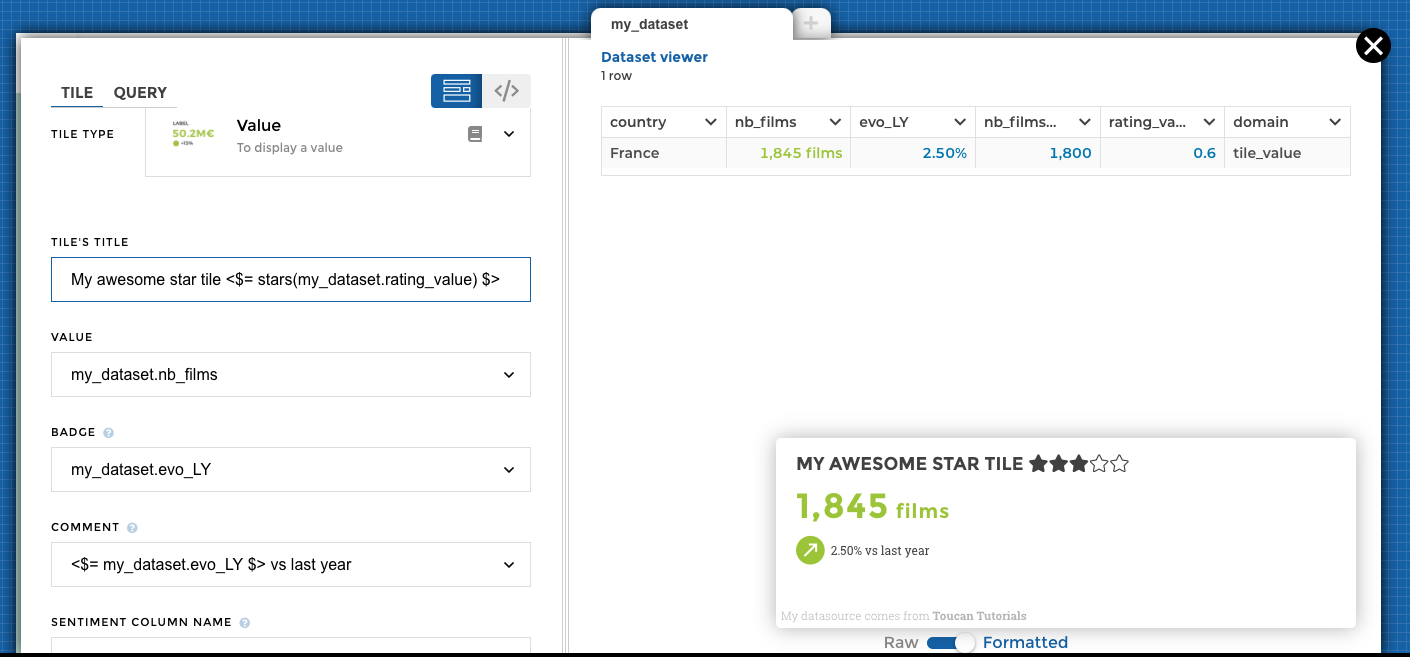
In the Name parameter, you need to add the following syntax :
<$= stars(my_dataset.rating_value) $>
my_datasetis the name of the dataset containing the rating value. You can find the name of your dataset on the tab above the preview of your data. If you didn’t change it, it’s by defaultmy_dataset.- This means, you can select a different dataset than the one you use to build your value tile.
rating_valueis the column name containing your rating value.
The rating value must be between 0 and 1.
The stars will be completed depending on the value :
- 1 => all five stars will be completed
- 0 => no star will be colored in the title
- 0,5 => 3 stars will be colored in the title