How to :: Build a Toucan App
How to build the best small-app?
Discover dataviz
Choosing the type of viz to use, to represent your data in business is not an infused science, there are no rules you can blindly follow. Choosing a poor visualization can lead to audience confusion or data misinterpretation.
At Toucan we work with you to build the most meaningful stories.
Stories concerning your business, your performances.
Below are our 5 steps we recommend you keep in mind when building your graphics
Go further
Discover dataviz in 6 minutes
Read this blog article to get a complete tour of dataviz principles in 6 minutes. (🇬🇧 English version coming soon)
Know everything about dataviz
Read this blog article to know everything there is to know about dataviz. (🇬🇧 English version coming soon)
Step 1 : Prioritize your indicators
Clear and evident reporting
This means comprehensiveness is your first enemy. Too often, the lack of objectives planning, causes us to create graphs with all of our available data.
Start with the basics, look at information one by one before cross-analyzing it.
Step by step and don’t forget the obvious 🎯
Define a clear scope
It is vital that you define your audience, their needs, and select the most important indicators.
Once defined, stick to your perimeter, and any ideas coming out of your scope should be addressed in a new reporting.
Step 2 : Design first
Schematize your graphics
During this second step, do not invest your efforts in the results. Make paper diagrams with real indicators.
Think of yourself as the architect of the story. Get a global vision, make sure everything flows.
The story you’re sharing should be spontaneous and natural.
Iterate
Speak with your audience, and define with them, the improvements to be made and the usefulness and value of the graphics you are building.
Iterate as much as possible, until you come up with a relevant reporting.
Keep in mind that, to create a good reporting, one rule is relevant : a graphic = a message.
Step 3 : Integrate your data
Define
Once you have prioritized your indicators and schematize your graphics, it is time to integrate data, following the graphics and message you have defined.
This might lead to surprises or questioning about the results, and this is an opportunity to renew your feedback process with your employees or associates.
Define for each story the data you need: what time period? which level of detail? which currency? what type of evolution?
Gather and connect
Identify the sources of data and put your graphics to life!
Step 4 : Tell a story
If you can quite remember, a graphic = a message; therefore, data visualization should not stop only at curves and bars.
What we call data storytelling, is the ability to tell a story with data, with the aim of simplifying its understanding.
This phase requires a thorough contextualization: narrative, a legend, suitable colors, a glossary…
Allow your interlocutors to fully understand the message you are conveying.
Remember, don’t forget the obvious 🎯
Step 5 : Good reporting is actionable
Whether it is for the management of commercial performance or financial communication, it is important to present your department’s performance indicators in a way that it will lead to taking actions.
For example, let us imagine the financial department has not achieved its objectives. How possible is it to help them? What were the performances at n-1? Is a problem of seasonality or under-performance due to the absence of one of the sales representatives?
Collect the data and share them into action points.
And don’t forget to use Toucan’s made to action features like the tips, or the possibility to send notifications based on KPIs values.
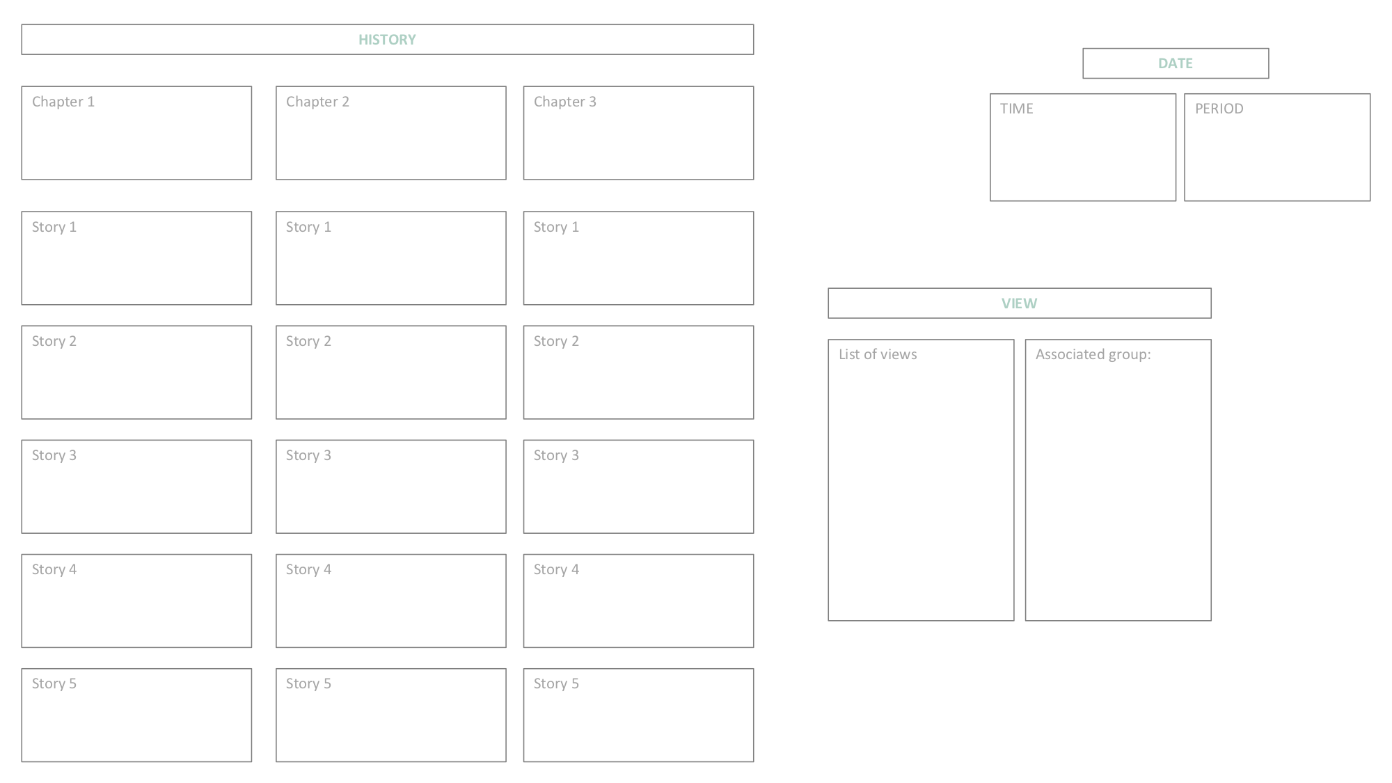
Draw the skeleton of your app
When you launch a new project, you need to think about these three cornerstones at first:
Do you need a view?
The VIEW you choose is very structuring. You have to focus on it first!
It allows users to filter the content of the entire app (a geographic or business segmentation for instance). Or it could address different users.
Do you need a date requester?
Then the DATE REQUESTER is also very structuring. It should be the second thing you choose
- Time: You wan to display a datetime (ex: March 2019, S3 2019…)
- Period: You also want to allow your client choosing a period (ex: March 2019 - Current month, Marche 2019 - YTD…)
How to structure my story?
And finally you have to draft the entire structure of the history you’d like to tell:
- Chapters (between 2 and 4 according the topic)
- Subchapters (not mandatory)
- Stories (one need = one story)
Don’t hesitate to fill this canvass to help you finding the good story !