How to :: Build mobile first small apps
30% of users are on mobile
That’s what we observe across thousands of users and multiple years (smartphone and tablet). Of course this will highly vary from one app to another. But this proportion is growing, and fast: you should take this into account each step of the way when building a Toucan app.
“Unify through insights” will only be possible if we deliver insights where its most needed. And what could be better than making it available on the pocket of each decision maker in a company?
Toucan small apps are mobile-first
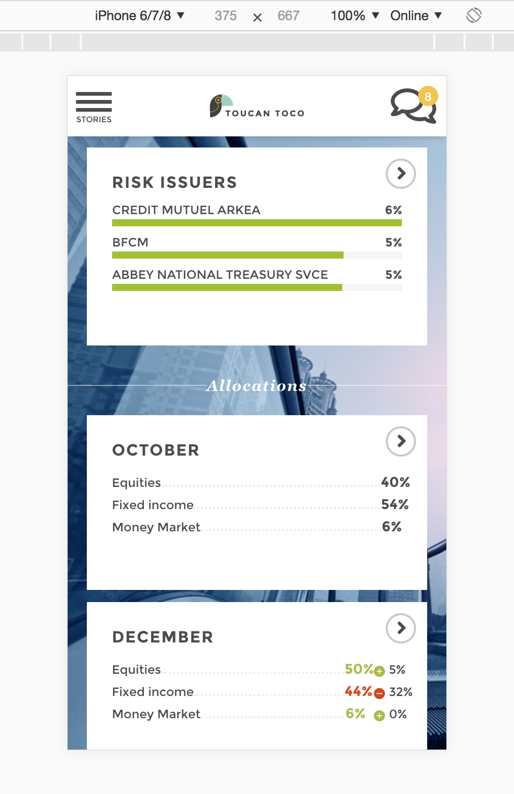
Offering a smooth mobile experience is a key focus of our product development. Whenever we can, we adapt the app design from a device to another (legend, filters, navigation, charts layout, etc.).
We also offer a landscape mode that make it easier to focus on an analysis or share it with colleagues.
We are constantly improving our mobile-first approach to make sure to provide our users a seemless experience, wether on their mobile or their tablet. Every new feature implemented on Toucan Toco is tested to fit this mobile driven approach.
Embrace the mobile-first method!
From the start of the construction of a new project it should be clear that all stories are made for mobile users.
Mobile design is the most demanding. If we focus on it, we can be confident the experience will be great on other devices too.
Each time you discuss on a story, ask yourself: will this give a good experience on mobile? Is using 3 filters a good idea (answer : it’s not!).
Each time you design a story test it using the mobile view of your navigator (for instance for [firefox](https://developer.mozilla.org/fr/docs/Outils/Vue_adaptative or chrome. Don’t forget to refresh the page after switching the view!
Create
Each time you deliver a new version of the app to your users make sure to present it on a mobile or using a mobile emulator on your desktop.