Widget Value Sparkline (old home only)
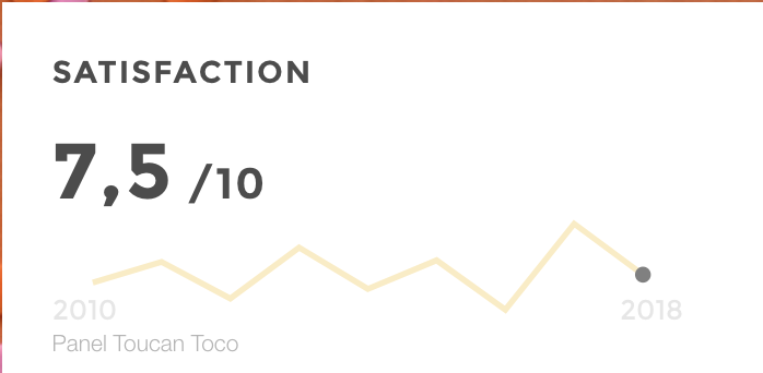
value sparkline
Use the Widget linechart to show a trend in a time series next to a fixed value.
*ie: “I want to know the total amount of my sales this month and also display the daily detail”
Note: the only difference withe the line tile is that the main value
displayed is fixed
Configuration
Mandatory config options: Outside chartOptions
value:fixed value to display In chartOptionsdata/query/domain: data source name as defined in the DATA_SOURCES block of your etl_configchartType: "value-sparkline"date:column name containing the date to displayvalue:column name containing the value to display (corresponding to the date)
Available options:
unit:what will be displayed next to the value (same indentation as ChartOptions)source:text to display at the bottom of the tile as the source of the data, or a note (same indentation as ChartOptions)
{
  name:
  type: "value-sparkline"
  value:

  chartOptions:
    value:
    date:
    data:
      query:
        domain:
  }
Ex1: with a unit
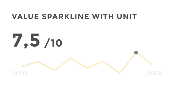
value sparkline unit
Data structure
| label         | value_ex |year    |
|-------------- |----------|--------|
| Satisfaction  | 4,3      |2016    |
| Satisfaction  | 9,7      |2017    |
| Satisfaction  | 6,5      |2018    |
{
  name: "Satisfaction"
  type: "value-sparkline"
  value: "7.5"
  chartOptions:
    value: "value_ex"
    date: "year"
    data:
      query:
        domain: 'value_sparkline'
  unit: " / 10"
}
Ex2: with a source
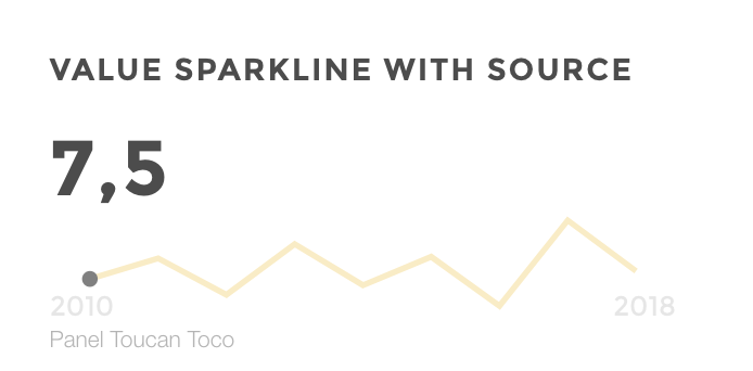
value sparkline source
Data structure
| label         | value_ex |year    |
|-------------- |----------|--------|
| Satisfaction  | 4,3      |2016    |
| Satisfaction  | 9,7      |2017    |
| Satisfaction  | 6,5      |2018    |
{
  name: "Satisfaction"
  type: "value-sparkline"
  value: "7.5"
  chartOptions:
    value: "value_ex"
    date: "year"
    data:
      query:
        domain: 'value_sparkline'
  source: "Panel Toucan Toco"
}